https://stackoverflow.com/questions/21804812
 italiano
 english
 français
 española
 中国
中国 日本の
日本の العربية
 Deutsch
 한국어
한국어 Português
 Russian
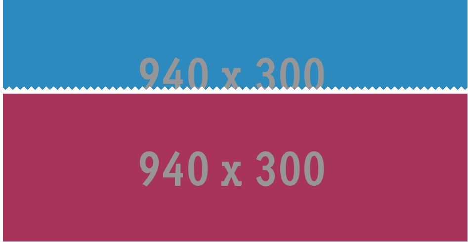
I actually forgot about this question but I resolved it quite a while back and created a demo of it on Codepen here: http://codepen.io/dcdev/pen/noAiw
css
body {
  background-color:transparent;
}
div {
  margin:0 auto;
  width:940px;
  height:300px;
}
div.top {
  background-image:url(http://www.placehold.it/940x300/2D8ABE);
}
div.bottom {
  background-image:url(http://www.placehold.it/940x300/A93459);
}
#zz {
  max-width:940px;
  margin-top:-125px;
  height:15px;
  background:-webkit-linear-gradient(0deg,transparent 15px,#fff 15px),-webkit-linear-gradient(-135deg,#fff 10px,transparent 10px),-webkit-linear-gradient(135deg,#fff 10px,transparent 10px);background:-moz-linear-gradient(0deg,transparent 15px,#fff 15px),-moz-linear-gradient(-135deg,#fff 10px,transparent 10px),-moz-linear-gradient(135deg,#fff 10px,transparent 10px);background:-o-linear-gradient(0deg,transparent 15px,#fff 15px),-o-linear-gradient(-135deg,#fff 10px,transparent 10px),-o-linear-gradient(135deg,#fff 10px,transparent 10px);background:-ms-linear-gradient(0deg,transparent 15px,#fff 15px),-ms-linear-gradient(-135deg,#fff 10px,transparent 10px),-ms-linear-gradient(135deg,#fff 10px,transparent 10px);background:linear-gradient(0deg,transparent 15px,#fff 15px),linear-gradient(-135deg,#fff 10px,transparent 10px),linear-gradient(135deg,#fff 10px,transparent 10px);background-color:transparent;background-position:center center;background-repeat:repeat-x;-webkit-background-size:100% 100%,15px 15px,15px 15px;-moz-background-size:100% 100%,15px 15px,15px 15px;background-size:100% 100%,15px 15px,15px 15px;-webkit-transform:rotate(180deg);-moz-transform:rotate(180deg);-o-transform:rotate(180deg);-ms-transform:rotate(180deg);transform:rotate(180deg);
}
html
<div class="top"></div>
<div id="zz" role="separator"></div>
<div class="bottom"></div>