Question

So, I am trying to use pure CSS to have a slight dropshadow that lays over a tab. I want it to fade out on the ends at 20% and 80%. I've been trying to acheive this for some time now, but finding myself not happy with the results so far.

Here's an image of what I want to have:

Shadow Tab

HTML:

<button type="button" class="btn">
    <span>Button Text</span>
    <span class="buttonshadow"></span>
</button>

CSS:

.btn {
    -webkit-border-radius: 0px;
    -webkit-border-bottom-right-radius: 5px;
    -webkit-border-bottom-left-radius: 5px;
    -moz-border-radius: 0px;
    -moz-border-radius-bottomright: 5px;
    -moz-border-radius-bottomleft: 5px;
    border-radius: 0px;
    border-bottom-right-radius: 5px;
    border-bottom-left-radius: 5px;
    font-size: 24px;
    padding: 6px 16px 7px;
    line-height: 1;
    position: relative;
    color: #ffffff;
    background-color: #5CBCEC;
    border-color: #5CBCEC;
    display: inline-block;
    margin-bottom: 0;
    background-image: none;
    border: 1px solid transparent;
    white-space: nowrap;
    overflow: visible;
}
.buttonshadow {
    width: 120%;
    height: 100%;
    position: absolute;
    top: 0;
    left: -10%;
}
.buttonshadow:before {
    content: "";
    position: absolute;
    z-index: 1;
    top: -1px;
    left: 0;
    width: 100%;
    height: 5px;
    background: -webkit-radial-gradient(50% -3%, ellipse cover, rgba(00, 00, 00, 0.2), rgba(97, 97, 97, 0.0) 40%);
    background: radial-gradient(ellipse at 50% 0%, rgba(0, 0, 0, 0.4), rgba(97, 97, 97, 0) 70%);
}

Here's my current fiddle so far: JSFiddle

Clearly this does not look the same. Any help is much appreciated!!!

No correct solution

OTHER TIPS

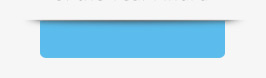
If i understand the problem correctly you want the gradient outside the button on the edges.

problem lies in the .buttonshadow and .buttonshadow:before

I changed it to this

.buttonshadow {
    width: 100%;
    height: 100%;
    position: absolute;
    top: 0;
    left: -25px;
}
.buttonshadow:before {
    content: "";
    position: absolute;
    z-index: 1;
    top: -1px;
    left: 0;
    width: 130%;
    height: 5px;
    background: -webkit-radial-gradient(50% -3%, ellipse cover, rgba(00, 00, 00, 0.2), rgba(97, 97, 97, 0.0) 40%);
    background: radial-gradient(ellipse at 50% 0%, rgba(55, 55, 55, 1), rgba(97, 97, 97, 0) 80%);
}

Check fiddle

http://jsfiddle.net/rLsbC/1/

you can then fiddle around with the gradient to get more what you want. Hope this helps!

Note: If you want to change the width of the gradient change the width in .buttonshadow:before and the left attribute in .buttonshadow

This is one solution that may work for you.

Demo Fiddle

In order to get the fading at the ends I had to squish the radial gradient down a bit, and then position it to look right. I added it to the .btn class instead of a separate element.

CSS:

.btn:after {
    content: '';
    display: block;
    position: absolute;
    width: 120%;
    height: 5px;
    top: -2px;
    left: -10%;
    background: -webkit-radial-gradient(center, ellipse cover, rgba(0,0,0,0.45) 0%,rgba(0,0,0,0) 85%); 
}

[me, earlier via comments] I’d try with just a linear gradient for the span over the whole width of the button, and then add a faded shadow via an elliptical gradient on both sides using :before/ :after elements on the span …

OK, I gave it a go now – http://jsfiddle.net/rLsbC/3/

Sorry, it’s Firefox only for now as I didn’t bother with vendor prefixes for other browsers – but to add those should be not a big deal. (For those that actually support radial gradients anyway.)

I replaced the shadow in the span element itself with a linear gradient,

background: linear-gradient(to bottom, rgba(0, 0, 0, 0.4) 0%,
  rgba(97, 97, 97, 0) 100%);

and then added positioned :before/:after with an elliptical radial gradient positioned at the top right resp. top left corner of those generated elements, like this

background: -moz-radial-gradient(top right, ellipse cover, rgba(0, 0, 0, 0.4),
  rgba(97, 97, 97, 0) 50%);

Had to make the span element itself a little higher to get the linear gradient and the elliptical ones stuck to the sides of it to match up.

If you take that as a basis and play around with the specific values of the gradients (and maybe the width/position of the generated elements), you should be able to get very close to what you want.

Licensed under: CC-BY-SA with attribution
Not affiliated with StackOverflow
scroll top