Fluent UI no theme in SpFx
 https://sharepoint.stackexchange.com/questions/287879
-
19-02-2021 - |
 italiano
 english
 français
 española
 中国
中国 日本の
日本の العربية
 Deutsch
 한국어
한국어 Português
 Russian
Question
I'm currently working on my first SPFx project using Microsoft's Fluent UI React. I tested my solution in the local workbench and everything seemed fine. But as soon as I release it to the app catalog (still hosted from localhost) and use it on a site the Fluent components are not using theme colors.
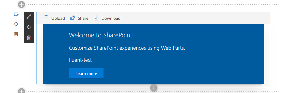
As an example I took the initial code generated by yo and added a CommandBar at the top of the component. This is what I see in the local workbench:
And this is the same webpart running on sharepoint online:
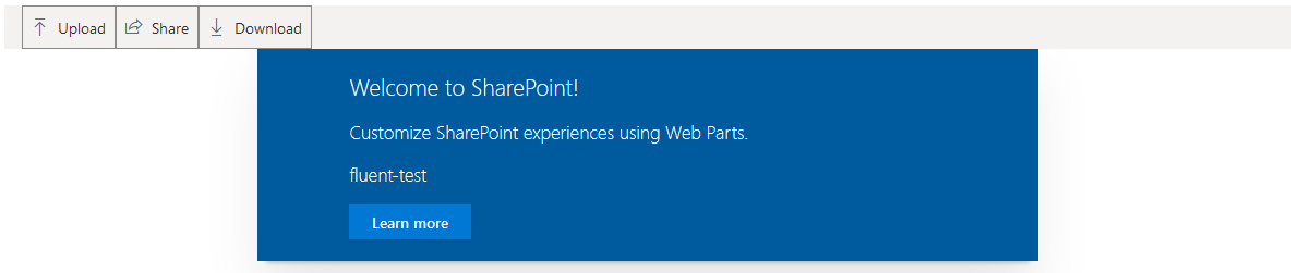
As you can see the CommandBar icons are not themed and the buttons have a border. Other Fluent controls have the same problem.
I used the code examples from the Fluent UI developer page. This is my code for the webpart I used as an example here:
import * as React from 'react';
import styles from './FluentTest.module.scss';
import { IFluentTestProps } from './IFluentTestProps';
import { escape } from '@microsoft/sp-lodash-subset';
import { CommandBar, ICommandBarItemProps } from 'office-ui-fabric-react/lib/CommandBar';

const _items: ICommandBarItemProps[] = [
  {
    key: 'upload',
    text: 'Upload',
    iconProps: { iconName: 'Upload' },
    href: 'https://developer.microsoft.com/en-us/fluentui',
  },
  {
    key: 'share',
    text: 'Share',
    iconProps: { iconName: 'Share' },
    onClick: () => console.log('Share'),
  },
  {
    key: 'download',
    text: 'Download',
    iconProps: { iconName: 'Download' },
    onClick: () => console.log('Download'),
  },
];

export default class FluentTest extends React.Component<IFluentTestProps, {}> {
  public render(): React.ReactElement<IFluentTestProps> {
    return (
      <div className={ styles.fluentTest }>
        <div>
          <CommandBar
            items={_items}
            ariaLabel="Use left and right arrow keys to navigate between commands"
          />
        </div>
        <div className={ styles.container }>
          <div className={ styles.row }>
            <div className={ styles.column }>
              <span className={ styles.title }>Welcome to SharePoint!</span>
              <p className={ styles.subTitle }>Customize SharePoint experiences using Web Parts.</p>
              <p className={ styles.description }>{escape(this.props.description)}</p>
              <a href="https://aka.ms/spfx" className={ styles.button }>
                <span className={ styles.label }>Learn more</span>
              </a>
            </div>
          </div>
        </div>
      </div>
    );
  }
}
What do I need to do to have the controls use the standard theme (or any theme)? Thanks in advance!
No correct solution
OTHER TIPS
I found what the problem was! The examples on the Fluent UI developer page use the old resources for imports!
They use
import { CommandBar, ICommandBarItemProps } from 'office-ui-fabric-react/lib/CommandBar';
Instead of:
import { CommandBar, ICommandBarItemProps } from '@fluentui/react';
After changing this, the controls look much better but still lack colours. This can then be achieved by loading a theme first thing in the webpart:
import { loadTheme } from '@fluentui/react';

loadTheme({
  palette: {
    themePrimary: '#0078d4',
    themeLighterAlt: '#eff6fc',
    themeLighter: '#deecf9',
    themeLight: '#c7e0f4',
    themeTertiary: '#71afe5',
    themeSecondary: '#2b88d8',
    themeDarkAlt: '#106ebe',
    themeDark: '#005a9e',
    themeDarker: '#004578',
    neutralLighterAlt: '#f8f8f8',
    neutralLighter: '#f4f4f4',
    neutralLight: '#eaeaea',
    neutralQuaternaryAlt: '#dadada',
    neutralQuaternary: '#d0d0d0',
    neutralTertiaryAlt: '#c8c8c8',
    neutralTertiary: '#c2c2c2',
    neutralSecondary: '#858585',
    neutralPrimaryAlt: '#4b4b4b',
    neutralPrimary: '#333333',
    neutralDark: '#272727',
    black: '#1d1d1d',
    white: '#ffffff',
  },
});
You can apply theme to command bar items like below:
import {
  IContextualMenuItemStyles,
  IContextualMenuStyles,
} from 'office-ui-fabric-react/lib/ContextualMenu';

import { getTheme, concatStyleSets } from 'office-ui-fabric-react/lib/Styling';


const theme = getTheme();

// Styles for both command bar and overflow/menu items
const itemStyles: Partial<IContextualMenuItemStyles> = {
  label: { fontSize: 18 },
  icon: { color: theme.palette.red },
  iconHovered: { color: theme.palette.redDark },
};

// For passing the styles through to the context menus
const menuStyles: Partial<IContextualMenuStyles> = {
  subComponentStyles: { menuItem: itemStyles, callout: {} },
};
Check the code given in CommandBar custom buttons and overflow menu example at: CommandBar
Also, you can use theme colors in the SharePoint Framework using theme token placeholders in your custom CSS like:
When working with fixed colors, you specify them in CSS properties, for example:
.button {
  background-color: #0078d7;
}
To use a theme color instead, replace the fixed color with a theme token:
.button {
  background-color: "[theme: themePrimary, default: #0078d7]";
}
Check detailed information at: Use theme colors in your SharePoint Framework customizations
