How to Vertical align elements in a div?
 https://stackoverflow.com/questions/79461
-
09-06-2019 - |
 italiano
 english
 français
 española
 中国
中国 日本の
日本の العربية
 Deutsch
 한국어
한국어 Português
 Russian
Question
I have a div with two images and an h1. All of them need to be vertically aligned within the div, next to each other.
One of the images needs to be absolute positioned within the div.
What is the CSS needed for this to work on all common browsers?
<div id="header">
    <img src=".." ></img>
    <h1>testing...</h1>
    <img src="..."></img>
</div>
Solution
Wow, this problem is popular. It's based on a misunderstanding in the vertical-align property. This excellent article explains it:
Understanding vertical-align, or "How (Not) To Vertically Center Content" by Gavin Kistner.
“How to center in CSS” is a great web tool which helps to find the necessary CSS centering attributes for different situations.
In a nutshell (and to prevent link rot):
- Inline elements (and only inline elements) can be vertically aligned in their context via
vertical-align: middle. However, the “context” isn’t the whole parent container height, it’s the height of the text line they’re in. jsfiddle example - For block elements, vertical alignment is harder and strongly depends on the specific situation:
- If the inner element can have a fixed height, you can make its position
absoluteand specify itsheight,margin-topandtopposition. jsfiddle example - If the centered element consists of a single line and its parent height is fixed you can simply set the container’s
line-heightto fill its height. This method is quite versatile in my experience. jsfiddle example - … there are more such special cases.
- If the inner element can have a fixed height, you can make its position
OTHER TIPS
Now that flexbox support is increasing, this CSS applied to the containing element would vertically center the contained item:
.container {
    display: flex;
    align-items: center;
}
Use the prefixed version if you also need to target Explorer 10, and old (< 4.4) Android browsers:
.container {
    display: -ms-flexbox;
    display: -webkit-flex;
    display: flex;

    -ms-flex-align: center;
    -webkit-align-items: center;
    -webkit-box-align: center;

    align-items: center;
}
I used this very simple code:
HTML:
<div class="ext-box">
    <div class="int-box">
        <h2>Some txt</h2>
        <p>bla bla bla</p>
    </div>
</div>
CSS:
div.ext-box { display: table; width:100%;}
div.int-box { display: table-cell; vertical-align: middle; }
Obviously, whether you use a .class or an #id, the result won't change.
It worked for me:
.vcontainer {
    min-height: 10em;
    display: table-cell;
    vertical-align: middle;
}
 .outer {
   display: flex;
   align-items: center;
   justify-content: center;
 }
A technique from a friend of mine:
HTML:
<div style="height:100px; border:1px solid;">
    <p style="border:1px dotted;">I'm vertically centered.</p>
</div>
CSS:
div:before {content:" "; display:inline-block; height:100%; vertical-align:middle;}
div p {display:inline-block;}
DEMO here
All of them need to be vertically aligned within the div
Aligned how? Tops of the images aligned with the top of the text?
One of the images needs to be absolute positioned within the div.
Absolutely positioned relative to the DIV? Perhaps you could sketch out what you're looking for...?
fd has described the steps for absolute positioning, as well as adjusting the display of the H1 element such that images will appear inline with it. To that, i'll add that you can align the images by use of the vertical-align style:
#header h1 { display: inline; }
#header img { vertical-align: middle; }
...this would put the header and images together, with top edges aligned. Other alignment options exist; see the documentation. You might also find it beneficial to drop the DIV and move the images inside the H1 element - this provides semantic value to the container, and removes the need to adjust the display of the H1:
<h1 id=header">
   <img src=".." ></img>
   testing...
   <img src="..."></img>
</h1>
To position block elements to the center (works in IE9 and above), needs a wrapper div:
.vcontainer {
  position: relative;
  top: 50%;
  transform: translateY(-50%);
  -webkit-transform: translateY(-50%);
}
Use this formula, and it will works always without cracks:
#outer {height: 400px; overflow: hidden; position: relative;}
#outer[id] {display: table; position: static;}

#middle {position: absolute; top: 50%;} /* For explorer only*/
#middle[id] {display: table-cell; vertical-align: middle; width: 100%;}

#inner {position: relative; top: -50%} /* For explorer only */
/* Optional: #inner[id] {position: static;} */
<div id="outer">
<div id="middle">
<div id="inner">
any text
any height
any content, for example generated from DB
everything is vertically centered
</div>
</div>
</div>Almost all methods needs to specify the height, but often we don't have any heights.
So here is a CSS3 3 line trick that doesn't require to know the height.
.element {
    position: relative;
    top: 50%;
    transform: translateY(-50%);
}
It's supported even in IE9.
with its vendor prefixes:
.element {
    position: relative;
    top: 50%;
    -webkit-transform: translateY(-50%);
    -ms-transform: translateY(-50%);
    transform: translateY(-50%);
}
Source: http://zerosixthree.se/vertical-align-anything-with-just-3-lines-of-css/
My trick is to put inside the div a table with 1 row and 1 column, set 100% of width and height, and the property vertical-align:middle.
<div>

    <table style="width:100%; height:100%;">
        <tr>
            <td style="vertical-align:middle;">
                BUTTON TEXT
            </td>
        </tr>
    </table>

</div>
By default h1 is a block element and will render on the line after the first img, and will cause the second img to appear on the line following the block.
To stop this from occurring you can set the h1 to have inline flow behaviour:
#header > h1 { display: inline; }
As for absolutely positioning the img inside the div, you need to set the containing div to have a "known size" before this will work properly. In my experience, you also need to change the position attribute away from the default - position: relative works for me:
#header { position: relative; width: 20em; height: 20em; }
#img-for-abs-positioning { position: absolute; top: 0; left: 0; }
If you can get that to work, you might want to try progressively removing the height, width, position attributes from div.header to get the minimal required attributes to get the effect you want.
UPDATE:
Here is a complete example that works on Firefox 3:
<!DOCTYPE html PUBLIC "-//W3C//DTD XHTML 1.0 Strict//EN"
          "http://www.w3.org/TR/xhtml1/DTD/xhtml1-strict.dtd">
<html>
    <head>
        <title>Example of vertical positioning inside a div</title>
        <style type="text/css">
            #header > h1 { display: inline; }
            #header { border: solid 1px red;
                      position: relative; }
            #img-for-abs-positioning { position: absolute;
                                       bottom: -1em; right: 2em; }
        </style>
    </head>

    <body>
        <div id="header">
            <img src="#" alt="Image 1" width="40" height="40" />
            <h1>Header</h1>
            <img src="#" alt="Image 2" width="40" height="40"
                 id="img-for-abs-positioning" />
        </div>
    </body>
</html>
Using CSS to vertical center, you can let the outer containers act like a table, and the content as a table cell. In this format your objects will stay centered. :)
I nested multiple objects in JSFiddle for an example, but the core idea is like this:
HTML
<div class="circle">
  <div class="content">
    Some text
  </div>
</div>
CSS
 .circle {
   /* act as a table so we can center vertically its child */
   display: table;
   /* set dimensions */
   height: 200px;
   width: 200px;
   /* horizontal center text */
   text-align: center;
   /* create a red circle */
   border-radius: 100%;
   background: red;
 }

 .content {
   /* act as a table cell */
   display: table-cell;
   /* and now we can vertically center! */
   vertical-align: middle;
   /* some basic markup */
   font-size: 30px;
   font-weight: bold;
   color: white;
 }
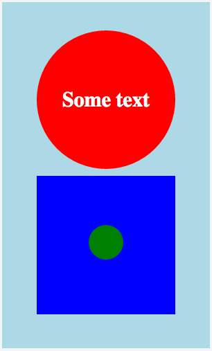
The multiple objects example:
HTML
<div class="container">
  <div class="content">

    <div class="centerhoriz">

      <div class="circle">
        <div class="content">
          Some text
        </div><!-- content -->
      </div><!-- circle -->

      <div class="square">
        <div class="content">
          <div id="smallcircle"></div>
        </div><!-- content -->
      </div><!-- square -->

    </div><!-- center-horiz -->

  </div><!-- content -->
</div><!-- container -->
CSS
.container {
  display: table;
  height: 500px;
  width: 300px;
  text-align: center;
  background: lightblue;
}

.centerhoriz {
  display: inline-block;
}

.circle {
  display: table;
  height: 200px;
  width: 200px;
  text-align: center;
  background: red;
  border-radius: 100%;
  margin: 10px;
}

.square {
  display: table;
  height: 200px;
  width: 200px;
  text-align: center;
  background: blue;
  margin: 10px;
}

.content {
  display: table-cell;
  vertical-align: middle;
  font-size: 30px;
  font-weight: bold;
  color: white;
}

#smallcircle {
  display: inline-block;
  height: 50px;
  width: 50px;
  background: green;
  border-radius: 100%;
}
Result
We may use a CSS function calculation to calculate the size of the element and then position the child element accordingly.
Example HTML:
<div class="box">
    <span><a href="#">Some Text</a></span>
</div>
And CSS:
.box {
    display: block;
    background: #60D3E8;
    position: relative;
    width: 300px;
    height: 200px;
    text-align: center;

}
.box span {
    font: bold 20px/20px 'source code pro', sans-serif;
    position: absolute;
    left: 0;
    right: 0;
    top: calc(50% - 10px);
}
a {
    color: white;
    text-decoration: none;
}
Demo created here: https://jsfiddle.net/xnjq1t22/
This solution works well with responsive div height and width as well.
Note: The calc function is not tested for compatiblity with old browsers.
As per today, I have found a new workaround to vertically align multiple text-lines in a div using CSS3 (and I am also using bootstrap v3 grid system to beautify the UI), which is as below:
.immediate-parent-of-text-containing-div{
    height: 50px;         /* or any fixed height that suits you.*/
}

.text-containing-div {
    display: inline-grid;
    align-items: center;
    text-align: center;
    height: 100%;
}
As per my understanding, immediate parent of text containing element must have some height. I hope it will help you too. Thanks!
There are two ways to align elements vertically and horizontally

1. Bootstrap 4.3.X
for vertical alignment: d-flex align-items-center
for horizontal alignment: d-flex justify-content-center
.container {
    height: 180px;
    width:100%;
}
<link href="https://stackpath.bootstrapcdn.com/bootstrap/4.3.1/css/bootstrap.min.css"
rel="stylesheet"/>
<div class="d-flex align-items-center justify-content-center bg-info container">
<div class="bg-light p-2">I am in Center</div>
</div>2. CSS3
.container {
    display: flex;
    align-items: center;
    justify-content: center;
    background-color: #17a2b8;
    height: 180px;
    width:100%;
}

.child {
  background-color: #f8f9fa;
  padding: 0.5rem;
}
<div class="container">
<div class="child">I am in Center</div>
</div>Just use a one-cell table inside the div! Just set the cell and table height and with to 100% and you can use the vertical-align.
A one-cell table inside the div handles the vertical-align and is backward compatible back to the Stone Age!
I have been using the following solution (with no positioning and no line height) since over a year, it works with IE 7 and 8 as well.
<style>
.outer {
    font-size: 0;
    width: 400px;
    height: 400px;
    background: orange;
    text-align: center;
    display: inline-block;
}

.outer .emptyDiv {
    height: 100%;
    background: orange;
    visibility: collapse;
}

.outer .inner {
    padding: 10px;
    background: red;
    font: bold 12px Arial;
}

.verticalCenter {
    display: inline-block;
    *display: inline;
    zoom: 1;
    vertical-align: middle;
}
</style>

<div class="outer">
    <div class="emptyDiv verticalCenter"></div>
    <div class="inner verticalCenter">
        <p>Line 1</p>
        <p>Line 2</p>
    </div>
</div>
This is my personal solution for an i element inside a div
HTML
<div class="circle">
    <i class="fa fa-plus icon">
</i></div>
CSS
.circle {
   border-radius: 50%;
   color: blue;
   background-color: red;
   height:100px;
   width:100px;
   text-align: center;
   line-height: 100px;
}

.icon {
  font-size: 50px;
  vertical-align: middle;
}
For me, it worked this way:
<div style="width:70px; height:68px; float:right; display: table-cell; line-height: 68px">
    <a href="javascript:void(0)" style="margin-left: 4px; line-height: 2" class="btn btn-primary">Login</a>
</div>
The "a" element converted to a button, using Bootstrap classes, and it is now vertically centered inside an outer "div".
<div class="outdiv">
  <div class="indiv">
     <span>test1</span>
     <span>test2</span>
  </div>
</div>


.outdiv {
    display: flex;
    justify-content:center;
    align-items:center;
}
Just this:
<div>
    <table style="width: 100%; height: 100%">
        <tr>
            <td style="width: 100%; height: 100%; vertical-align: middle;">
               What ever you want vertically-aligned
            </td>
        </tr>
    </table>
</div>
A one-cell table inside the div handles the vertical-align and is backward compatible back to the Stone Age!
<!DOCTYPE HTML PUBLIC "-//W3C//DTD HTML 4.01//EN">
<html>
    <head>
        <style type="text/css">
            #style_center { position:relative; top:50%; left:50%; }
            #style_center_absolute { position:absolute; top:50px; left:50px; }
            <!--#style_center { position:relative; top:50%; left:50%; height:50px; margin-top:-25px; }-->
        </style>
    </head>

    <body>
        <div style="height:200px; width:200px; background:#00FF00">
            <div id="style_center">+</div>
        </div>
    </body>
</html>
Here is just another (responsive) approach:
html,
    body {
        height: 100%;
    }
    body {
        margin: 0;
    }

    .table {
        display: table;
        width:  auto;
        table-layout:auto;
        height: 100%;
    }
        .table:nth-child(even) {
            background: #a9edc3;
        }
        .table:nth-child(odd) {
            background: #eda9ce;
        }

    .tr {
        display: table-row;
    }
    .td {
        display: table-cell;
        width: 50%;
        vertical-align: middle;
    }
I'm a .NET guy who just got into web programming. I didn't use CSS (well, a little bit). I used a little JavaScript to accomplish vertical centering along with jQuery's .css function.
I'm just posting everything from my test. It's probably not overly elegant, but it works so far.
script.

<html>
    <head>
        <script src="https://ajax.googleapis.com/ajax/libs/jquery/2.2.0/jquery.min.js"></script>

        <script type="application/javascript">
            function centerElementVertically(id) {
                var btnDivHeight = $(id).outerHeight();
                var prnt = $(id).parent();
                var parentHeight = prnt.outerHeight();

                var newTop = ((parentHeight - btnDivHeight) / 2) + 'px';
                var newPct = newTop / parentHeight+'%;';

                $(id).css({top: newTop});
            }

            function showAlert(){
                alert("alert");
            }

            $(window).load(()=>{
                centerElementVertically('#buttonRight');
                centerElementVertically('#buttonLeft');
                centerElementVertically('#testerbtn')
            });

            $(window).resize(()=>{
                centerElementVertically('#buttonRight');
                centerElementVertically('#buttonLeft');
                centerElementVertically('#testerbtn')
            })
        </script>

        <style>
            #div1 {
                position:relative;
                height: 33%;
                background-color: red;
                overflow: hidden;
            }
            #buttonLeft {
                position: relative;
                float:left;
                width:50%;
                height:20%;
                background-color: cornsilk;
            }
            #buttonRight {
                position: relative;
                float:right;
                width:50%;
                height:50%;
                background-color: darkorchid;
            }
            #testerbtn {
                position: absolute;
            }
            body {
                background-color: aqua;
            }
        </style>

        <body>
            <div id="div1">
                <div id="buttonLeft">
                    <button id="testerbtn">tester</button>
                </div>
                <div id="buttonRight"></div>
            </div>
        </body>
    </head>
</html>
<div id="header" style="display: table-cell; vertical-align:middle;">
...
or CSS
.someClass
{
   display: table-cell;
   vertical-align:middle;
}
