 https://stackoverflow.com/questions/15319097
 italiano
 english
 français
 española
 中国
中国 日本の
日本の العربية
 Deutsch
 한국어
한국어 Português
 Russian
Use CSS3 background-size: cover.
Here's a working example: http://jsfiddle.net/HBPRv/.
And you can read the documentation here.
Question
How can I resize and align a picture within a div?
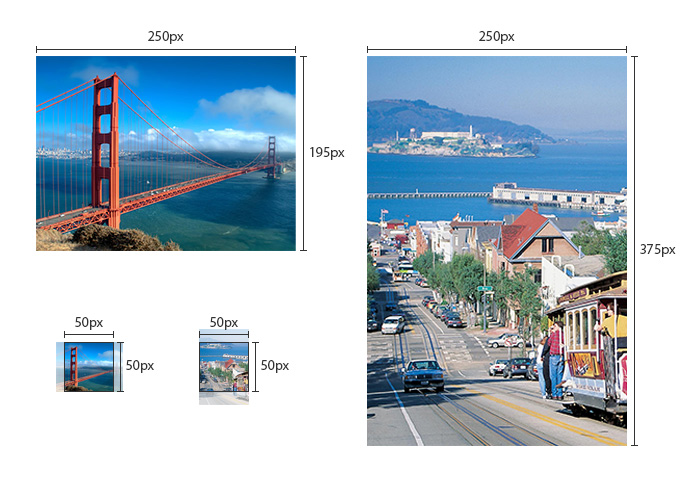
I need to show resized images on a 50x50px div. I also want them to be centralized on the div. I've made this image below to show exactly what i want to do.
The problem in that the CSS needs to work when the image is larger on width, and when it's larger on height.
I've found this solution using max-width or max-height, but it only works for one option (larger width, or larger height):
div.img-crop-thumb
{
    width: 50px;
    height: 50px;
    position: relative;
    overflow: hidden;
}
.img-crop-thumb img
{
    position: absolute;
    top: 0px;
    left: -50%;
    max-width: 30px;
    height: auto;
}
Solution 2
Use CSS3 background-size: cover.
Here's a working example: http://jsfiddle.net/HBPRv/.
And you can read the documentation here.
OTHER TIPS
Here is my function for this (PHP). Although I do loads of dynamic image file calls
function remoteFileExists($url) {
    $curl = curl_init($url);

    //don't fetch the actual page, you only want to check the connection is ok
    curl_setopt($curl, CURLOPT_NOBODY, true);

    //do request
    $result = curl_exec($curl);

    $ret = false;

    //if request did not fail
    if ($result !== false) {
        //if request was ok, check response code
        $statusCode = curl_getinfo($curl, CURLINFO_HTTP_CODE);

        if ($statusCode == 200) {
            $ret = true;
        }
    }

    curl_close($curl);

    return $ret;
}

function pictureResize($imgDest, $width, $link){
    $default_pic = "default location"; //set a default image if none exists
    $exists = remoteFileExists($imgDest);
    if ($exists) {
        list($w_orig, $h_orig) = getimagesize($imgDest); //get size
        if($w_orig > $h_orig){ // if the width is greater than the height
            $ratio = $w_orig / $h_orig; // get the aspect ratio of the image
            $newWidth = $width * $ratio; // make a new width size
            $margin = round($newWidth/2); // find the margin
            $thisPic = '
                <div style="height:'.$width.'px; overflow:hidden; position:relative; width:'.$width.'px;">
                <img src="'.$imgDest.'" height="'.$width.'px" style="position:absolute; left:50%; margin-left:-'.$margin.'px;" /></div>';
        }else{
            $thisPic = '
                <div style="height:'.$width.'px; overflow:hidden; width:'.$width.'px;">
                <img src="'.$imgDest.'" width="'.$width.'px" /></div>';
        }
    }else{
        $thisPic = '
                <div style="height:'.$width.'px; overflow:hidden; position:relative; width:'.$width.'px;">
                <img src="'.$default_pic.'" width="'.$width.'px" height="'.$width.'px" style="position:absolute; left:50%; margin-left:-'.round(($width/2)-1).'px;" /></div>';
    }
    return $thisPic;
}
This doesn't center the height but it will center the width. Call the image like so...
pictureResize($imgDest, /*set an int value for size*/, "set a string for location");
I hope this will at least point you in the right direction
Using JavaScript:
WORKING DEMO: http://jsfiddle.net/wV4tn/
(Works smoothly for landscape, portrait and square sizes!)
//Takes in image's original width/height and the container's width height
function scaletofit(imgw, imgh, contw, conth){
    var perc = 0;
    if((conth / contw) > (imgh / imgw)){
        perc = contw / imgw;
    } else {
        perc = conth / imgh;
    }
    return [Math.round(imgw * perc), Math.round(imgh * perc)];
}
For centralizing in the div, put left: 50% and margin-left as -imagewidth/2 OR top: 50% and margin-top as -imageheight/2, depending on what you need.
