 https://stackoverflow.com/questions/16268440
 italiano
 english
 français
 española
 中国
中国 日本の
日本の العربية
 Deutsch
 한국어
한국어 Português
 Russian
I must be confused on what your asking. If your talking about centering the wheel, then in "c1", just use: margin: 1.5em auto 0 auto;
Positioning of 3d element in css
-
13-04-2022 - |
Question
I'm having two issues with the positioning of a 3d-transformed element within a div. In the image below, the pink squares are containers for 10-faced "wheels". The perspective origin is set to the middle of each div.
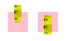
The first issue (left wheel) is that the wheel is not vertically centered in the div. I can use translateY to artificially move the wheel down, but the exact amount to translate varies between devices (eg. it is not the same with Chrome on PC vs. Chrome on Android). Why is the wheel not centered vertically?
The second issue (right wheel) is that if I set the height of the wheel to something other than 1em and rotate the wheel along the X axis, the wheel does not rotate from its center, and thus appear to wobble within the div. This seems strange as the height of the wheel really is not 1em, it is 3.077em. Why does this happen?
Complete animated example here: http://jsfiddle.net/dhApe/2/. No-prefix version (works on Firefox): http://jsfiddle.net/dhApe/3/
The main CSS rules:
.wheel-container {
    position: absolute;
    top: 4em;
    height: 4em;
    width: 4em;
    background: pink;
    -webkit-perspective: 5em;
    -webkit-perspective-origin: 50% 50%;
}

.wheel {
    position: relative;
    margin: 0 auto;
    width: 1em;
    height: 1em;
    -webkit-transition: -webkit-transform 0.5s linear;
    -webkit-transform-style: preserve-3d;
}
Solution
Licensed under: CC-BY-SA with attribution
Not affiliated with StackOverflow
