Just as the title suggests, I am making a website that utilizes the "off canvas" menu approach to save space and modernize the look and feel of the site on mobile devices.
The exact problem is that the menu itself will not move off the canvas when the page is loaded in iOS 7 on an iPad. This is not the case in iOS 6 though, when I checked it. The flyout works perfectly on my desktop when I resize the browser window.
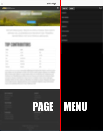
This is what it looks like on an iPad Air with iOS 7
I was surprised to find that the layout actually worked as expected in iOS 6 with an earlier iPad. I am racking my brains trying to figure this out. Here is the code I am working with (note: I am using the Bootstrap 3 framework underneath all of this):
HTML HEADER
<meta name="viewport" content="width=device-width, initial-scale=1.0">
GLOBAL DEVICE-RELATED CSS
@-webkit-viewport   { width: device-width; }
@-moz-viewport      { width: device-width; }
@-ms-viewport       { width: device-width; }
@-o-viewport        { width: device-width; }
@viewport           { width: device-width; }
MENU CSS
@media screen and (max-width: $screen-tablet) {
    #nav {
      position: absolute;
      top: 0;
      padding-top: 5.25em;
    }
    #nav .block {
      position: relative;
      padding: 0;
    }

    .js-ready #nav {
      height: 100%;
      width: 70%;
      background: #333333;
    }
    .js-ready #nav .block {
      background: transparent;
    }
    .js-ready #nav {
      left: -70%;
    }
    .js-ready #inner-wrap {
      left: 0;
    }
    .js-nav #inner-wrap {
      left: 70%;
    }
  }
}
JAVASCRIPT
// Toggle the mobile navigation off-canvas menu
$(document).on('click', '.nav-btn', function(event)
{
    event.preventDefault();

    if ($('html').hasClass('js-nav-in'))
{
    $('html').removeClass('js-nav-in').addClass('js-nav-out');
}
    else if ($('html').hasClass('js-nav-out'))
{
    $('html').removeClass('js-nav-out').addClass('js-nav-in');
}
});
I'm sorry for the code dump, but that seems to make this a more complex issue. Any tips or suggestions anyone has would be appreciated. I am willing to completely rebuild the menu if it means that this menu would work across the bulk of tablets and mobile phones.
As a note, when I tap on the menu icon or closing x the view zooms in as if the total width of the page is less. I think this may be a complete rebuild type situation. If you know of a resource where I would be able to see how this could be properly done, I would accept it.
EDIT: The sizing seems to work in iOS 7 Safari. However, when the user swipes to the side, the menu comes out. This is still an issue, just a different one. Any helpful resources would be appreciated.
 https://stackoverflow.com/questions/22496370
 italiano
 english
 français
 española
 中国
中国 日本の
日本の العربية
 Deutsch
 한국어
한국어 Português
 Russian