 https://stackoverflow.com/questions/23619093
 italiano
 english
 français
 española
 中国
中国 日本の
日本の العربية
 Deutsch
 한국어
한국어 Português
 Russian
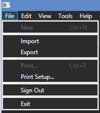
The white lines are part of the Popup template, which is what MenuItem uses at its default template. You'll have to override it to remove these linings.
If you have Blend, then you can easily change the template and copy-paste the code into your project. If you don't have Blend, give this a shot:
1- Add a reference to PresentationFramework.Aero
2- In your XAML file, import this namespace:
xmlns:Themes="clr-namespace:Microsoft.Windows.Themes;assembly=PresentationFramework.Aero"
Paste this code inside the Window.Resources section. This is what Blend generated based on the modified template:
 <LinearGradientBrush x:Key="MenuItemSelectionFill" EndPoint="0,1" StartPoint="0,0">
        <GradientStop Color="#34C5EBFF" Offset="0"/>
        <GradientStop Color="#3481D8FF" Offset="1"/>
    </LinearGradientBrush>
    <Geometry x:Key="Checkmark">M 0,5.1 L 1.7,5.2 L 3.4,7.1 L 8,0.4 L 9.2,0 L 3.3,10.8 Z</Geometry>
    <ControlTemplate x:Key="{ComponentResourceKey ResourceId=SubmenuItemTemplateKey, TypeInTargetAssembly={x:Type MenuItem}}" TargetType="{x:Type MenuItem}">
        <Grid SnapsToDevicePixels="true">
            <Rectangle x:Name="Bg" Fill="{TemplateBinding Background}" RadiusY="2" RadiusX="2" Stroke="{TemplateBinding BorderBrush}" StrokeThickness="1"/>
            <Rectangle x:Name="InnerBorder" Margin="1" RadiusY="2" RadiusX="2"/>
            <Grid>
                <Grid.ColumnDefinitions>
                    <ColumnDefinition MinWidth="24" SharedSizeGroup="MenuItemIconColumnGroup" Width="Auto"/>
                    <ColumnDefinition Width="4"/>
                    <ColumnDefinition Width="*"/>
                    <ColumnDefinition Width="37"/>
                    <ColumnDefinition SharedSizeGroup="MenuItemIGTColumnGroup" Width="Auto"/>
                    <ColumnDefinition Width="17"/>
                </Grid.ColumnDefinitions>
                <ContentPresenter x:Name="Icon" ContentSource="Icon" Margin="1" SnapsToDevicePixels="{TemplateBinding SnapsToDevicePixels}" VerticalAlignment="Center"/>
                <Border x:Name="GlyphPanel" BorderBrush="#CDD3E6" BorderThickness="1" Background="#E6EFF4" CornerRadius="3" Height="22" Margin="1" Visibility="Hidden" Width="22">
                    <Path x:Name="Glyph" Data="{StaticResource Checkmark}" Fill="#0C12A1" FlowDirection="LeftToRight" Height="11" Width="9"/>
                </Border>
                <ContentPresenter Grid.Column="2" ContentSource="Header" Margin="{TemplateBinding Padding}" RecognizesAccessKey="True" SnapsToDevicePixels="{TemplateBinding SnapsToDevicePixels}"/>
                <TextBlock Grid.Column="4" Margin="{TemplateBinding Padding}" Text="{TemplateBinding InputGestureText}"/>
            </Grid>
        </Grid>
        <ControlTemplate.Triggers>
            <Trigger Property="Icon" Value="{x:Null}">
                <Setter Property="Visibility" TargetName="Icon" Value="Collapsed"/>
            </Trigger>
            <Trigger Property="IsChecked" Value="true">
                <Setter Property="Visibility" TargetName="GlyphPanel" Value="Visible"/>
                <Setter Property="Visibility" TargetName="Icon" Value="Collapsed"/>
            </Trigger>
            <Trigger Property="IsHighlighted" Value="true">
                <Setter Property="Fill" TargetName="Bg" Value="{StaticResource MenuItemSelectionFill}"/>
                <Setter Property="Stroke" TargetName="Bg" Value="#8071CBF1"/>
                <Setter Property="Stroke" TargetName="InnerBorder" Value="#40FFFFFF"/>
            </Trigger>
            <Trigger Property="IsEnabled" Value="false">
                <Setter Property="Foreground" Value="#FF9A9A9A"/>
                <Setter Property="Background" TargetName="GlyphPanel" Value="#EEE9E9"/>
                <Setter Property="BorderBrush" TargetName="GlyphPanel" Value="#DBD6D6"/>
                <Setter Property="Fill" TargetName="Glyph" Value="#848589"/>
            </Trigger>
        </ControlTemplate.Triggers>
    </ControlTemplate>
    <LinearGradientBrush x:Key="MenuItemPressedFill" EndPoint="0,1" StartPoint="0,0">
        <GradientStop Color="#28717070" Offset="0"/>
        <GradientStop Color="#50717070" Offset="0.75"/>
        <GradientStop Color="#90717070" Offset="1"/>
    </LinearGradientBrush>
    <Geometry x:Key="UpArrow">M 0,4 L 3.5,0 L 7,4 Z</Geometry>
    <Style x:Key="MenuScrollButton" BasedOn="{x:Null}" TargetType="{x:Type RepeatButton}">
        <Setter Property="ClickMode" Value="Hover"/>
        <Setter Property="MinWidth" Value="0"/>
        <Setter Property="MinHeight" Value="0"/>
        <Setter Property="Template">
            <Setter.Value>
                <ControlTemplate TargetType="{x:Type RepeatButton}">
                    <DockPanel Background="Transparent" SnapsToDevicePixels="true">
                        <Rectangle x:Name="R1" DockPanel.Dock="Right" Fill="Transparent" Width="1"/>
                        <Rectangle x:Name="B1" DockPanel.Dock="Bottom" Fill="Transparent" Height="1"/>
                        <Rectangle x:Name="L1" DockPanel.Dock="Left" Fill="Transparent" Width="1"/>
                        <Rectangle x:Name="T1" DockPanel.Dock="Top" Fill="Transparent" Height="1"/>
                        <ContentPresenter x:Name="ContentContainer" HorizontalAlignment="Center" Margin="2,2,2,2" VerticalAlignment="Center"/>
                    </DockPanel>
                    <ControlTemplate.Triggers>
                        <Trigger Property="IsPressed" Value="true">
                            <Setter Property="Fill" TargetName="R1" Value="{DynamicResource {x:Static SystemColors.ControlLightLightBrushKey}}"/>
                            <Setter Property="Fill" TargetName="B1" Value="{DynamicResource {x:Static SystemColors.ControlLightLightBrushKey}}"/>
                            <Setter Property="Fill" TargetName="L1" Value="{DynamicResource {x:Static SystemColors.ControlDarkDarkBrushKey}}"/>
                            <Setter Property="Fill" TargetName="T1" Value="{DynamicResource {x:Static SystemColors.ControlDarkDarkBrushKey}}"/>
                            <Setter Property="Margin" TargetName="ContentContainer" Value="3,3,1,1"/>
                        </Trigger>
                    </ControlTemplate.Triggers>
                </ControlTemplate>
            </Setter.Value>
        </Setter>
    </Style>
    <MenuScrollingVisibilityConverter x:Key="MenuScrollingVisibilityConverter"/>
    <Geometry x:Key="DownArrow">M 0,0 L 3.5,4 L 7,0 Z</Geometry>
    <Style x:Key="{ComponentResourceKey ResourceId=MenuScrollViewer, TypeInTargetAssembly={x:Type FrameworkElement}}" BasedOn="{x:Null}" TargetType="{x:Type ScrollViewer}">
        <Setter Property="HorizontalScrollBarVisibility" Value="Hidden"/>
        <Setter Property="VerticalScrollBarVisibility" Value="Auto"/>
        <Setter Property="Template">
            <Setter.Value>
                <ControlTemplate TargetType="{x:Type ScrollViewer}">
                    <Grid SnapsToDevicePixels="true">
                        <Grid.ColumnDefinitions>
                            <ColumnDefinition Width="*"/>
                        </Grid.ColumnDefinitions>
                        <Grid.RowDefinitions>
                            <RowDefinition Height="Auto"/>
                            <RowDefinition Height="*"/>
                            <RowDefinition Height="Auto"/>
                        </Grid.RowDefinitions>
                        <Border Grid.Column="0" Grid.Row="1">
                            <ScrollContentPresenter Margin="{TemplateBinding Padding}"/>
                        </Border>
                        <RepeatButton Grid.Column="0" CommandTarget="{Binding RelativeSource={RelativeSource TemplatedParent}}" Command="{x:Static ScrollBar.LineUpCommand}" Focusable="false" Grid.Row="0" Style="{StaticResource MenuScrollButton}">
                            <RepeatButton.Visibility>
                                <MultiBinding ConverterParameter="0" Converter="{StaticResource MenuScrollingVisibilityConverter}" FallbackValue="Visibility.Collapsed">
                                    <Binding Path="ComputedVerticalScrollBarVisibility" RelativeSource="{RelativeSource TemplatedParent}"/>
                                    <Binding Path="VerticalOffset" RelativeSource="{RelativeSource TemplatedParent}"/>
                                    <Binding Path="ExtentHeight" RelativeSource="{RelativeSource TemplatedParent}"/>
                                    <Binding Path="ViewportHeight" RelativeSource="{RelativeSource TemplatedParent}"/>
                                </MultiBinding>
                            </RepeatButton.Visibility>
                            <Path Data="{StaticResource UpArrow}" Fill="{DynamicResource {x:Static SystemColors.MenuTextBrushKey}}"/>
                        </RepeatButton>
                        <RepeatButton Grid.Column="0" CommandTarget="{Binding RelativeSource={RelativeSource TemplatedParent}}" Command="{x:Static ScrollBar.LineDownCommand}" Focusable="false" Grid.Row="2" Style="{StaticResource MenuScrollButton}">
                            <RepeatButton.Visibility>
                                <MultiBinding ConverterParameter="100" Converter="{StaticResource MenuScrollingVisibilityConverter}" FallbackValue="Visibility.Collapsed">
                                    <Binding Path="ComputedVerticalScrollBarVisibility" RelativeSource="{RelativeSource TemplatedParent}"/>
                                    <Binding Path="VerticalOffset" RelativeSource="{RelativeSource TemplatedParent}"/>
                                    <Binding Path="ExtentHeight" RelativeSource="{RelativeSource TemplatedParent}"/>
                                    <Binding Path="ViewportHeight" RelativeSource="{RelativeSource TemplatedParent}"/>
                                </MultiBinding>
                            </RepeatButton.Visibility>
                            <Path Data="{StaticResource DownArrow}" Fill="{DynamicResource {x:Static SystemColors.MenuTextBrushKey}}"/>
                        </RepeatButton>
                    </Grid>
                </ControlTemplate>
            </Setter.Value>
        </Setter>
    </Style>
    <ControlTemplate x:Key="{ComponentResourceKey ResourceId=SubmenuContent, TypeInTargetAssembly={x:Type FrameworkElement}}" TargetType="{x:Type ContentControl}">
        <Border BorderBrush="#FF959595" BorderThickness="1" Background="#3f3f46">
            <Grid>
                <ContentPresenter Grid.ColumnSpan="2" Margin="1,0"/>
            </Grid>
        </Border>
    </ControlTemplate>
    <ControlTemplate x:Key="{ComponentResourceKey ResourceId=TopLevelHeaderTemplateKey, TypeInTargetAssembly={x:Type MenuItem}}" TargetType="{x:Type MenuItem}">
        <Grid SnapsToDevicePixels="true">
            <Rectangle x:Name="OuterBorder" RadiusY="2" RadiusX="2"/>
            <Rectangle x:Name="Bg" Fill="{TemplateBinding Background}" Margin="1" RadiusY="1" RadiusX="1" Stroke="{TemplateBinding BorderBrush}" StrokeThickness="1"/>
            <Rectangle x:Name="InnerBorder" Margin="2"/>
            <DockPanel>
                <ContentPresenter x:Name="Icon" ContentSource="Icon" Margin="4,0,6,0" SnapsToDevicePixels="{TemplateBinding SnapsToDevicePixels}" VerticalAlignment="Center"/>
                <Path x:Name="GlyphPanel" Data="{StaticResource Checkmark}" Fill="{TemplateBinding Foreground}" FlowDirection="LeftToRight" Margin="7,0,0,0" Visibility="Collapsed" VerticalAlignment="Center"/>
                <ContentPresenter ContentSource="Header" Margin="{TemplateBinding Padding}" RecognizesAccessKey="True" SnapsToDevicePixels="{TemplateBinding SnapsToDevicePixels}"/>
            </DockPanel>
            <Popup x:Name="PART_Popup" AllowsTransparency="true" Focusable="false" HorizontalOffset="1" IsOpen="{Binding IsSubmenuOpen, RelativeSource={RelativeSource TemplatedParent}}" PopupAnimation="{DynamicResource {x:Static SystemParameters.MenuPopupAnimationKey}}" Placement="Bottom" VerticalOffset="-1">
                <Themes:SystemDropShadowChrome x:Name="Shdw" Color="Transparent">
                    <ContentControl x:Name="SubMenuBorder" IsTabStop="false" Template="{DynamicResource {ComponentResourceKey ResourceId=SubmenuContent, TypeInTargetAssembly={x:Type FrameworkElement}}}">
                        <ScrollViewer CanContentScroll="true" Style="{DynamicResource {ComponentResourceKey ResourceId=MenuScrollViewer, TypeInTargetAssembly={x:Type FrameworkElement}}}">
                            <ItemsPresenter KeyboardNavigation.DirectionalNavigation="Cycle" Grid.IsSharedSizeScope="true" Margin="2" SnapsToDevicePixels="{TemplateBinding SnapsToDevicePixels}" KeyboardNavigation.TabNavigation="Cycle"/>
                        </ScrollViewer>
                    </ContentControl>
                </Themes:SystemDropShadowChrome>
            </Popup>
        </Grid>
        <ControlTemplate.Triggers>
            <Trigger Property="IsSuspendingPopupAnimation" Value="true">
                <Setter Property="PopupAnimation" TargetName="PART_Popup" Value="None"/>
            </Trigger>
            <Trigger Property="Icon" Value="{x:Null}">
                <Setter Property="Visibility" TargetName="Icon" Value="Collapsed"/>
            </Trigger>
            <Trigger Property="IsChecked" Value="true">
                <Setter Property="Visibility" TargetName="GlyphPanel" Value="Visible"/>
                <Setter Property="Visibility" TargetName="Icon" Value="Collapsed"/>
            </Trigger>
            <Trigger Property="HasDropShadow" SourceName="PART_Popup" Value="true">
                <Setter Property="Margin" TargetName="Shdw" Value="0,0,5,5"/>
                <Setter Property="Color" TargetName="Shdw" Value="#71000000"/>
            </Trigger>
            <Trigger Property="IsHighlighted" Value="true">
                <Setter Property="Stroke" TargetName="Bg" Value="#90717070"/>
                <Setter Property="Stroke" TargetName="OuterBorder" Value="#50FFFFFF"/>
                <Setter Property="Stroke" TargetName="InnerBorder" Value="#50FFFFFF"/>
            </Trigger>
            <Trigger Property="IsKeyboardFocused" Value="true">
                <Setter Property="Stroke" TargetName="Bg" Value="#E0717070"/>
                <Setter Property="Fill" TargetName="Bg" Value="{StaticResource MenuItemPressedFill}"/>
                <Setter Property="Stroke" TargetName="InnerBorder" Value="#50747272"/>
            </Trigger>
            <Trigger Property="IsSubmenuOpen" Value="true">
                <Setter Property="Stroke" TargetName="Bg" Value="#E0717070"/>
                <Setter Property="Fill" TargetName="Bg" Value="{StaticResource MenuItemPressedFill}"/>
                <Setter Property="Stroke" TargetName="InnerBorder" Value="#50747272"/>
            </Trigger>
            <Trigger Property="IsEnabled" Value="false">
                <Setter Property="Foreground" Value="#FF9A9A9A"/>
                <Setter Property="Fill" TargetName="GlyphPanel" Value="#848589"/>
            </Trigger>
        </ControlTemplate.Triggers>
    </ControlTemplate>
    <ControlTemplate x:Key="{ComponentResourceKey ResourceId=TopLevelItemTemplateKey, TypeInTargetAssembly={x:Type MenuItem}}" TargetType="{x:Type MenuItem}">
        <Grid SnapsToDevicePixels="true">
            <Rectangle x:Name="OuterBorder" RadiusY="2" RadiusX="2"/>
            <Rectangle x:Name="Bg" Fill="{TemplateBinding Background}" Margin="1" RadiusY="1" RadiusX="1" Stroke="{TemplateBinding BorderBrush}" StrokeThickness="1"/>
            <Rectangle x:Name="InnerBorder" Margin="2"/>
            <DockPanel>
                <ContentPresenter x:Name="Icon" ContentSource="Icon" Margin="4,0,6,0" SnapsToDevicePixels="{TemplateBinding SnapsToDevicePixels}" VerticalAlignment="Center"/>
                <Path x:Name="GlyphPanel" Data="{StaticResource Checkmark}" Fill="{TemplateBinding Foreground}" FlowDirection="LeftToRight" Margin="7,0,0,0" Visibility="Collapsed" VerticalAlignment="Center"/>
                <ContentPresenter ContentSource="Header" Margin="{TemplateBinding Padding}" RecognizesAccessKey="True" SnapsToDevicePixels="{TemplateBinding SnapsToDevicePixels}"/>
            </DockPanel>
        </Grid>
        <ControlTemplate.Triggers>
            <Trigger Property="Icon" Value="{x:Null}">
                <Setter Property="Visibility" TargetName="Icon" Value="Collapsed"/>
            </Trigger>
            <Trigger Property="IsChecked" Value="true">
                <Setter Property="Visibility" TargetName="GlyphPanel" Value="Visible"/>
                <Setter Property="Visibility" TargetName="Icon" Value="Collapsed"/>
            </Trigger>
            <Trigger Property="IsHighlighted" Value="true">
                <Setter Property="Stroke" TargetName="Bg" Value="#90717070"/>
                <Setter Property="Stroke" TargetName="OuterBorder" Value="#50FFFFFF"/>
                <Setter Property="Stroke" TargetName="InnerBorder" Value="#50FFFFFF"/>
            </Trigger>
            <Trigger Property="IsKeyboardFocused" Value="true">
                <Setter Property="Stroke" TargetName="Bg" Value="#E0717070"/>
                <Setter Property="Fill" TargetName="Bg" Value="{StaticResource MenuItemPressedFill}"/>
                <Setter Property="Stroke" TargetName="InnerBorder" Value="#50747272"/>
            </Trigger>
            <Trigger Property="IsEnabled" Value="false">
                <Setter Property="Foreground" Value="#FF9A9A9A"/>
                <Setter Property="Fill" TargetName="GlyphPanel" Value="#848589"/>
            </Trigger>
        </ControlTemplate.Triggers>
    </ControlTemplate>
    <Geometry x:Key="RightArrow">M 0,0 L 4,3.5 L 0,7 Z</Geometry>
    <ControlTemplate x:Key="{ComponentResourceKey ResourceId=SubmenuHeaderTemplateKey, TypeInTargetAssembly={x:Type MenuItem}}" TargetType="{x:Type MenuItem}">
        <Grid SnapsToDevicePixels="true">
            <Rectangle x:Name="Bg" Fill="{TemplateBinding Background}" RadiusY="2" RadiusX="2" Stroke="{TemplateBinding BorderBrush}" StrokeThickness="1"/>
            <Rectangle x:Name="InnerBorder" Margin="1" RadiusY="2" RadiusX="2" Stroke="Transparent" StrokeThickness="1"/>
            <Grid>
                <Grid.ColumnDefinitions>
                    <ColumnDefinition MinWidth="24" SharedSizeGroup="MenuItemIconColumnGroup" Width="Auto"/>
                    <ColumnDefinition Width="4"/>
                    <ColumnDefinition Width="*"/>
                    <ColumnDefinition Width="37"/>
                    <ColumnDefinition SharedSizeGroup="MenuItemIGTColumnGroup" Width="Auto"/>
                    <ColumnDefinition Width="17"/>
                </Grid.ColumnDefinitions>
                <ContentPresenter x:Name="Icon" ContentSource="Icon" Margin="1" SnapsToDevicePixels="{TemplateBinding SnapsToDevicePixels}" VerticalAlignment="Center"/>
                <Border x:Name="GlyphPanel" BorderBrush="#CDD3E6" BorderThickness="1" Background="#E6EFF4" CornerRadius="3" Height="22" Margin="1" Visibility="Hidden" Width="22">
                    <Path x:Name="Glyph" Data="{StaticResource Checkmark}" Fill="#0C12A1" FlowDirection="LeftToRight" Height="11" Width="9"/>
                </Border>
                <ContentPresenter Grid.Column="2" ContentSource="Header" Margin="{TemplateBinding Padding}" RecognizesAccessKey="True" SnapsToDevicePixels="{TemplateBinding SnapsToDevicePixels}"/>
                <TextBlock Grid.Column="4" Margin="{TemplateBinding Padding}" Text="{TemplateBinding InputGestureText}" Visibility="Collapsed"/>
                <Path Grid.Column="5" Data="{StaticResource RightArrow}" Fill="{TemplateBinding Foreground}" Margin="4,0,0,0" VerticalAlignment="Center"/>
            </Grid>
            <Popup x:Name="PART_Popup" AllowsTransparency="true" Focusable="false" HorizontalOffset="-2" IsOpen="{Binding IsSubmenuOpen, RelativeSource={RelativeSource TemplatedParent}}" PopupAnimation="{DynamicResource {x:Static SystemParameters.MenuPopupAnimationKey}}" Placement="Right" VerticalOffset="-3">
                <Themes:SystemDropShadowChrome x:Name="Shdw" Color="Transparent">
                    <ContentControl x:Name="SubMenuBorder" IsTabStop="false" Template="{DynamicResource {ComponentResourceKey ResourceId=SubmenuContent, TypeInTargetAssembly={x:Type FrameworkElement}}}">
                        <ScrollViewer CanContentScroll="true" Style="{DynamicResource {ComponentResourceKey ResourceId=MenuScrollViewer, TypeInTargetAssembly={x:Type FrameworkElement}}}">
                            <ItemsPresenter KeyboardNavigation.DirectionalNavigation="Cycle" Grid.IsSharedSizeScope="true" Margin="2" SnapsToDevicePixels="{TemplateBinding SnapsToDevicePixels}" KeyboardNavigation.TabNavigation="Cycle"/>
                        </ScrollViewer>
                    </ContentControl>
                </Themes:SystemDropShadowChrome>
            </Popup>
        </Grid>
        <ControlTemplate.Triggers>
            <Trigger Property="IsSuspendingPopupAnimation" Value="true">
                <Setter Property="PopupAnimation" TargetName="PART_Popup" Value="None"/>
            </Trigger>
            <Trigger Property="IsHighlighted" Value="true">
                <Setter Property="Stroke" TargetName="InnerBorder" Value="#D1DBF4FF"/>
            </Trigger>
            <Trigger Property="Icon" Value="{x:Null}">
                <Setter Property="Visibility" TargetName="Icon" Value="Collapsed"/>
            </Trigger>
            <Trigger Property="IsChecked" Value="true">
                <Setter Property="Visibility" TargetName="GlyphPanel" Value="Visible"/>
                <Setter Property="Visibility" TargetName="Icon" Value="Collapsed"/>
            </Trigger>
            <Trigger Property="HasDropShadow" SourceName="PART_Popup" Value="true">
                <Setter Property="Margin" TargetName="Shdw" Value="0,0,5,5"/>
                <Setter Property="Color" TargetName="Shdw" Value="#71000000"/>
            </Trigger>
            <Trigger Property="IsHighlighted" Value="true">
                <Setter Property="Fill" TargetName="Bg" Value="{StaticResource MenuItemSelectionFill}"/>
                <Setter Property="Stroke" TargetName="Bg" Value="#8571CBF1"/>
            </Trigger>
            <Trigger Property="IsEnabled" Value="false">
                <Setter Property="Foreground" Value="#FF9A9A9A"/>
                <Setter Property="Background" TargetName="GlyphPanel" Value="#EEE9E9"/>
                <Setter Property="BorderBrush" TargetName="GlyphPanel" Value="#DBD6D6"/>
                <Setter Property="Fill" TargetName="Glyph" Value="#848589"/>
            </Trigger>
        </ControlTemplate.Triggers>
    </ControlTemplate>
    <Style x:Key="MenuItemStyle1" TargetType="{x:Type MenuItem}">
        <Setter Property="HorizontalContentAlignment" Value="{Binding HorizontalContentAlignment, RelativeSource={RelativeSource AncestorType={x:Type ItemsControl}}}"/>
        <Setter Property="VerticalContentAlignment" Value="{Binding VerticalContentAlignment, RelativeSource={RelativeSource AncestorType={x:Type ItemsControl}}}"/>
        <Setter Property="Background" Value="Transparent"/>
        <Setter Property="Template" Value="{DynamicResource {ComponentResourceKey ResourceId=SubmenuItemTemplateKey, TypeInTargetAssembly={x:Type MenuItem}}}"/>
        <Style.Triggers>
            <Trigger Property="Role" Value="TopLevelHeader">
                <Setter Property="Padding" Value="7,2,8,3"/>
                <Setter Property="Template" Value="{DynamicResource {ComponentResourceKey ResourceId=TopLevelHeaderTemplateKey, TypeInTargetAssembly={x:Type MenuItem}}}"/>
            </Trigger>
            <Trigger Property="Role" Value="TopLevelItem">
                <Setter Property="Padding" Value="7,2,8,3"/>
                <Setter Property="Template" Value="{DynamicResource {ComponentResourceKey ResourceId=TopLevelItemTemplateKey, TypeInTargetAssembly={x:Type MenuItem}}}"/>
            </Trigger>
            <Trigger Property="Role" Value="SubmenuHeader">
                <Setter Property="Padding" Value="2,3,2,3"/>
                <Setter Property="Template" Value="{DynamicResource {ComponentResourceKey ResourceId=SubmenuHeaderTemplateKey, TypeInTargetAssembly={x:Type MenuItem}}}"/>
            </Trigger>
            <Trigger Property="Role" Value="SubmenuItem">
                <Setter Property="Padding" Value="2,3,2,3"/>
            </Trigger>
        </Style.Triggers>
    </Style>
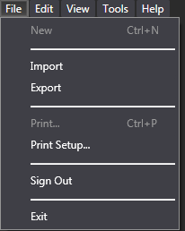
Let your Menu still use your MainMenu style, but have each sub MenuItem use the style Blend generated. For example, try
<MenuItem Header="_File" Style="{DynamicResource MenuItemStyle1}">
It will look like this:
Not sure how close this is to what you're looking for but should hopefully put you on the right track.
