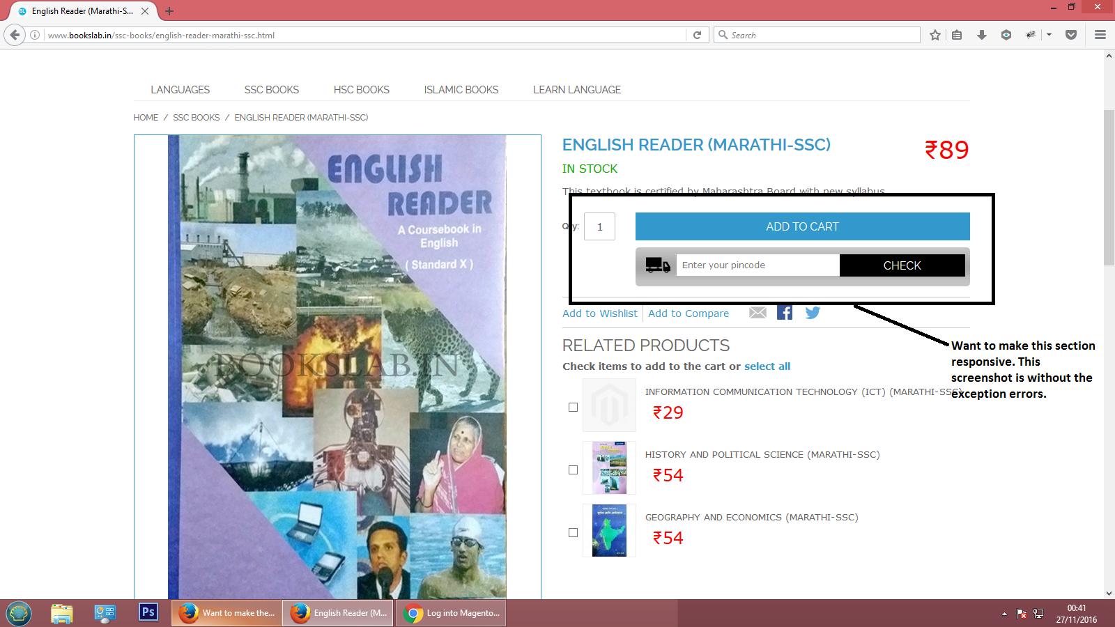
Want to make the zipcode section responsive in every dimension of screen
 https://magento.stackexchange.com/questions/147660
-
04-10-2020 - |
 italiano
 english
 français
 española
 中国
中国 日本の
日本の العربية
 Deutsch
 한국어
한국어 Português
 Russian
سؤال
My website name is bookslab.in. It is an ecommerce magento website. My website is responsive except my zipcode section. I want to make that zipcode section responsive in each & every screen of computer like my other pages & sections of my website. I am having the exception for this zipcode section. Any stacky can go to my website & check it out for better understanding. I am facing the problem in mobile & tablet screens. So any help will be appreciated. I had also attached the screenshot. I had also provided the css file & code of this zipcode section.
cod.phtml
<?php
/**************************************
 */

$msgData = Mage::helper('netgo_cod')->getConfigData();
if($msgData['zip_status'] == 1){
?>
<div class="input-box">
    <div class="z-btn">
        <label>Zip Code : </label><input type="text" placeholder="Enter your pincode" value="" name="cod" class="product-custom-option required-entry" id="cod" size="29" style='color:black; font-size:12px'>
        <button type="button" onclick="checkCOD();" name="zip-check" title="Check" class="button" id="zip-check"><span><span>Check</span></span></button>
    </div>
    <div id="cod_msg"></div>
</div>

<script>
    function checkCOD(){
             var zipcode;
        var cod = $('cod').value;
        if(cod == ''){
            $('cod_msg').update('<span class="cod-error"><?php echo $msgData['emp_msg']; ?></span>');
            return
        }else{
            $('cod_msg').update('<img src="<?php echo Mage::getBaseUrl( Mage_Core_Model_Store::URL_TYPE_WEB, true ).'media/cod/img/ajax-loader-2.gif';?>">');
            new Ajax.Request('<?php echo Mage::getBaseUrl().'netgo/cod/check';?>', {
                method:'post',
                parameters: {zipcode: cod},
                onSuccess: function(transport) {
                    var response = transport.responseText || "no response text";
                    $('cod_msg').update(response);

                    if(response.search('Delivery of the book is not available on the above pincode')!=-1)
                                        {
                                          zipcode='checked';
                                          jQuery('.btn-cart').attr('disabled', 'disabled');
                                        }
                                      else
                                      {
                                      jQuery('.btn-cart').removeAttr('disabled');

                                      }

                },
                onFailure: function() { alert('Something went wrong...'); }
            });
        }
    }
</script>
<?php } ?>
css file:
/***************************************
 */


div.product-view .add-to-cart{
    padding-bottom:15px;
}
div.product-view .add-to-cart-buttons {
    float: right;
    margin-right: 0px;
    max-width: 100%;
    width: 82%;
}
.z-btn label {
    background: rgba(0, 0, 0, 0) url("img/van-icon.png") no-repeat scroll right 2px top 3px / 96% auto;
    float: left;
    font-size: 13px;
    height: auto;
    line-height: 28px;
    text-indent: -9999px;
    width: 37px;
}
.z-btn input.product-custom-option {
    border: 0 none;
    float: left;
    height: auto;
    line-height: 31px;
    margin-left: 7px;
    width: auto;
}


.z-btn {
    background: #ff0000 url("img/pr-opt-bg.jpg") repeat scroll 0 0;
    border-radius: 5px;
    color: #fff;
    float: left;
    margin-bottom: 0px;
    padding: 10px 15px 15px;
    width: 100%;
}
.z-btn button {
    background: #000 none repeat scroll 0 0;
    float: right !important;
    font-size: 13px;
    padding: 6px 20px;
    /*margin-top: -31px;*/
    position: absolute;
}

.input-box > div#cod_msg {
    display: inline-block;
    float: left;
    font-size: 22px;
    text-align: center;
    width: 100%;
}
.cod-suc,.cod-error{
    -moz-border-bottom-colors: none;
    -moz-border-left-colors: none;
    -moz-border-right-colors: none;
    -moz-border-top-colors: none;
    background: #fff none repeat scroll 0 0;
    border-color: -moz-use-text-color #ccc #ccc;
    border-image: none;
    border-style: none solid solid;
    border-width: 0 1px 1px;
    float: left;
    margin-bottom: 10px;
    padding: 2px 11px 3px;
    position: relative;
    text-align: center;
    top: -3px;
    width: 100%;
    }
#cod_msg img{display:inline-block;float:none;text-align:center;width:3%;}
.cod-error {
    color: #ff0000;
}
.cod-suc{
    color: #009036;
}

div.product-view .add-to-cart-buttons button#zip-check.button {
    line-height: 32px;
    min-height: auto;
    width: auto;
}
المحلول
Try this,
add this code in your css file and check this view how it shows
@media only screen and (min-width : 300px) and (max-width : 767px) {

.z-btn button {
  background: #000 none repeat scroll 0 0;
  position: unset;
}

.z-btn input.product-custom-option {
  border: 0 none;
  float: right !important;
  height: auto;
  line-height: 31px;
  margin-left: 7px;
  width: 80%;
}

}
لا تنتمي إلى magento.stackexchange
