How to style the divider between Ice Cream Sandwich tabs?
 https://stackoverflow.com/questions/9173927
-
26-04-2021 - |
 italiano
 english
 français
 española
 中国
中国 日本の
日本の العربية
 Deutsch
 한국어
한국어 Português
 Russian
سؤال
I'm using the following style together with a set of nine patch images to create a red line at the bottom of some Ice Cream Sandwich tabs instead of the standard blue line:
<style name="customTabStyle" parent="@android:style/Widget.Holo.ActionBar.TabBar">
    <item name="android:tabStripLeft">@null</item>
    <item name="android:tabStripRight">@null</item>
    <item name="android:tabStripEnabled">false</item>
    <item name="android:showDividers">none</item>
    <item name="android:measureWithLargestChild">true</item>
    <item name="android:background">@drawable/tab_line</item>
    <item name="android:gravity">center</item>
</style>

<style name="customTabBar" parent="@android:style/Widget.Holo">
    <item name="android:showDividers">middle</item>
    <item name="android:divider">@drawable/divider2</item>
    <item name="android:dividerPadding">0dp</item>
</style>

<style name="LightThemeSelector" parent="android:Theme.Holo.Light">
    <item name="android:actionBarTabStyle">@style/customTabStyle</item>
    <item name="android:actionBarTabBarStyle">@style/customTabBar</item>
</style>
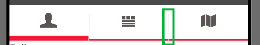
The red line is shown and everyting looks good, except for the divider between the tabs. As you can see inside the green box in the image the line is not drawn below the divider. How do I select a drawable, or a style for this divider?
The android:divider and android:showDividers items are not responsible for the divider between tabs. They only select the divider drawn between the tab icon and the tab title. I hide those dividers because there isn't a title and a divider would look strange.
Update With the answer from Aneal in mind I added a second style customTabBar. The style selects a drawable as a divider. The divider is a solid black line created with the following 9patch drawable:

With this drawable the divider is drawn, but there is also a blank line next to it:

المحلول
After removing every style I use I got the following image:

This image also contains the small gaps. Therefore it seems that this is some kind of default behavior.
However I found a way to work around the problem. I set the redline as a standard Background for the whole tabbar. This way the gap appears but nobody can see it because the background, that already contains the line is shown.
I now use the following style for all my activities:
<style name="LightThemeSelector" parent="android:Theme.Holo.Light">
    <item name="android:actionBarTabBarStyle">@style/customTabBar</item>
    <item name="android:actionBarTabStyle">@style/customTabStyle</item>
</style>
This style is used to style each single tab inside the tabbar:
<style name="customTabStyle" parent="@android:style/Widget.Holo.ActionBar.TabView">
    <item name="android:showDividers">none</item>
    <item name="android:measureWithLargestChild">true</item>
    <item name="android:background">@drawable/tab_line</item>
    <item name="android:gravity">center</item>
</style>
To style the whole Tabbar i use the following style:
<style name="customTabBar" parent="@android:style/Widget.Holo.ActionBar.TabBar">
    <item name="android:showDividers">middle</item>
    <item name="android:divider">@drawable/divider</item>
    <item name="android:dividerPadding">0dp</item>
    <item name="android:background">@drawable/tab_unselected</item>
</style>
This style defines my custom divider and also defines the background for the tabbar. As background I directly set the nine patch drawable that is drawn if a tab is not selected. The result of all this is a tabbar with a red underline without any gaps.

نصائح أخرى
Here you go.
<style name="YourTheme" parent="@android:style/Theme.Holo.Light">
    <item name="android:actionBarTabBarStyle">@style/Divider</item>
</style>

<style name="Divider" parent="@android:style/Widget.Holo.ActionBar.TabBar">
    <item name="android:divider">@drawable/your_divider_drawable_here</item>
    <item name="android:showDividers">middle</item>
    <item name="android:dividerPadding">12dip</item>
</style>
<style name="AppTheme" parent="AppBaseTheme">
    <item>......
    </item>
    <item name="android:actionBarDivider">@null</item>

</style>
here @null is for not to provide any divider and if you want to customize your divider than use @drawable/your_divider_image
If you'd like to get rid of dividers you could do just this:
<style name="customTabBar" parent="@android:style/Widget.Holo.ActionBar.TabBar">
    <item name="android:divider">@null</item>
</style>
Btw. This is caused by huge bug in the ICS in LinerLayout class implementation of android:divider attribute. It was introduced in Honeycomb, broken in ICS and working again in Jelly Bean.
Problem is that when you use android:divider it make small space between it child for place divider, but place divider no into this space, but after it, so it will be overlap by the tab itself and space will stay empty. Very stupid bug. Try to compare LinerLayout source code for release 4.0 and 4.1.
And yes solution is put the delimiter to the background of all tabs and it will be visible only in the gaps between tabs caused by this bug.
Based on ATom's answer, here's a way to have something resembling dividers in all android versions.
In order to make this work, you don't use any of the native divider methods (because they are broken in some versions). Don't forget removing any code where you set dividers.
The trick is simply setting a very small right margin in the views used for each tab. This way, there will be a small gap where you can see the background (the TabHost). To finish this, you set the background on the TabHost to mimic stretched divider.
Although this trick doesn't work for all possible designs you might want, it works well for many cases like the one I had.
Here's a sample implementation:
@Override
public View onCreateView(LayoutInflater inflater, ViewGroup container, Bundle savedInstanceState) {

    // ...
    //      inflate or create tabHost  in code
    //      call tabHost.setup
    // ...

    TabWidget tabWidget = tabHost.getTabWidget();
    tabWidget.setBackgroundResource(R.drawable.tab_divider);

    // ...  add tabs

    for( int i = 0; tabWidget.getChildCount()-1; i++) {
        View view = tabWidget.getChildAt(i);
        LinearLayout.LayoutParams layoutParams = (LinearLayout.LayoutParams) view.getLayoutParams();
        layoutParams.rightMargin = getResources().getDimensionPixelSize(R.dimen.tab_divider_width); //1dp
        view.setLayoutParams(layoutParams);
    }
    return tabHost;
}
Here's a sample tab_divider drawable:
<?xml version="1.0" encoding="utf-8"?>
<shape
    xmlns:android="http://schemas.android.com/apk/res/android"
    android:shape="rectangle">
        <solid android:color="@color/divider_color" />
        <stroke android:width="@dimen/tab_divider_vertical_padding"
                android:color="@color/tab_background_color"/>
</shape>
