 https://stackoverflow.com/questions/21516558
 italiano
 english
 français
 española
 中国
中国 日本の
日本の العربية
 Deutsch
 한국어
한국어 Português
 Russian
I had hardly seen any site using flex for responsiveness.
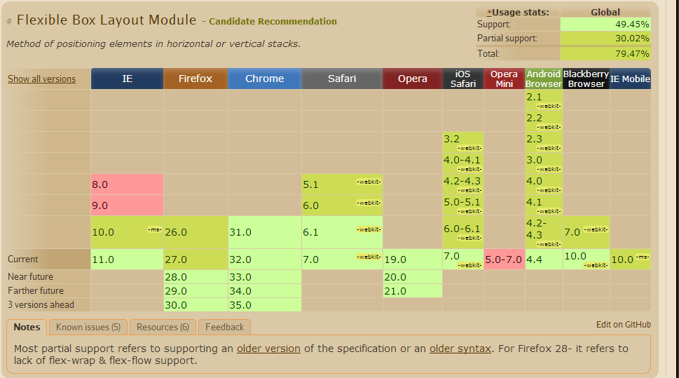
Source from CanIUse
CSS Flexible Boxes Layout specification is at the Candidate Recommendation stage, not all browsers have implemented it. WebKit implementation must be prefixed with -webkit; Internet Explorer implements an old version of the spec, prefixed; Opera 12.10 implements the latest version of the spec, unprefixed. See the compatibility table on each property for an up-to-date compatibility status.
Flex Box
The new flexbox layout mode is poised to redefine how we do layouts in CSS. Unfortunately the specification has changed a lot recently, so it's implemented differently in different browsers. There are a lot of out-of-date flexbox resources around.
Flexbox Has Many Exciting Features, As It
- can be laid out in any flow direction (leftwards, rightwards, downwards, or even upwards!)
- can have display order reversed or rearranged at the style layer (i.e., visual order can be independent of source and speech order)
- can be laid out linearly along a single (main) axis or wrapped into multiple lines along a secondary (cross) axis
- can “flex” their sizes to respond to the available space
- can be aligned with respect to their container or each other
- can be dynamically collapsed or uncollapsed along the main axis while preserving the container’s cross size.
The Problem With The Old Box Model
Consider the following code for use with a three column layout.
.col {
    width: 33.33%;
    padding: 0 5%;
}
That won’t actually give you columns that are 33.33% wide, it will create columns that are 43.33% wide. This will break the 3 column layout because the combined width of the columns exceed 100%. In other words, the padding is added to the already existing width. So it’s padding + width.
If you need to create a 3 column layout you typically use float (or inline-block), and then figure out the necessary widths, paddings and margins so they fit inside the parent container. It’s an unecessary amount of work that it’d be nice to avoid, even if it has become second nature by now.
I found a good tutorial for the current status of the implementation of Flexbox here.
Known Issues from CanIUse
- Firefox does not support specifying widths in percentages. See bug.
- IE10 and IE11 default values for
flexare0 0 auto(see here) rather than0 1 auto, as per the draft spec, as of September 2013. - Firefox does not support flex-wrap, align-content properties. See bug
- In IE10 and IE11, containers with
display: flexandflex-direction: columnwill not properly calculate their flexed childrens' sizes if the container hasmin-heightbut no explicitheightproperty. See bug. - In Chrome and Safari, the height of (non flex) children are not recognized in percentages. However Firefox and IE recognize and scale the children based on percentage heights.

