 https://stackoverflow.com/questions/21999813
 italiano
 english
 français
 española
 中国
中国 日本の
日本の العربية
 Deutsch
 한국어
한국어 Português
 Russian
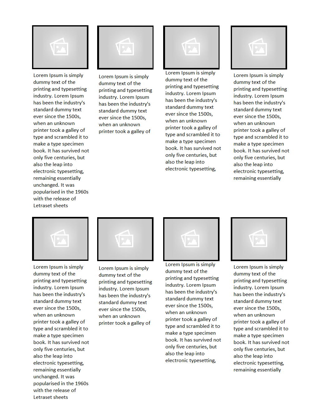
Here is the Responsive Layout example, This layout will fit it as per screen resolution.
Only have to Keep in mind when making Responsive layout every value should be in % and using @media queries the layout can fit from mobile to tablet devices.
For example check this CSS code..
ul, p{margin:0; padding:0;}
#gallery li {float:left;list-style-type:none;
  padding:2px; min-width:22%;max-width:100%;width:22%}
#gallery li img{display:block;width:100%;height:100%;}
p{border:1px solid #000;width:100%;height:100%;}

@media only screen and (max-width: 480px), only screen and (max-device-width: 480px) {
 {
   ul#gallery{width:100%}
 }
 ul, p{margin:0; padding:0;}
  #gallery li{width:100%;display:block;float:left;}
}
Check the Demo here. http://jsbin.com/divuvehe/1/edit
