I would like to create a paradoxical effect via the z-index CSS property.

In my code I have five circles, like in the image below, and they are all absolutely positioned with no defined z-index. Therefore, by default, every circle overlaps the previous one.

Right now, circle 5 overlaps circle 1 (left image). The paradox I'd like to achieve is to have, at the same time, circle 1 under the circle 2 and on top of circle 5 (as in the right image).


(source: schramek.cz)

Here's my code

Markup:

<div class="item i1">1</div>
<div class="item i2">2</div>
<div class="item i3">3</div>
<div class="item i4">4</div> 
<div class="item i5">5</div>

CSS

.item {
    width: 50px;
    height: 50px;
    line-height: 50px;
    border: 1px solid red;
    background: silver;
    border-radius: 50%;
    text-align: center;
}

.i1 { position: absolute; top: 30px; left: 0px; }
.i2 { position: absolute; top: 0px; left: 35px; }
.i3 { position: absolute; top: 30px; left: 65px; }
.i4 { position: absolute; top: 70px; left: 50px; }
.i5 { position: absolute; top: 70px; left: 15px; }

A live example is also available at http://jsfiddle.net/Kx2k5/.

I tried a lot of techniques with stacking orders, stacking context and so on. I read some articles about these techniques, but no success. How can I solve this?

有帮助吗?

解决方案

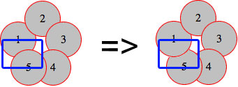
Here's my attempt: http://jsfiddle.net/Kx2k5/1/
(successfully tested on Fx27, Ch33, IE9, Sf5.1.10 and Op19)


CSS

.item {
   /* include borders on width and height */  
   -webkit-box-sizing : border-box;
   -moz-box-sizing    : border-box;
   box-sizing         : border-box;
   ...
}

.i1:after {
   content: "";

   /* overlap a circle over circle #1 */
   position : absolute;
   z-index  : 1;
   top      : 0;
   left     : 0;
   height   : 100%;
   width    : 100%;

   /* inherit border, background and border-radius */
   background    : inherit;
   border-bottom : inherit;
   border-radius : inherit;

   /* only show the bottom area of the pseudoelement */
   clip          : rect(35px 50px 50px 0);
}

Basically I've overlapped an :after pseudoelement over the first circle (with some properties inherited), then I've clipped it with clip() property, so I only make its bottom section visible (where circle #1 overlaps the circle #5).

For the CSS properties I've used here, this example should be working even on IE8 (box-sizing, clip(), inherit, and pseudoelements are supported there)


Screenshot of resulting effect

enter image description here

其他提示

My attempt also using clip. The idea was to have half and half for the div. That way setting z-index would work.

So you can set the top part to z-index: -1 and the bottom to z-index: 1.

Outcome:

enter image description here

.item {
  width: 50px;
  height: 50px;
  line-height: 50px;
  border: 1px solid red;
  background: silver;
  border-radius: 50%;
  text-align: center;
}
.under {
  z-index: -1;
}
.above {
  z-index: 1;
  overflow: hidden;
  clip: rect(30px 50px 60px 0);
}
.i1 {
  position: absolute;
  top: 30px;
  left: 0px;
}
.i2 {
  position: absolute;
  top: 0px;
  left: 35px;
}
.i3 {
  position: absolute;
  top: 30px;
  left: 65px;
}
.i4 {
  position: absolute;
  top: 70px;
  left: 50px;
}
.i5 {
  position: absolute;
  top: 70px;
  left: 15px;
}
<div class="item i1 under">1</div>
<div class="item i1 above">1</div>
<div class="item i2">2</div>
<div class="item i3">3</div>
<div class="item i4">4</div>
<div class="item i5">5</div>

DEMO HERE

Note: Tested on IE 10+, FF 26+,Chrome 33+ and Safari 5.1.7+.

Here's my go at it.

I also use a pseudo element positioned on top of the first circle, but rather than using clip, I keep its background transparent and just give it an inset box-shadow that matches the background color of the circles (silver) as well as a red border to cover the bottom right sides of the circle's border.

Demo

CSS (that is different from starting point)

.i1 { 
  position: absolute; top: 30px; left: 0px;
  &:before {
    content: '';
    position: absolute;
    z-index: 100;
    top: 0;
    left: 0;
    width: 50px;
    height: 50px;
    border-radius:  50%;
    box-shadow: inset 5px -5px 0 6px silver;
    border-bottom: solid 1px red;
  }
}

Final product enter image description here

Sadly the following is just a theoretical answer, as for some reason I can't get -webkit-transform-style: preserve-3d; to work (have to be making some obvious mistake, but can't seem to figure it out). Either way, after reading your question I - as with every paradox - wondered why it's only an apparent impossibility, rather than a real one. Another few seconds me realize that in real life the leaves are rotated a bit, thus allowing such a thing to exist. So then I wanted to concoct a simple demonstration of the technique, but without the previous property that's impossible (it gets drawn to the flat parent layer). Either way, here is the base code none the less

<div class="container">
    <div>
        <div class="i1 leaf">
            <div class="item">1</div>
        </div>
        <div class="i2 leaf">
            <div class="item">2</div>
        </div>
        <div class="i3 leaf">
            <div class="item">3</div>
        </div>
        <div class="i4 leaf">
            <div class="item">4</div>
        </div>
        <div class="i5 leaf">
            <div class="item">5</div>
        </div>
    </div>
</div>

And the css:

.i1 {
    -webkit-transform:rotateZ(288deg)
}
.i2 {
    -webkit-transform:rotateZ(0deg)
}
.i3 {
    -webkit-transform:rotateZ(72deg)
}
.i4 {
    -webkit-transform:rotateZ(144deg)
}
.i5 {
    -webkit-transform:rotateZ(216deg)
}
.leaf { 
    position:absolute;
    left:35px;
    top:35px;
}
.leaf > .item {
    -webkit-transform:rotateY(30deg) translateY(35px)
}

And you can find the full code here.

JS Fiddle

HTML

<div class="item i1">1</div>
<div class="item i2">2</div>
<div class="item i3">3</div>
<div class="item i4">4</div>
<div id="five">5</div>
<div class="item2 i5"></div>
<div class="item3 i6"></div>

CSS

.item {
    width: 50px;
    height: 50px;
    line-height: 50px;
    border: 1px solid red;
    background: silver;
    border-radius: 50%;
    text-align: center;
}
.item2 {
      width: 25px;
    height: 50px;
    line-height: 50px;
    border: 1px solid red;
    border-right: none;
    border-radius: 50px 0 0 50px;
    background: silver 50%;
    background-size: 25px;
    text-align: center;   
        z-index: -3;
}
.item3 {
    width: 25px;
    height: 50px;
    line-height: 50px;
    border: 1px solid red;
    border-left: none;
    border-radius: 0 50px 50px 0;
    background: silver 50%;
    background-size: 25px;
    text-align: center;    
}
.i1 {
    position: absolute;
    top: 30px;
    left: 0px;
}
.i2 {
    position: absolute;
    top: 0px;
    left: 35px;
}
.i3 {
    position: absolute;
    top: 30px;
    left: 65px;
}
.i4 {
    position: absolute;
    top: 70px;
    left: 55px;
}
.i5 {
    position: absolute;
    top: 70px;
    left: 15px;
}
.i5 {
    position: absolute;
    top: 72px;
    left:19px;

}
.i6 {
    position: absolute;
    top: 72px;
    left: 44px;
}
#five {
     position: absolute;
    top: 88px;
    left: 40px;
    z-index: 100;
}

JS Fiddle LIVE DEMO

Works on IE8 too.

HTML

<div class="half under"><div class="item i1">1</div></div>
<div class="half above"><div class="item i1">1</div></div>
<div class="item i2">2</div>
<div class="item i3">3</div>
<div class="item i4">4</div> 
<div class="item i5">5</div>

CSS

.item {
    width: 50px;
    height: 50px;
    line-height: 50px;
    border: 1px solid red;
    background: silver;
    border-radius: 50%;
    text-align: center;
}
.half {
    position: absolute;
    overflow: hidden;
    width: 52px;
    height: 26px;
    line-height: 52px;
    text-align: center;
}
.half.under {
    top: 30px; 
    left: 0px;
    z-index: -1;
    border-radius: 90px 90px 0 0;
}
.half.above {
    top: 55px;
    left: 0px;
    z-index: 1;
    border-radius: 0 0 90px 90px;
}
.half.above .i1 { margin-top:-50%; }
.i2 { position: absolute; top: 0px; left: 35px;}
.i3 { position: absolute; top: 30px; left: 65px;}
.i4 { position: absolute; top: 70px; left: 50px; }
.i5 { position: absolute; top: 70px; left: 15px; }
许可以下: CC-BY-SA归因
不隶属于 StackOverflow
scroll top