Flex: Justify-content: space-around but full size on both ends?
 https://stackoverflow.com//questions/25055964
 italiano
 english
 français
 española
 中国
中国 日本の
日本の العربية
 Deutsch
 한국어
한국어 Português
 Russian
题
Prompt
Suppose we want to distribute a row of inline-block elements inside a div of flexible width, we consider the spaces on the far end of the first and last elements to be significant and should be part of the spacing.
Mark-up
<div id="whole-thing">
<!-- inline-block element, width shrinks to widest row -->

    <div id="row1" class="row">
    <!-- block element (100% width) -->

        <div id="box1" class="box">
        <div id="box2" class="box">
        ..
    </div>
    <div id="row2" class="row">
        ..
    </div>
    ..
</div>
Picture
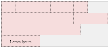
I.e. Turn something like this
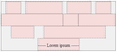
into this:
In this case, the width of the whole thing shrinks up to the 2nd row (widest) so there's no spacing between any of the boxes on that row.
But the content in each boxes may vary, and the spacing should adjust accordingly if necessary:
Attempts
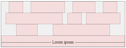
justify-content: space-between(or other styling/work-arounds to the same effect):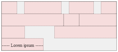
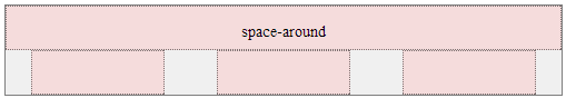
Is not what we want.justify-content: space-aroundshould be it apart from the fact that it distribute the spaceswith half-size spaces on either end, which, again, is not what we want, but almost..
Compare:
js hack. Well, it works, but I am still hanging on to the hope that there's a clean way to go about implementing this.
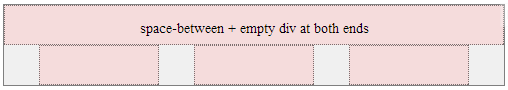
Adding an empty div at the beginning and the end of every row div and then use
space-between.
Also works, and it's how I got the above pictures of the solution. But then I would end up with a bunch of empty divs.
Should I use table layout for this (in css, not in mark-up)? If so, how?
This is making me weep. I would be thankful for any help towards a clean solution to this.
Here's a link to fiddle
Fiddle
Placing content:'' ::before and ::after the rows (these pseudo-elements are direct children of the selected) effectively implements the 4th point above (space-between + empty elements at both ends) without redundant mark-up.
解决方案
I agree this should be covered by flexbox itself. Currently we only have space-around but it's just incomplete. ATM the best solution for you is to wrap rows inside two pseudo elements. Basically it's your solution, but you won't need to touch the actual markup since it's generated content.
.row::before, .row::after
{
    content:'';display:block;
    width:0;height:0;
    overflow:hidden;
}
