Mobile Menu is not coming properly [closed]
 https://magento.stackexchange.com/questions/162104
-
06-10-2020 - |
 italiano
 english
 français
 española
 中国
中国 日本の
日本の العربية
 Deutsch
 한국어
한국어 Português
 Russian
题
I have developed one magento website.
In this, Menu is not coming properly in resonsive. If we click on the menu icon, that is coming simply at the top of homepage banner.
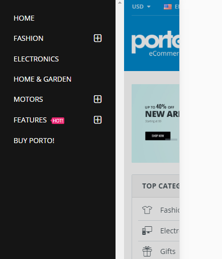
When i click on menu icon, i am getting menu like,

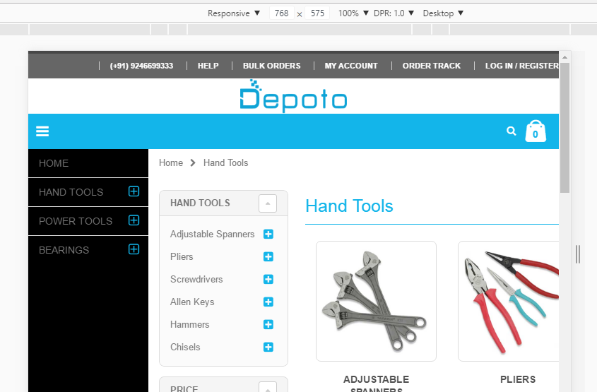
But, I want like,
解决方案
Mobile menu checking.
To check if your mobile menu is working it is best to use a browser with developer tools.
For example Google Chrome has a developer tool with mobile views.
Open your website in Google Chrome and activate Mobile view by going into the developer console by pressing F12.

Now click the mobile view. I encircled it in red then you will see:
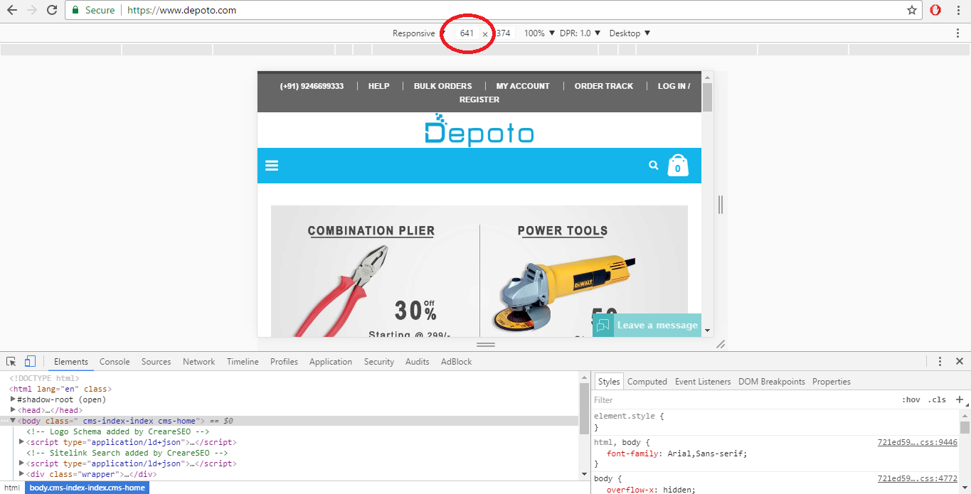
As you can see the site loads your mobile menu for the links above at 641 width.
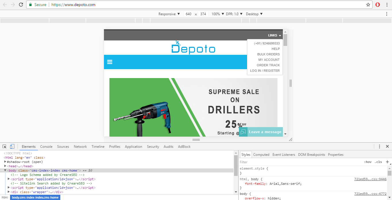
And I checked it at 640 below width and the mobile menu works.
So the solution would be to look for the code that makes it work only at 640 below and increase it to what you would like.
According to the poster of the question that is not what he meant when he asked the question. So here is a solution for the edited question which requires:
- The mobile menu will show as the left column of the page when clicked.
- The content will shift to the right of the mobile menu when clicked.
The thing to note is that when the mobile menu is shown a class is added to the body "mobile-nav-shown". We can use that to our advantage.
Create a CSS modification @media screen and (max-width: 991px) {} and add these:
@media screen and (max-width: 991px) {

.mobile-nav-shown .page{width: 150%; overflow: hidden;}
.mobile-nav-shown .mobile-nav.side-block.container
{
width: 170px;
float: left;
margin: 0 auto;
border: none;
height: 500px;
background-color: black;
max-width: 49%;}

.mobile-nav-shown .top-container{float: left; overflow: visible; width: 50%}
.mobile-nav-shown .main-container{float: left; overflow: visible; width: 50%}
.mobile-nav-shown .main.container{min-width: 840px}
.mobile-nav-shown .header-container{clear: both;}
.mobile-nav-shown .footer-container{clear: both;}
}
Edit the other things you want to change in the CSS.
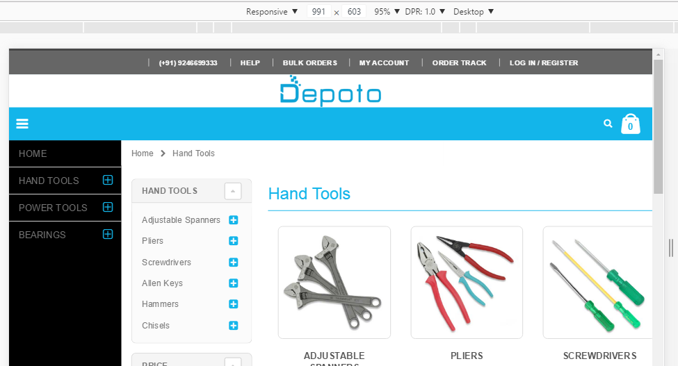
View at 991 width:
View at 768 width:
At the lower widths you might need to add CSS to work with the .main.container @media screen and (max-width: VALUE) {} .mobile-nav-shown .main.container { min-width: lower this to the max width VALUE of the page; }
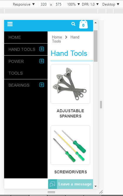
View at 320 width:
That's all I can help you with for now.
