有什么办法限制边框长度?
 https://stackoverflow.com/questions/4131490
 italiano
 english
 français
 española
 中国
中国 日本の
日本の العربية
 Deutsch
 한국어
한국어 Português
 Russian
题
有什么方法可以限制边界的长度。我有一个 <div> 它具有底部边框,但我想在左侧添加一个边界 <div> 这只会延伸一半。
没有任何方法可以在页面上添加额外元素的情况下进行操作?
解决方案
希望这可以帮助:
#mainDiv {
  height: 100px;
  width: 80px;
  position: relative;
  border-bottom: 2px solid #f51c40;
  background: #3beadc;
}

#borderLeft {
  border-left: 2px solid #f51c40;
  position: absolute;
  top: 50%;
  bottom: 0;
}
<div id="mainDiv">
<div id="borderLeft"></div>
</div>其他提示
CSS生成的内容可以为您解决此问题:
div {
  position: relative;
}
/* Main div for border to extend to 50% from bottom left corner */
div:after {
  content:"";
  background: black;
  position: absolute;
  bottom: 0;
  left: 0;
  height: 50%;
  width: 1px;
}
(注意 - content: ""; 为了使伪元素渲染是必要的)
这 :after 岩石:)
如果您有点玩耍,甚至可以将调整大小的边框元素设置为中心,或者仅在旁边还有另一个元素(例如菜单)时出现。这是一个带有菜单的示例:
#menu > ul > li {
    position: relative;
    float: left;
    padding: 0 10px;
}

#menu > ul > li + li:after {
    content:"";
    background: #ccc;
    position: absolute;
    bottom: 25%;
    left: 0;
    height: 50%;
    width: 1px;
}
#menu > ul > li {
  position: relative;
  float: left;
  padding: 0 10px;
  list-style: none;
}
#menu > ul > li + li:after {
  content: "";
  background: #ccc;
  position: absolute;
  bottom: 25%;
  left: 0;
  height: 50%;
  width: 1px;
}
<div id="menu">
<ul>
<li>Foo</li>
<li>Bar</li>
<li>Baz</li>
</ul>
</div>使用CSS性质,我们只能控制边界的厚度。不长。
但是我们可以模仿边界效应并控制其 width 和 height 就像我们想要的其他一些方式一样。
与CSS(线性梯度):
我们可以用 linear-gradient() 创建背景图像并用CSS控制其大小和位置,以使其看起来像边框。由于我们可以将多个背景图像应用于元素,因此我们可以使用此功能来创建多个边框,例如图像,并应用于元素的不同侧面。我们还可以使用一些纯色,梯度或背景图像覆盖其余可用区域。
必需的HTML:
我们只需要一个元素(可能有一些类)。
<div class="box"></div>
脚步:
- 用
linear-gradient(). - 采用
background-size调整width/height上面创建的图像,使其看起来像边框。 - 采用
background-position调整位置(例如left,right,left bottom上述创建边框的等等。
必要的CSS:
.box {
  background-image: linear-gradient(purple, purple),
                    // Above css will create background image that looks like a border.
                    linear-gradient(steelblue, steelblue);
                    // This will create background image for the container.

  background-repeat: no-repeat;

  /* First sizing pair (4px 50%) will define the size of the border i.e border
     will be of having 4px width and 50% height. */
  /* 2nd pair will define the size of stretched background image. */
  background-size: 4px 50%, calc(100% - 4px) 100%;

  /* Similar to size, first pair will define the position of the border
     and 2nd one for the container background */
  background-position: left bottom, 4px 0;
}
例子:
和 linear-gradient() 我们可以创建纯色和梯度的边界。以下是使用此方法创建的边界的一些示例。
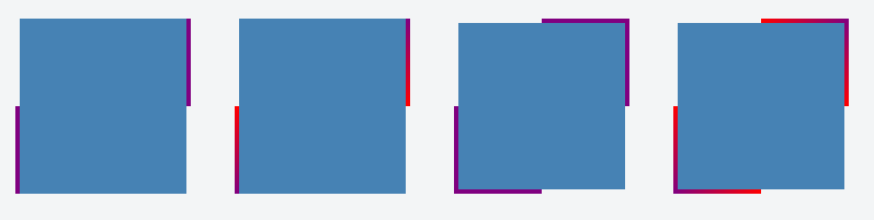
仅在一侧应用边框的例子:
.container {
  display: flex;
}
.box {
  background-image: linear-gradient(purple, purple),
                    linear-gradient(steelblue, steelblue);
  background-repeat: no-repeat;
  background-size: 4px 50%, calc(100% - 4px) 100%;
  background-position: left bottom, 4px 0;

  height: 160px;
  width: 160px;
  margin: 20px;
}
.gradient-border {
  background-image: linear-gradient(red, purple),
                    linear-gradient(steelblue, steelblue);
}
<div class="container">
<div class="box"></div>
<div class="box gradient-border"></div>
</div>在两个方面应用边框的例子:
.container {
  display: flex;
}
.box {
  background-image: linear-gradient(purple, purple),
                    linear-gradient(purple, purple),
                    linear-gradient(steelblue, steelblue);
  background-repeat: no-repeat;
  background-size: 4px 50%, 4px 50%, calc(100% - 8px) 100%;
  background-position: left bottom, right top, 4px 0;

  height: 160px;
  width: 160px;
  margin: 20px;
}

.gradient-border {
  background-image: linear-gradient(red, purple),
                    linear-gradient(purple, red),
                    linear-gradient(steelblue, steelblue);
}
<div class="container">
<div class="box"></div>
<div class="box gradient-border"></div>
</div>各方面都应用边框的例子:
.container {
  display: flex;
}
.box {
  background-image: linear-gradient(purple, purple),
                    linear-gradient(purple, purple),
                    linear-gradient(purple, purple),
                    linear-gradient(purple, purple),
                    linear-gradient(steelblue, steelblue);
  background-repeat: no-repeat;
  background-size: 4px 50%, 50% 4px, 4px 50%, 50% 4px, calc(100% - 8px) calc(100% - 8px);
  background-position: left bottom, left bottom, right top, right top, 4px 4px;

  height: 160px;
  width: 160px;
  margin: 20px;
}

.gradient-border {
  background-image: linear-gradient(red, purple),
                    linear-gradient(to right, purple, red),
                    linear-gradient(to bottom, purple, red),
                    linear-gradient(to left, purple, red),
                    linear-gradient(steelblue, steelblue);
}
<div class="container">
<div class="box"></div>
<div class="box gradient-border"></div>
</div>截屏:
对于水平线,您可以使用HR标签:
hr { width: 90%; }
但是不可能限制边界高度。唯一的元素高度。
边界仅定义每侧,而不在一侧的分数中。所以,不,你不能那样做。
另外,一个新元素也不是边界,它只会模仿您想要的行为 - 但这仍然是一个元素。
另一种方法是将边框图像与线性梯度结合使用。
div {
  width: 100px;
  height: 75px;
  background-color: green;
  background-clip: content-box; /* so that the background color is not below the border */

  border-left: 5px solid black;
  border-image: linear-gradient(to top, #000 50%, rgba(0,0,0,0) 50%); /* to top - at 50% transparent */
  border-image-slice: 1;
}<div></div>JSFIDDLE: https://jsfiddle.net/u7zq0amc/1/
浏览器支持:IE:11+
Chrome:全部
Firefox:15+
为了获得更好的支持,还要添加供应商前缀。
这是CSS的技巧,而不是正式解决方案。我将代码留下黑色,因为它可以帮助我定位元素。之后,为您的内容(颜色:白色)和(保证 - 顶:-5px左右)上色,以使其仿佛没有时期不存在。
div.yourdivname:after {
content: ".";
  border-bottom:1px solid grey;
  width:60%;
  display:block;
  margin:0 auto;
}
另一个解决方案是您可以使用背景图像模仿左边框的外观
- 创建您需要作为图形的边界左翼样式
- 将其放置在DIV的左侧(使其足够长的时间可以处理大约两个文本大小的较大浏览器)
- 将垂直位置从DIV的顶部设置为50%。
您可能需要对IE进行调整(按照往常),但是如果您要使用的设计,那值得一试。
- 我通常不反对将图像用于CSS固有提供的东西,但是有时,如果设计需要,则没有其他方式。
您只能定义每个边界。您将不得不为此添加一个额外的元素!
