How can I specify which TreeViewItem Style/Template for a TreeViewItem Generated from HierarchicalDataTemplate?
 https://stackoverflow.com/questions/4726318
-
12-10-2019 - |
 italiano
 english
 français
 española
 中国
中国 日本の
日本の العربية
 Deutsch
 한국어
한국어 Português
 Russian
Question
The Situation:
I have two classes that are represented in a TreeView. DiskSpec and DiskSet. DiskSpec can exist by itself, or it can be a child of DiskSet. I am working on enabling DragDrop functionality so that the user can drag a DiskSpec from the DiskSpec node onto a DiskSet to add it to that DiskSet. Now all is working except for one thing. My DragDropHelper class needs to specify in an ItemsPresenter (or related class) that that control is a drag source or a drop target.
My TreeView is set up like so: 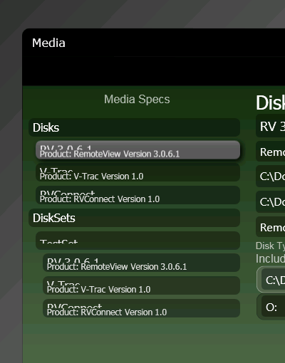 .
.
The Problem:
So I really need to have two TreeViewItem Styles. Once for DiskSets (which specifies that the ItemsPresenter that will present the DiskSpecs is a DropTarget) and one for everything else which specifies that it's ItemsPresenter is a DragSource.
Unfortunately I have not seen any way to set the TreeViewItem Style or Template from the HierarchicalDataTemplate object, and there does not appear to be a way to specify that this ItemTemplate is only for a particular DataType.
Any thoughts? Or am I missing something?
Find below some samples from my XAML.
Default TreeViewItem
See the ItemsPresenter section for an example of the DragDropHelper properties settings.
<Style TargetType="{x:Type TreeViewItem}">
    <Setter Property="IsExpanded" Value="{Binding IsExpanded, Mode=TwoWay}"/>
    <Setter Property="Background" Value="Transparent"/>
    <Setter Property="HorizontalContentAlignment" Value="{Binding HorizontalContentAlignment, RelativeSource={RelativeSource AncestorType={x:Type ItemsControl}}}"/>
    <Setter Property="VerticalContentAlignment" Value="{Binding VerticalContentAlignment, RelativeSource={RelativeSource AncestorType={x:Type ItemsControl}}}"/>
    <Setter Property="Padding" Value="1,0,0,0"/>
    <Setter Property="Foreground" Value="{DynamicResource {x:Static SystemColors.ControlTextBrushKey}}"/>
    <Setter Property="FocusVisualStyle" Value="{StaticResource TreeViewItemFocusVisual}"/>
    <Setter Property="Template">
        <Setter.Value>
            <ControlTemplate TargetType="{x:Type TreeViewItem}">
                <Grid Margin="0,4,0,0">
                    <Grid.ColumnDefinitions>
                        <ColumnDefinition Width="Auto" MinWidth="10"/>
                        <ColumnDefinition Width="*"/>
                    </Grid.ColumnDefinitions>
                    <Grid.RowDefinitions>
                        <RowDefinition Height="Auto" MinHeight="27.75"/>
                        <RowDefinition/>
                    </Grid.RowDefinitions>
                    <ToggleButton x:Name="Expander" ClickMode="Press" IsChecked="{Binding IsExpanded, RelativeSource={RelativeSource TemplatedParent}}" BorderBrush="#00376206" Foreground="#00000000" Style="{DynamicResource ToggleButtonStyle1}" Grid.Column="1">
                        <ToggleButton.Background>
                            <LinearGradientBrush EndPoint="0.5,1" StartPoint="0.5,0">
                                <GradientStop Color="White" Offset="0"/>
                                <GradientStop Color="#00F3EEDB" Offset="0.9"/>
                            </LinearGradientBrush>
                        </ToggleButton.Background>
                    </ToggleButton>
                    <Border x:Name="Bd" BorderBrush="{TemplateBinding BorderBrush}" BorderThickness="{TemplateBinding BorderThickness}" Grid.Column="0" Padding="{TemplateBinding Padding}" SnapsToDevicePixels="true" Grid.ColumnSpan="2" CornerRadius="7" Height="26" VerticalAlignment="Top" Margin="0,0,8,0" Background="#59000000">
                        <ContentPresenter x:Name="PART_Header" ContentSource="Header" HorizontalAlignment="{TemplateBinding HorizontalContentAlignment}" SnapsToDevicePixels="{TemplateBinding SnapsToDevicePixels}" Margin="5,3,0,3" VerticalAlignment="Center"/>
                    </Border>
                    <ItemsPresenter x:Name="ItemsHost" Grid.ColumnSpan="2" Grid.Column="1" Grid.Row="1" drag:DragDropHelper.IsDropTarget="False" />
                </Grid>
                <ControlTemplate.Triggers>
                    <Trigger Property="IsExpanded" Value="false">
                        <Setter Property="Visibility" TargetName="ItemsHost" Value="Collapsed"/>
                    </Trigger>
                    <Trigger Property="HasItems" Value="false">
                        <Setter Property="Visibility" TargetName="Expander" Value="Hidden"/>
                    </Trigger>
                    <Trigger Property="IsSelected" Value="true">
                        <Setter Property="BitmapEffect" TargetName="Bd">
                            <Setter.Value>
                                <DropShadowBitmapEffect />
                            </Setter.Value>
                        </Setter>
                        <Setter Property="Foreground" Value="{DynamicResource {x:Static SystemColors.HighlightTextBrushKey}}"/>
                        <Setter Property="Background" TargetName="Bd">
                            <Setter.Value>
                                <LinearGradientBrush EndPoint="0.5,1" StartPoint="0.5,0">
                                    <GradientStop Color="#FF5C5C5C" Offset="0.27"/>
                                    <GradientStop Color="#FF585858" Offset="1"/>
                                    <GradientStop Color="#FF747474" Offset="0"/>
                                </LinearGradientBrush>
                            </Setter.Value>
                        </Setter>
                    </Trigger>
                    <MultiTrigger>
                        <MultiTrigger.Conditions>
                            <Condition Property="IsSelected" Value="true"/>
                            <Condition Property="IsSelectionActive" Value="false"/>
                        </MultiTrigger.Conditions>
                        <Setter Property="Background" TargetName="Bd" Value="{DynamicResource {x:Static SystemColors.ControlBrushKey}}"/>
                        <Setter Property="Foreground" Value="{DynamicResource {x:Static SystemColors.ControlTextBrushKey}}"/>
                    </MultiTrigger>
                    <Trigger Property="IsEnabled" Value="false">
                        <Setter Property="Foreground" Value="{DynamicResource {x:Static SystemColors.GrayTextBrushKey}}"/>
                    </Trigger>
                </ControlTemplate.Triggers>
            </ControlTemplate>
        </Setter.Value>
    </Setter>
    <Style.Triggers>
        <Trigger Property="VirtualizingStackPanel.IsVirtualizing" Value="true">
            <Setter Property="ItemsPanel">
                <Setter.Value>
                    <ItemsPanelTemplate>
                        <VirtualizingStackPanel/>
                    </ItemsPanelTemplate>
                </Setter.Value>
            </Setter>
        </Trigger>
    </Style.Triggers>
</Style>
TreeView structure
<TreeView x:Name="treeView" Margin="4,40,4,4" Style="{DynamicResource SnazzyTreeView}" >
    <TreeView.Resources>

    </TreeView.Resources>
    <TreeViewItem ItemsSource="{Binding Disks}" IsExpanded="True" drag:DragDropHelper.IsDragSource="True" drag:DragDropHelper.IsDropTarget="False" drag:DragDropHelper.DragDropTemplate="{StaticResource draggedDisk}">
        <TreeViewItem.Header>
            <TextBlock Text="Disks" Foreground="White" FontSize="16"/>
        </TreeViewItem.Header>
    </TreeViewItem>
    <TreeViewItem ItemsSource="{Binding DiskSets}" IsExpanded="True">
        <TreeViewItem.Header>
            <TextBlock Text="DiskSets" Foreground="White" FontSize="16"/>
        </TreeViewItem.Header>
    </TreeViewItem>
</TreeView>
Bea Stolnitz's Blog Post: How can I drag and drop items between data bound ItemsControls?
Solution
Why do you need a style for a TreeViewItem? It can be done using DataTemplates only, and don't specify a key if you want them to apply automatically.
<Window.Resources>
    <DataTemplate DataType = "{x:Type local:DiskSpec}">
        <TextBlock Text="{Binding Title}" drag:DragDropHelper.IsDragSource="True"
                   drag:DragDropHelper.IsDropTarget="False"/>
    </DataTemplate>

    <HierarchicalDataTemplate DataType = "{x:Type local:DiskSet}"
                            ItemsSource = "{Binding Path=Disks}">
        <TextBlock Text="{Binding Title}"/>
    </HierarchicalDataTemplate>

</Window.Resources>
tree.ItemsSource = new object[]{
            new DiskSpec{Title = "Disc 1"},
            new DiskSpec{Title = "Disc 2"},
            new DiskSet{Title = "Set 1", Disks = new List<DiskSpec>{new DiskSpec{Title="Disc 1.1"}}},
            new DiskSet{Title = "Set 2", Disks = new List<DiskSpec>{new DiskSpec{Title="Disc 2.1"}, new DiskSpec{Title="Disc 2.2"}}}};
After that you can enable drag in the Disk template and drop in the Set template.
