 https://stackoverflow.com/questions/20632962
 italiano
 english
 français
 española
 中国
中国 日本の
日本の العربية
 Deutsch
 한국어
한국어 Português
 Russian
This is because of the z-index of your elements. Try changing the z-index of .pac-container. Example: .pac-container { z-index: 9999; }.
Bootstrap 3 - navbar issue when it's fixed
-
18-09-2022 - |
Question
With Bootstrap 3 navigation bar, I want to display Google place options on an input text field. Following is the screen shot for same:
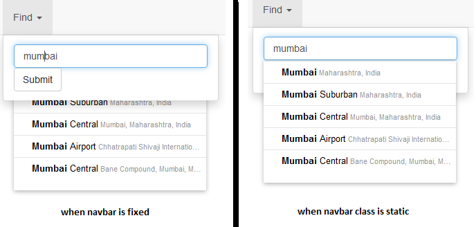
As can be seen from screen shots, when navbar is fixed, options are displayed at the back. And, when navbar is static, options are displayed as expected. I want the options to be displayed properly when navbar is fixed.
I tried to point the code on bootply but, it's not working. Working code at JSFiddle. Also, code is as under:
<!DOCTYPE html>
<html lang="en">
  <head>
    <meta charset="utf-8">
    <meta http-equiv="X-UA-Compatible" content="IE=edge">
    <meta name="viewport" content="width=device-width, initial-scale=1.0">

    <title>Navbar Template for Bootstrap</title>

    <!-- Bootstrap core CSS -->
    <link href="http://netdna.bootstrapcdn.com/bootstrap/3.0.3/css/bootstrap.min.css" rel="stylesheet">

    <script src="https://maps.googleapis.com/maps/api/js?libraries=places&sensor=false"></script>

  </head>

  <body style="min-height:      2000px;">

    <div class="container">

      <!-- Static navbar -->
      <div class="navbar navbar-default navbar-fixed-top" role="navigation">
        <div class="navbar-header">
          <button type="button" class="navbar-toggle" data-toggle="collapse" data-target=".navbar-collapse">
            <span class="sr-only">Toggle navigation</span>
            <span class="icon-bar"></span>
            <span class="icon-bar"></span>
            <span class="icon-bar"></span>
          </button>
          <a class="navbar-brand" href="#">Project name</a>
        </div>
        <div class="navbar-collapse collapse">
          <ul class="nav navbar-nav">
            <li class="active"><a href="#">Home</a></li>
            <li><a href="#">Contact</a></li>
            <li class="dropdown">
              <a href="#" class="dropdown-toggle" data-toggle="dropdown">Find <b class="caret"></b></a>
              <ul class="dropdown-menu">
                <li>
                    <form class="navbar-form navbar-left" role="search">
                      <div class="form-group">
                        <input type="text" name="search" style="width: 20em;" class="form-control" placeholder="Search">
                      </div>
                      <button type="submit" class="btn btn-default">Submit</button>
                    </form>
                </li>
              </ul>
            </li>
          </ul>

        </div><!--/.nav-collapse -->
      </div>


    </div> <!-- /container -->


    <!-- Bootstrap core JavaScript
    ================================================== -->
    <!-- Placed at the end of the document so the pages load faster -->
    <script src="http://code.jquery.com/jquery-1.10.2.min.js"></script>
    <script src="http://netdna.bootstrapcdn.com/bootstrap/3.0.3/js/bootstrap.min.js"></script>
  </body>
</html>

<script>

    window.onload = function() {

        var options = {
            types: ['geocode']
        };

        var inputField;
        inputField = document.getElementsByName( 'search' )[0];
        new google.maps.places.Autocomplete( inputField, options );

    };

</script>
Please help.
Thanks much in advance!
Solution
Licensed under: CC-BY-SA with attribution
Not affiliated with StackOverflow
