 https://stackoverflow.com/questions/21408574
 italiano
 english
 français
 española
 中国
中国 日本の
日本の العربية
 Deutsch
 한국어
한국어 Português
 Russian
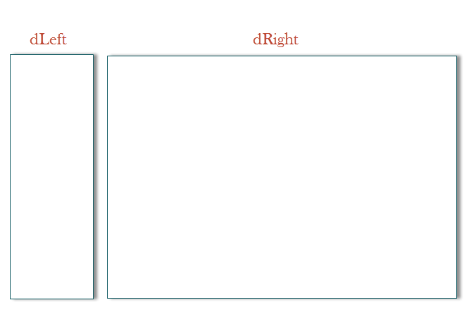
First of all when you are dealing with Grid Based layouts, always make sure you use
* {
   -moz-box-sizing: border-box;
   -webkit-box-sizing: border-box;
   box-sizing: border-box;

   /* Resets */
   margin: 0;
   padding: 0;
}
Note:
*is nothing but a universal selector which will apply the defined properties to every element. Inorder to target specific elements, use more specific selectors likediv.class_nameetc
Now, why you need that?
If you see in the diagram below..

CSS adds margin, padding and border outside the box and not inside, which is default content box behavior, so when you use the snippet I shared, it changes the box model behavior and makes the element count the border and padding inside the element.
Coming to your issue, the CSS you provided is perfect, but position, float, or margin or even uncleared floating elements anything can cause the issue which you are facing, so if you can, consider altering your CSS stylesheet, and would be worth if you use box-sizing: border-box;
How do you achieve this?
Well, obviously, I won't provide you entire thing, but just a general idea of how to achieve this, as I see you are using width: 79%;
Now here, I have two elements floated to the left, with the box model altered, so I don't have to use -1% width for any of the element. When you need spacing, nest more blocks inside the grid and then, instead of marginpadding especially on floated parent elements.
<div class="wrap">
    <div class="left_wrap"></div>
    <div class="right_wrap"></div>
</div>

* {
    -moz-box-sizing: border-box;
    -webkit-box-sizing: border-box;
    box-sizing: border-box;

    /* Resets */
    margin: 0;
    padding: 0;
}

.wrap:after {
    clear: both;
    display: table;
    content: "";
}

.wrap > div {
    min-height: 300px;
}

.wrap .left_wrap {
    width: 30%;
    float: left;
    border: 3px solid #f00;
}

.wrap .right_wrap {
    border: 3px solid #000;
    width: 70%;
    float: left;
}
