 https://stackoverflow.com/questions/21588959
 italiano
 english
 français
 española
 中国
中国 日本の
日本の العربية
 Deutsch
 한국어
한국어 Português
 Russian
One potential solution is to swap your content:after to content:before.
CSS:
/* .content:after {
content: "";
display: block;
} */
.content:before {
content: "";
display: block;
height: 45px;
}
Question
First of all, please read this whole question so you can fully understand what i am looking for, Thanks!
This is a question i have been trying to research for a great time now, and has stumped me for quit a while. Can i have a true sticky footer with a fixed header?
How can i implement a sticky footer with a fixed header? I can't add padding or a margin to the body or content, since that will break the footer. Also, i want to be able to use width:100% and height: 100% inside my content without it overflowing and creating a mess.
Here is what i am aiming for (Please excuse my great Photoshop skills) :
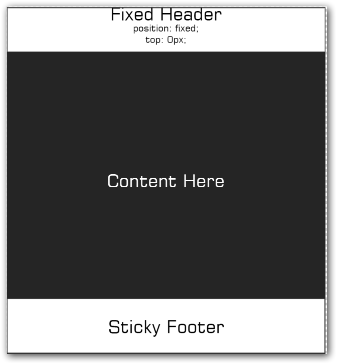
This look good, when i use position:fixed; and bottom:0; on my footer. But to make it truly sticky, i need to add some css to my page. (from : http://css-tricks.com/snippets/css/sticky-footer/)
* {
  margin: 0;
}
html, body {
  height: 100%;
}
.page-wrap {
  min-height: 100%;
  /* equal to footer height */
  margin-bottom: -142px;
}
.page-wrap:after {
  content: "";
  display: block;
}
.site-footer, .page-wrap:after {
  /* .push must be the same height as footer */
  height: 142px;
}
.site-footer {
  background: orange;
}
This allows me to have a GREAT looking sticky footer, but here is the problem. Some of the content is underneath my fixed navigation bar.
I can't add padding or a margin to the body, html, OR the content, because that will make the sticky footer mess up. Is there any way i can do this without CSS "Hacks"?
This is with the content under the header: http://jsfiddle.net/g2ydV/3/
Looks good right!, but some of the content is hidden under the header? Lets fix that by adding a margin to the content: http://jsfiddle.net/g2ydV/2/
The above example works, BUT the footer is messed up. How can i achieve this effect without messing up my sticky footer?
Solution
One potential solution is to swap your content:after to content:before.
CSS:
/* .content:after {
     content: "";
     display: block;
} */

.content:before {
 content: "";
 display: block;
 height: 45px;
}
OTHER TIPS
There's an alternative way of doing this using display: table; and display: table-cell which seems to be becoming increasingly popular.
I'm just offering it up as an alternative worth having a look at. It's quite clean and doesn't require any defined heights for the header and footer which is nice.
HTML
<div id="wrap">
  <div id="wrap-inner">

    <div class="navbar">
      <span>Fixed Header (content under here)</span>
    </div>

    <div class="content">
      <p>Content Here ... part of this is under the header, i need to see all of it without messing up the sticky footer</p>
    </div>

    <div class="footer">
      <span>Sticky footer!</span>
    </div>

  </div>
</div>
CSS
html, body {
  height: 100%;
}

body {
  margin: 0;
}

#wrap {
  display: table;
  width: 100%;
  height: 100%;
  min-height: 100%;
}

#wrap-inner {
  vertical-align: middle; /* optional for positioning content in the middle */
  display: table-cell;
}

.navbar, .footer {
  position: fixed;
  width: 100%;
}

.navbar {
  top: 0;
  width: 100%;
}

.footer {
  bottom: 0;
}
it's my decision for fixed header
html {
    position: relative;
    min-height: 100%;
}

#main-container {
    padding-top: 55px; /*  this is header height  */
}

footer {
    position: absolute;
    bottom: 0;
    width: 100%;
}
body {
  margin: 0;
  padding:0;
  line-height: normal;
  height: 100%;
  overflow: hidden;
}

.header {
  background:#3d5084;
  padding: 16px 0 16px 30px;
  display: flex;
  align-items: center;
  justify-content: center;
}

.main-middle-container {
  padding: 30px;
  display: flex;
  align-items: center;
  justify-content: flex-start;
  height: calc(100vh - 150px);
  flex-direction: column;
  overflow: hidden;
  overflow-y: auto;
  background: #f1f1f1;
}

 .footer {
   background: #3d5084;
   padding: 11px 25px;
   position: fixed;
   bottom: 0;
   left: 0;
   right: 0;
   position: relative;
   z-index: 1;
}
