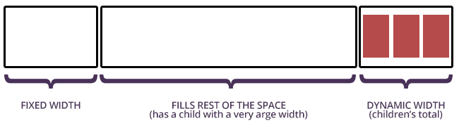
HTML
<table>
  <tr>
    <td></td>
    <td>
      <div>
        <div></div>
      </div>
    </td>
    <td>
      <b></b>
      <b></b>
      <b></b>
    </td>
  </tr>
</table>
CSS
table{ width:100%; }

/*
This is the trick. There is a wrapping DIV with a position:relative which
holds the actual content DIV which is positioned Absolute, so it's width won't
affect it's own cell width's
*/
td > div{ position:relative; width:100%; height:20px; }
div div{
  position:absolute;
  background:green; height:100%; width:800px;
}


/* First TD has FIXED width */
td:nth-child(1){ width:100px; background:#EEE; }

/* Middle TD width takes the rest of the space */
td:nth-child(2){ overflow:hidden;  }

/* Last TD has width depends on it's children's width */
td:nth-child(3){ white-space:nowrap; width:1%; }
 https://stackoverflow.com/questions/21815725
 italiano
 english
 français
 española
 中国
中国 日本の
日本の العربية
 Deutsch
 한국어
한국어 Português
 Russian