 https://stackoverflow.com/questions/22178493
 italiano
 english
 français
 española
 中国
中国 日本の
日本の العربية
 Deutsch
 한국어
한국어 Português
 Russian
Your border-radius was defined in px instead of %
#menu {
-moz-border-radius: 100%;
-webkit-border-radius: 100%;
}
Question
I'm trying to create a circular menu with radials using html and css, but the white borders are not built well. And it is not look fine in google chrome (not like a circle). I need get the last white radial, between item5 and item6. I have tried the next code:
HTML
<div id="menu">
    <div class="item1 item">
        <div class="content"><a href="#one">Solución Aula Digital</a></div>
    </div>
    <div class="item2 item">
        <div class="content"><a href="#two">Live Streaming</a></div>
    </div>
    <div class="item3 item">
        <div class="content"><a href="#three">Social Tecal Online</a></div>
    </div>
    <div class="item4 item">
        <div class="content"><a href="#four">FlexScorn</a></div>
    </div>
    <div class="item5 item">
        <div class="content"><a href="#five">Video On Demand</a></div>
    </div>
    <div id="wrapper6">
        <div class="item6 item">
            <div class="content"><a href="#six">Video Colaboración</a></div>
        </div>
    </div>
    <div id="center">
        <a href="#"></a>
    </div>
</div>
CSS
    #menu {
    background: #aaa;
    position: relative;
    width: 300px;
    height: 300px;
    margin: 0 auto;
    overflow: hidden;
    border-radius: 155px;
    -moz-border-radius: 90px;
    -webkit-border-radius: 90px;
  }
 #center {
    position: absolute;
    left: 60px;
    top: 60px;
    width: 180px;
    height: 180px;
    z-index: 10;
    background: #FFFFFF;
    border-radius: 100px;
    -moz-border-radius: 100px;
    -webkit-border-radius: 100px;
}
#center a {
    display: block;
    width: 100%;
    height: 100%
}
.item {
    background: #aaa;
    overflow: hidden;
    position: absolute;

    transform-origin: 100% 100%;
    -moz-transform-origin: 100% 100%;
    -webkit-transform-origin: 100% 100%;
    transition: background .5s;
    -moz-transition: background .5s;
    -webkit-transition: background .5s;
    -o-transition: background .5s;
    -ms-transition: background .5s;
    border: 3px solid #FFFFFF;
}
.item:hover {
    background: #eee
}
.item1 {
    z-index: 1;
    transform: rotate(60deg);
    -moz-transform: rotate(60deg);
    -webkit-transform: rotate(60deg);
    width: 134px;
    height: 134px;
}
.item2 {
    z-index: 2;
    transform: rotate(120deg);
    -moz-transform: rotate(120deg);
    -webkit-transform: rotate(120deg);
    width: 150px;
    height: 150px;
}
.item3 {
    z-index: 3;
    transform: rotate(180deg);
    -moz-transform: rotate(180deg);
    -webkit-transform: rotate(180deg);
            width: 150px;
    height: 150px;
}
.item4 {
    z-index: 4;
    transform: rotate(240deg);
    -moz-transform: rotate(240deg);
    -webkit-transform: rotate(240deg);
            width: 152px;
    height: 152px;
}
.item5 {
    z-index: 5;
    transform: rotate(300deg);
    -moz-transform: rotate(300deg);
    -webkit-transform: rotate(300deg);
            width: 151px;
    height: 151px;
}
.item6 {
    border: none;
    position: absolute;
    z-index: 6;
    transform: rotate(-30deg);
    -moz-transform: rotate(-30deg);
    -webkit-transform: rotate(-30deg);
    width: 140px;
    height: 140px;
}
#wrapper6 {
    position: absolute;
    width: 160px;
    height: 160px;
    /*overflow: hidden;*/
    transform-origin: 100% 100%;
    -moz-transform-origin: 100% 100%;
    -webkit-transform-origin: 100% 100%;
    /*border: 2px solid #FFFFFF;*/
}


.item1 .content {
    left: 0px;
    top: 17px;
    transform: rotate(-60deg);
    -moz-transform: rotate(-60deg);
    -webkit-transform: rotate(-60deg);
}
.item2 .content {
    left: -5px;
    top: 31px;
    transform: rotate(-59deg);
    -moz-transform: rotate(-59deg);
    -webkit-transform: rotate(-59deg);
}
.item3 .content {
    left: -40px;
    top: 8px;
    transform: rotate(-237deg);
    -moz-transform: rotate(-237deg);
    -webkit-transform: rotate(-237deg);
}
.item4 .content {
    left: -43px;
    top: 4px;
    transform: rotate(-240deg);
    -moz-transform: rotate(-240deg);
    -webkit-transform: rotate(-240deg);
}
.item5 .content {
    left: -52px;
    top: 7px;
    transform: rotate(-247deg);
    -moz-transform: rotate(-247deg);
    -webkit-transform: rotate(-247deg);
}
.item6 .content {
    left: 26px;
    top: -3px;
    transform: rotate(-29deg);
    -moz-transform: rotate(-29deg);
    -webkit-transform: rotate(-29deg);
}
.content, .content a {
    width: 100%;
    height: 100%;
    text-align: center
}
.content {
    position: absolute;
}
.content a {
    line-height: 100px;
    display: block;
    position: absolute;
    text-decoration: none;
    font-family: 'Segoe UI', Arial, Verdana, sans-serif;
    font-size: 12px;
    /*text-shadow: 1px 1px #eee;
    text-shadow: 0 0 5px #fff, 0 0 5px #fff, 0 0 5px #fff*/
}
.display-target {
    display: none;
    text-align: center;
    opacity: 0;
}
.display-target:target {
    display: block;
    opacity: 1;
    animation: fade-in 1s;
    -moz-animation: fade-in 1s;
    -webkit-animation: fade-in 1s;
    -o-animation: fade-in 1s;
    -ms-animation: fade-in 1s;
}
@keyframes fade-in {
    from { opacity: 0 }
    to { opacity: 1 }
}
@-moz-keyframes fade-in {
    from { opacity: 0 }
    to { opacity: 1 }
}
@-webkit-keyframes fade-in {
    from { opacity: 0 }
    to { opacity: 1 }
}
@-o-keyframes fade-in {
    from { opacity: 0 }
    to { opacity: 1 }
}
@-ms-keyframes fade-in {
    from { opacity: 0 }
    to { opacity: 1 }
}
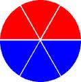
I need get the six borders like this image :
Help, please!
Solution
Your border-radius was defined in px instead of %
#menu {
    -moz-border-radius: 100%;
    -webkit-border-radius: 100%;
}
OTHER TIPS
This is the reason it's not being a circle in Chrome:
border-radius: 155px;
-moz-border-radius: 90px;
-webkit-border-radius: 90px;
You're defining a different border radius for Webkit and Mozilla than for everyone else. Use the same value in all three styles.
Also:
border-radius: 50%;
...will get you a circle no matter the size of the element.
