Easier way to create circle div than using an image?
 https://stackoverflow.com/questions/4840736
-
27-10-2019 - |
 italiano
 english
 français
 española
 中国
中国 日本の
日本の العربية
 Deutsch
 한국어
한국어 Português
 Russian
Question
I'm wondering if there's an easier way to create circular divs than what I'm doing now.
Currently, I am just making an image for each different size, but it's annoying to do this.
Is there anyway using CSS to make divs which are circular and I can specify the radius?
Solution
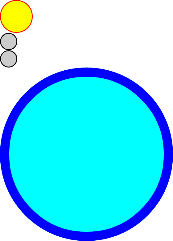
Here's a demo: http://jsfiddle.net/thirtydot/JJytE/1170/
CSS:
.circleBase {
    border-radius: 50%;
    behavior: url(PIE.htc); /* remove if you don't care about IE8 */
}

.type1 {
    width: 100px;
    height: 100px;
    background: yellow;
    border: 3px solid red;
}
.type2 {
    width: 50px;
    height: 50px;
    background: #ccc;
    border: 3px solid #000;
}
.type3 {
    width: 500px;
    height: 500px;
    background: aqua;
    border: 30px solid blue;
}
HTML:
<div class="circleBase type1"></div>

<div class="circleBase type2"></div><div class="circleBase type2"></div>

<div class="circleBase type3"></div>
To make this work in IE8 and older, you must download and use CSS3 PIE. My demo above won't work in IE8, but that's only because jsFiddle doesn't host PIE.htc.
My demo looks like this:
OTHER TIPS
Setting the border-radius of each side of an element to 50% will create the circle display at any size:
.circle {
  border-radius: 50%;
  width: 200px;
  height: 200px;
  /* width and height can be anything, as long as they're equal */
}
Try this
.iphonebadge {
  border-radius:99px;
 -moz-border-radius:99px;
 -webkit-border-radius:99px;
  background:red;
  color:#fff;
  border:3px #fff solid;
  background-color: #e7676d;
  background-image: -webkit-gradient(linear, left top, left bottom, from(#e7676d), to(#b7070a)); /* Saf4+, Chrome */
  background-image: -webkit-linear-gradient(top, #e7676d, #b7070a); /* Chrome 10+, Saf5.1+, iOS 5+ */
  background-image: -moz-linear-gradient(top, #e7676d, #b7070a); /* FF3.6 */
  background-image: -ms-linear-gradient(top, #e7676d, #b7070a); /* IE10 */
  background-image: -o-linear-gradient(top, #e7676d, #b7070a); /* Opera 11.10+ */
  background-image: linear-gradient(top, #e7676d, #b7070a);
  filter: progid:DXImageTransform.Microsoft.gradient(startColorStr='#e7676d', EndColorStr='#b7070a');
 -webkit-box-shadow: 0px 2px 4px #000000; /* Saf3-4 */
 -moz-box-shadow: 0px 2px 4px #000000; /* FF3.5 - 3.6 */
  box-shadow: 0px 2px 4px #000000; /* Opera 10.5, IE9, FF4+, Chrome 10+ */
  display:inline-block;
  padding:2px 2px 2px 2px ;
  margin:3px;
  font-family:arial;
  font-weight:bold;
   }
It is actually possible.
See: CSS Tip: How to Make Circles Without Images. See demo.
But be warned, It has serious disadvantages in terms of compatibility basically, you are making a cat bark.
See it working here
As you will see you just have to set up the height and width to half the border-radius
Good luck!
There's also [the bad idea of] using several (20+) horizontal or vertical 1px divs to construct a circle. This jQuery plugin uses this method to construct different shapes.
Give width and height depending on the size but,keep both equal
.circle {
  background-color: gray;
  height: 400px;
  width: 400px;
  border-radius: 100%;
}
<div class="circle">
</div>.fa-circle{
color: tomato;
}
div{
font-size: 100px;
}<link href="https://maxcdn.bootstrapcdn.com/font-awesome/4.7.0/css/font-awesome.min.css" rel="stylesheet"/>
<div><i class="fa fa-circle" aria-hidden="true"></i></div>Just wanted to mention another solution which answers the question of "Easier way to create circle div than using an image?" which is to use FontAwesome.
You import the fontawesome css file or from the CDN here
and then you just:
<div><i class="fa fa-circle" aria-hidden="true"></i></div>
and you can give it any color you want any font size.
You can use radius but it will not work on IE: border-radius: 5px 5px;.
You can try the radial-gradient CSS function:
.circle {
    width: 500px;
    height: 500px;
    border-radius: 50%;
    background: #ffffff; /* Old browsers */
    background: -moz-radial-gradient(center, ellipse cover, #ffffff 17%, #ff0a0a 19%, #ff2828 40%, #000000 41%); /* FF3.6-15 */
    background: -webkit-radial-gradient(center, ellipse cover, #ffffff 17%,#ff0a0a 19%,#ff2828 40%,#000000 41%); /* Chrome10-25,Safari5.1-6 */
    background: radial-gradient(ellipse at center, #ffffff 17%,#ff0a0a 19%,#ff2828 40%,#000000 41%); /* W3C, IE10+, FF16+, Chrome26+, Opera12+, Safari7+ */
}
Apply it to a div layer:
<div class="circle"></div>
Let's say you have this image:
to make a circle out of this you only need to add
.circle {
  border-radius: 50%;
  width: 100px;
  height: 100px;
}
So if you have a div you can do the same thing.
Check the example below:
.circle {
  border-radius: 50%;
  width: 100px;
  height: 100px;
  animation: stackoverflow-example infinite 20s linear;
  pointer-events: none;
}

@keyframes stackoverflow-example {
  from {
    transform: rotate(0deg);
  }
  to {
    transform: rotate(360deg);
  }
}
<div>
<img class="circle" src="https://www.sitepoint.com/wp-content/themes/sitepoint/assets/images/icon.javascript.png">
</div>basically this uses div's position absolute to place a character at the given coordinates. so using the parametric equation for a circle, you can draw a circle. if you were to change div's position to relative, it'll result in a sine wave...
in essence we are graphing equations by abusing the position property. i'm not versed well in css, so someone can surely make this more elegant. enjoy.
this works on all browsers and mobile devices (that i'm aware of). i use it on my own website to draw sine waves of text (www.cpixel.com). the original source of this code is found here: www.mathopenref.com/coordcirclealgorithm.html
    <html>
    <head></head>
    <body>
    <script language="Javascript">

    var x_center = 50; //0 in both x_center and y_center will place the center
    var y_center = 50; // at the top left of the browser
    var resolution_step = 360; //how many times to stop along the circle to plot your character.
    var radius = 50; //how big ya want your circle?
    var plot_character = "·"; //could use any character here, try letters/words for cool effects
    var div_top_offset=10;
    var div_left_offset=10;
    var x,y;

    for ( var angle_theta = 0;  angle_theta < 2 * Math.PI;  angle_theta += 2 * Math.PI/resolution_step ){
        x = x_center + radius * Math.cos(angle_theta);
        y = y_center - radius * Math.sin(angle_theta);
        document.write("<div style='position:absolute;top:" + (y+div_top_offset) + ";left:"+ (x+div_left_offset) + "'>" + plot_character + "</div>");
    }

    </script>
    </body>
    </html>
Adding the css property of:
border-radius: 50%;
to any div makes it circular.
For circle, create a div element and then enter width = 2 times of the border radius = 2 times padding. Also line-height = 0 For example, with 50px as radii of the circle, the below code works well:
width: 100px;
padding: 50px 0;
border: solid;
line-height: 0px;
border-radius: 50px;
