Question

Since about a year the multicolumn css3 property matured enjoying support from many browsers. Reason to finally implement it on your website for better design and readability. I thought let's push the envelope and adopt the ancient-but-ever-so-beautiful Drop Caps (=first large initial letter) into the multicolumn. However, certain screen widths break the multicolumn layout in FireFox. What am I doing wrong?

see jsfiddle DEMO

When resizing the window width, you can see the jumping/breaking of the layout in action in IE and Firefox. Below an example. Stuck on whats causing the defects in the multicolumn miss-alignments!?


enter image description here


Sorry for my beardy alter ego selfportrait: I forgot to shave, was staring all day at this problem with no time to tidy up. I promise you though a clean neat shaved portrait back here once this issue is solved!


enter image description here


Above more alignment problems in most screen widths on Internet Explorer 11. Curious Safari and Chrome show the layout faultlessly at all browser screen widths no breakage there.


#multicolumn {
         column-count: 3;
    -moz-column-count: 3;
 -webkit-column-count: 3;
         column-gap: 53px;
    -moz-column-gap: 53px;
 -webkit-column-gap: 53px;
         column-rule-color: #EEE;
    -moz-column-rule-color: #EEE;
 -webkit-column-rule-color: #EEE;
         column-rule-style: solid;
    -moz-column-rule-style: solid;
 -webkit-column-rule-style: solid;
     column-rule-width: 1px;
    -moz-column-rule-width: 1px;
 -webkit-column-rule-width: 1px;
}

#multicolumn p:first-letter{
    float:left;
    font-weight:normal;
    font-size:44px;
    margin: 7px 1px 0px 0px;
    line-height:27px;
    background-color:#AEE;
}
Was it helpful?

Solution

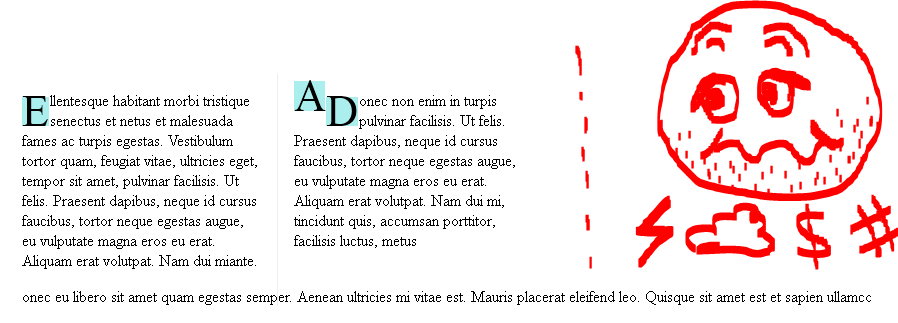
First of all I want to say that the use of the multi column layout module is still not recommendable.

Mainly because of the missing support for the break-before , break-after, break-inside properties, with the exception of IE 10+ and the proprietary -webkit-column-break-* properties (see: CSS3 Multiple column layout).
(You also may want to take a look at my answer to this SO question: IE (11) improper handling of CSS multi-columns?)

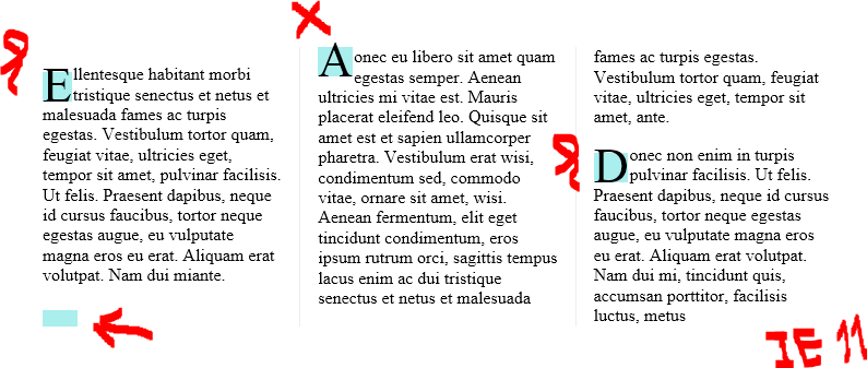
Additionally you have to remember, that there is a so called "multi-column pseudo-algorithm", which seems to be confused by your :first-letter selector.

You can avoid this problem by using a span element with a class attribute for the drop caps instead.

But as the first letters are larger in size than the rest of the text, there arises another problem.
It may happen that a (single) line of text of the beginning of a paragraph with a drop cap may fit to the previous column, whereas the drop cap (which is about twice as high as the normal text) may not.

To avoid this unwanted behaviour you have to use another span element, which includes at least more text than that may fit into a single line (of text)!
And giving these span elements a display: inline-block; solves this problem.

Just a word about Amir5000 answer: Though my proposed solution also needs some extra span elements, it does not use "purely presentational markup" which may also produce unwanted empty lines.

But as said at the beginning, using multi-column is at least very "tricky" and very difficult to get predicted results across browsers and/ or different viewport widths.

So here is my proposed "solution": DEMO

OTHER TIPS

The cause of the issue was the float:lefton the #multicolumn p:first-letterif you take that out you will see it no longer has that issue; However you don't have the same format you wanted with the first letter. So I created a JSFIDDLE where I added

#multicolumn p { float: left; }

and added a width for the #multicolumn container and centered it as you can see.

Hope that resolves the issue for you.

-------Update---------

So after much time trying to get it to flow as intended I was able to come up with a work around that is pretty simple, if you take a look now at the updated FIDDLE

I added an empty span in between paragraphs to clear the float and also added a media query so it looks nicer on smaller screens

This was the simplest way I could come up with to solve your issue hope that helps!!

I am not sure about the the column issue. You should make a fiddle for it so that we can help you faster. As far as the first cap issue. This is pretty tricky, what are your constraints? Can you hardcode it look right or do you have to do it dynamically?

I have posted a hardcoded solution here. It is basically just using

:before 

http://jsfiddle.net/emersive/bdAWQ/1/

I have Chenges below css

p { float:left;}
#multicolumn { line-height: 20px; } /*need for IE browser*/

Demos

Licensed under: CC-BY-SA with attribution
Not affiliated with StackOverflow
scroll top