Question

I'm looking for a solution (hopefully pure Bootstrap, without any custom CSS) for a grid problem.

I want to change from a mobile layout to a desktop layout as shown in the image.

example

The code I have currently looks like this

<div class="row">
    <div class="col-xs-4">
        Content A
    </div>
    <div class="col-xs-8">
        <div>Content B</div>
        <div>Content C</div>
    </div>
</div>

I don't know how I can move B to be at the top and have A/C next to each other. I've tried a variety of different push/pull and col-md-* ideas, but they end up either breaking the mobile layout or causing A/B to disappear.

Was it helpful?

Solution 2

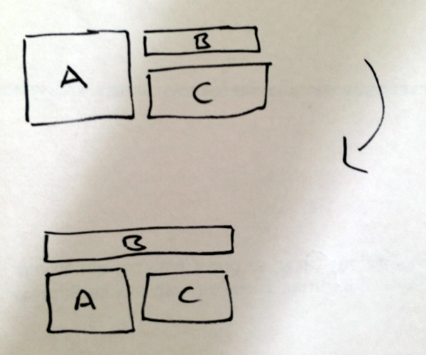
Found a way to do it.

<div class="row">
    <div class="col-xs-8 col-sm-12 col-xs-push-4 col-sm-push-0">
        Content B
    </div>
    <div class="col-sm-6 col-xs-4 col-xs-pull-8 col-sm-pull-0">
        Content A
    </div>
    <div class="col-sm-6 col-xs-8 col-xs-push-4 col-sm-push-0">
        Content C
    </div>
</div>

OTHER TIPS

Create two rows

  1. first row should have a div with class="col-xs-12" for A
  2. secund row should have two divs every div with class="col-xs-6" for B and C.

http://getbootstrap.com/css/#grid-example-mixed

Licensed under: CC-BY-SA with attribution
Not affiliated with StackOverflow
scroll top