Question

I have 3 divs in a container.

I want the left one (green) to be anchored (with some offset) to the left-bottom corner, the middle element (red) docked to the left element and centered vertically, and the right one (blue) to be docked to the right but centered vertically.

Here's a fiddle I'm working on.

I tried using right and margin-right etc. but it didn't work, here are some of my attempts.

This is the initial setup:

<div class="container">
    <div class="left">
    </div>
    <div class="middle">
    </div>
    <div class="right">
    </div>
</div>
.container {
    background: gray;    
    height: 300px;
    width: 100%;
}
.container > div {
    height: 100px;
    width: 100px;       
}
div.left {
    background: green;
    height: 250px;
}
div.middle {
    background: red;
}
div.right {
    background: blue;
}

Result: enter image description here

Was it helpful?

Solution

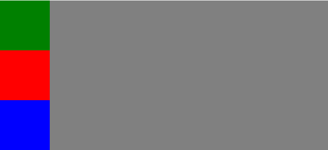
I've changed the fiddle based on your comments. Is this what you desire? Fiddle

*I've updated the fiddle

.container {
    position: relative;
    background: gray;    
    height: 300px;
    width: 100%;
}
.container > div {
    height: 100px;
    width: 100px;       
}
.left {
    position: absolute;
    left: 0;
    bottom: 0;
    height: 250px !important;
    background: green;
}
.middle {
    position: absolute;
    left: 100px;
    bottom: calc(50% - 50px);
    background: red;
}
.right {
    position: absolute;
    right: 0;
    bottom: calc(50% - 50px);
    background: blue;
}

Fiddle

OTHER TIPS

If you still want to retain the float layout (i.e. left and middle will not overlap each other), the solution is to wrap the inner content of each div with another <div> element, and position them absolutely with respect to their floated parents: http://jsfiddle.net/teddyrised/drrz6/2/

<div class="container">
    <div class="left"><div></div>
    </div>
    <div class="middle"><div></div>
    </div>
    <div class="right"><div></div>
    </div>
</div>

For your CSS:

.container {
    background: gray;    
    height: 300px;
    width: 100%;
}
.container > div {
    height: 300px;
    width: 100px;
    position: relative;
}
.container > div > div {
    width: 100px;
    height: 100px;
    position: absolute;
}
.left {
    float: left;
}
    .left > div {
        background: green;
        bottom: 0;
    }
.middle {
    float: left;
}
    .middle > div {
        background: red;
        top: 50%;
        margin-top: -50px; /* Half of height */
    }
.right {
    float: right;
}
    .right > div {
        background: blue;    
        bottom: 0;
    }

Simply use flex boxes:

Demo http://jsfiddle.net/fr9U5/

HTML:

<div class="box">
    <div class="left">left</div>
    <div class="middle">middle</div>
    <div class="right">right</div>
</div>

CSS:

.box {
    width: 270px;
    height:210px;
    display: -webkit-box;
    display: -moz-box;
    display: -ms-flexbox;
    display: -webkit-flex;
    display: flex;
    -webkit-box-direction: reverse;
    -moz-box-direction: reverse;
    -webkit-box-orient: vertical;
    -moz-box-orient: vertical;
    -webkit-flex-direction: column-reverse;
    -ms-flex-direction: column-reverse;
    flex-direction: column-reverse;
    -webkit-flex-wrap: nowrap;
    -ms-flex-wrap: nowrap;
    flex-wrap: nowrap;
    -webkit-box-pack: justify;
    -moz-box-pack: justify;
    -webkit-justify-content: space-between;
    -ms-flex-pack: justify;
    justify-content: space-between;
    -webkit-align-content: flex-start;
    -ms-flex-line-pack: start;
    align-content: flex-start;
    -webkit-box-align: center;
    -moz-box-align: center;
    -webkit-align-items: center;
    -ms-flex-align: center;
    align-items: center;
    background-color: gray;
}
.left {
    -webkit-box-ordinal-group: 1;
    -moz-box-ordinal-group: 1;
    -webkit-order: 0;
    -ms-flex-order: 0;
    order: 0;
    -webkit-box-flex: 0;
    -moz-box-flex: 0;
    -webkit-flex: 0 1 auto;
    -ms-flex: 0 1 auto;
    flex: 0 1 auto;
    -webkit-align-self: flex-start;
    -ms-flex-item-align: start;
    align-self: flex-start;
    background-color: green;
}
.middle {
    -webkit-box-ordinal-group: 1;
    -moz-box-ordinal-group: 1;
    -webkit-order: 0;
    -ms-flex-order: 0;
    order: 0;
    -webkit-box-flex: 0;
    -moz-box-flex: 0;
    -webkit-flex: 0 1 auto;
    -ms-flex: 0 1 auto;
    flex: 0 1 auto;
    -webkit-align-self: center;
    -ms-flex-item-align: center;
    align-self: center;
    background-color: red;
}
.right {
    -webkit-box-ordinal-group: 1;
    -moz-box-ordinal-group: 1;
    -webkit-order: 0;
    -ms-flex-order: 0;
    order: 0;
    -webkit-box-flex: 0;
    -moz-box-flex: 0;
    -webkit-flex: 0 1 auto;
    -ms-flex: 0 1 auto;
    flex: 0 1 auto;
    -webkit-align-self: flex-end;
    -ms-flex-item-align: end;
    align-self: flex-end;
    background-color: blue;
}
/*
    Legacy Firefox implementation treats all flex containers
    as inline-block elements.
*/
 @-moz-document url-prefix() {
    .flex-container {
        width: 100%;
        -moz-box-sizing: border-box;
    }
}
.box > div {
    border:1px solid #000;
    width: 33%;
    height:33%;
}

OK. I guess the position:absolute is what works best for me, although I'd prefer the middle (red) element to depend on the left (green) one.

Here is the solution, and thanks Terry for the tip on deducting half-size of self to center vertically.

.container {
    background: gray;    
    height: 300px;
    width: 100%;
    position: relative;
}
.container > div {    
    height: 100px;
    width: 100px;       
    position: absolute;
}
div.left {    
    background: green;
    left: 0;
    bottom: 0;    
    height: 250px;
}
div.middle {    
    background: red;
    left: 100px;
    bottom: 0;    
    top: 50%;
    margin-top: -50px; //deduct lalfsize of self

}
div.right {
    background: blue;
    right: 0;
    top: 50%;
    margin-top: -50px; //deduct lalfsize of self
}
Licensed under: CC-BY-SA with attribution
Not affiliated with StackOverflow
scroll top