Question

I'm trying to make a page where I have 3 divs next to each other. The left and right div both have limited content, the center div will in many cases have more content than fits on the page. My goal is to give the center div a vertical scrollbar when needed. Should the left or right div actually ever have too much content, then the complete page should be scrollable.

this is how I want it to look:

enter image description here

<div id="everything">
    <div id="centeredDiv">
        <div id="left">text</div>
        <div id="main">plenty of content</div>
        <div id="right">text</div>
    </div>
</div>

here is the css:

div {
    padding: 0px;
    margin: 0px;
    border: 0px;
    height: 100%;
}

div#everything {
  width: 100%;
  text-align: center;
  left: 0px;
  top: 0px;
}

div#centeredDiv {
  width: 200px;
  display: inline-block;
  position: relative;
}

div#left, div#right {
    width:100px;
    background-color: yellow;
    position: absolute;
    top: 0px;
}

div#left {
    left:-100px;
}

div#right {
    left:200px;
}

div#main {
    width:200px;
    background-color: orange;
    overflow-y : auto;
}

I tried to make a simplified jsfiddle example: enter link description here

clicking the button will increase content in the center div. When the page is full, I'd like to have scrollbars for the center div, but they don't show up. Can anyone help me accomplish that?

I also wouldn't mind the 3 divs actually taking up the entire space up to the bottom of the page even when they don't have much content. Is there a way to make height:100% greedy? Should I arrange my 3 divs differently?

Was it helpful?

Solution

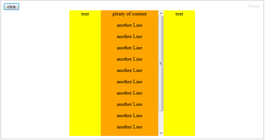
This will be pretty close to what you're looking for it sounds like: jsFiddle.

I actually only changed one thing: height: 100% to height:100vh.

div {
    padding: 0px;
    margin: 0px;
    border: 0px;
    height: 100vh;
}

vh is setting it to 100% of the viewport height. It's a new CSS3 unit. Using it just depends on what sort of compatibility you need with it. All major modern browsers support it. And it seems to have pretty good support for a few generations back: caniuse.com.

CSS-tricks.com has a good article about Viewport Height.

OTHER TIPS

You can set height:100% to the html and body and a min-height:100% to the div#main. That makes your example picture trick. See it here: http://jsfiddle.net/Zu7MS/1/

So,

html, body {
    height: 100%;
}

and

div#main {
    width:200px;
    background-color: orange;
    overflow-y : auto;
    min-height: 100%;
}

Set a max-height and overflow: scroll on the #main element

div#main {
    width:200px;
    background-color: orange;
    max-height: 300px;
    overflow-y: scroll;
}

Updated fiddle:

http://jsfiddle.net/km8Xk/5/

You're missing: overflow-y:scroll on the centeredDiv, and overflow:hidden on the right and left. I don't see that mentioned elsewhere, so if those divs can also have too much information, you'll want to set that style.

div#left, div#right {
  width:100px;
  background-color: yellow;
  position: absolute;
  top: 0px;
  overflow:hidden;
}
Licensed under: CC-BY-SA with attribution
Not affiliated with StackOverflow
scroll top