Here is another approach by using flexbox display. The flex-grow property specifies how the free space should be distributed among the elements when their total size is smaller than container size.
By default no width is specified on the elements that produce the lines and they have no content (meaning they are basically empty and take up no space). However, the flex-grow setting on these elements would make the leftover space (total space of the container - space of the text) get equally distributed among them. This makes it look as though the line runs from end to the other except for where the text is.
Solid line on either side of content:
In the below snippet, a top to bottom gradient is used to produce the effect of having a solid line on either side of the content.
h3{
  display: flex;
  flex: 1;
  width: 70%;
  margin: 20px auto;
  line-height: 1em;
}
.heading:before, .heading:after,
.heading-ie span.after, .heading-ie span.before{
  content: '';
  flex-grow: 1;
  margin: 0px 4px;
  background: linear-gradient(to right, white, white);
  background-size: 100% 2px;
  background-position: 0% 50%;
  background-repeat: repeat-x;
}

/* Just for demo*/
body{
  background-image: radial-gradient(circle, #3F9CBA 0%, #153346 100%);
}
<script src="https://cdnjs.cloudflare.com/ajax/libs/prefixfree/1.0.7/prefixfree.min.js"></script>
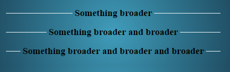
<h3 class='heading'>Something broader</h3>
<h3 class='heading'>Something broader and broader</h3>
<h3 class='heading'>Something broader<br/> and spans multiple <br/> no. of lines</h3>
<!-- IE11 specific version -->
<h3 class='heading-ie'>
<span class='before'></span> <!-- IE11 supports flex-grow only on actual elements -->
Something broader and broader and broader
<span class='after'></span> <!-- IE11 supports flex-grow only on actual elements -->
</h3>
Line with Gradient Effect on either side of content:
In the below snippet, a thin left to right gradient is used to produce the effect of a line which goes from a solid color near the content to transparent on the other side.
h3{
  display: flex;
  flex: 1;
  width: 70%;
  margin: 20px auto;
  line-height: 1em;
}
.heading:before, .heading:after,
.heading-ie span.after, .heading-ie span.before{
  content: '';
  flex-grow: 1;
  margin: 0px 4px;
  background-size: 100% 2px;
  background-position: 0% 50%;
  background-repeat: repeat-x;
}
.heading:before, .heading-ie span.before{
  background-image: linear-gradient(to right, transparent, white);
}
.heading:after, .heading-ie span.after{
  background-image: linear-gradient(to left, transparent, white);
}

/* Just for demo*/
body{
  background-image: radial-gradient(circle, #3F9CBA 0%, #153346 100%);
}
<script src="https://cdnjs.cloudflare.com/ajax/libs/prefixfree/1.0.7/prefixfree.min.js"></script>
<h3 class='heading'>Something broader</h3>
<h3 class='heading'>Something broader and broader</h3>
<h3 class='heading'>Something broader<br/> and spans multiple <br/> no. of lines</h3>

<!-- IE11 specific version -->

<h3 class='heading-ie'>
  <span class='before'></span> <!-- IE11 supports flex-grow only on actual elements -->
  Something broader and broader and broader
  <span class='after'></span> <!-- IE11 supports flex-grow only on actual elements -->
</h3>

Note: In the snippet I have used an extra span elements for the lines because IE11 doesn't seem to support flex-grow on pseudo-elements. Otherwise, the same can be achieved with a pseudo-element also.
Drawback of this approach is the browser support for this feature, which is pretty low at the moment. You may also have to adopt some browser specific customizations that are detailed in my answer here which is similar to this.
At present this doesn't give anything extra over web-tiki's answer but is just another possible option. This approach would be more helpful in cases like the below:
h3{
  display: flex;
  flex: 1;
  width: 70%;
  margin: 20px auto;
  line-height: 1em;
}
.heading-ie .start, .heading-ie .middle, .heading-ie .end{
  content: '';
  flex-grow: 1;
  margin: 0px 4px;
  background: linear-gradient(to right, white, white);
  background-position: 0% 50%;
  background-size: 100% 2px;
  background-repeat: repeat-x;
}

/* Order specifies the order in which the elements should be presen within container */

.content-1{
  order: 2;
}
.start{
  order: 1;
}
.middle{
  order: 3;
}
.content-2{
  order: 4;
}
.end{
  order: 5;
}

/* Just for demo*/

body {
  background-image: radial-gradient(circle, #3F9CBA 0%, #153346 100%);
}
<script src="https://cdnjs.cloudflare.com/ajax/libs/prefixfree/1.0.7/prefixfree.min.js"></script>

<h3 class='heading-ie'>
  <span class='start'></span> <!-- IE11 supports flex-grow only on actual elements -->
  <span class='content-1'>Text here</span>
  <span class='middle'></span> <!-- IE11 supports flex-grow only on actual elements -->
  <span class='content-2'>and here too</span>
  <span class='end'></span> <!-- IE11 supports flex-grow only on actual elements -->
</h3>

<h3 class='heading-ie'>
  <span class='start'></span> <!-- IE11 supports flex-grow only on actual elements -->
  <span class='content-1'>Text with <br/> line break</span>
  <span class='middle'></span> <!-- IE11 supports flex-grow only on actual elements -->
  <span class='content-2'>and here with <br/> line break too</span>
  <span class='end'></span> <!-- IE11 supports flex-grow only on actual elements -->
</h3>

 https://stackoverflow.com/questions/23584120
 italiano
 english
 français
 española
 中国
中国 日本の
日本の العربية
 Deutsch
 한국어
한국어 Português
 Russian