I'm trying to build a navbar in Bootstrap using the column system and I'm running into some problems that I'm not sure what I'm doing wrong.
I would like to end up with a navbar that looks like this:
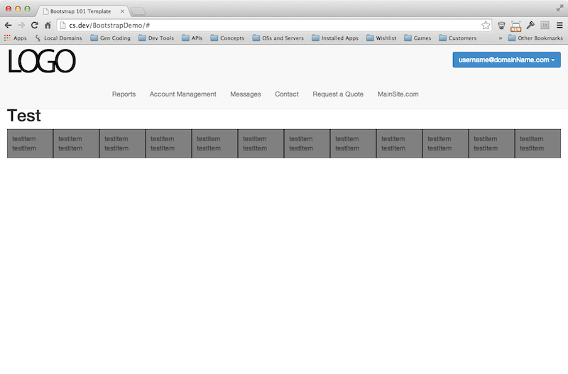
I'd like one row that has a left aligned column with the logo and a right aligned column with the user button and then a second row with center aligned buttons.
My thought was that I could create two divs with the class "col-lg-6 col-md-6", one for the logo and one for the User Button. These two would create the first 12 column row which would force the tags that follow onto a whole new row.
When I try that, though, I end up with everything running inline and out of order.

I know I can do it by adding my own custom css (which is how I was able to mock up the first screen shot), but my preference would be to stick to using the bootstrap column system so my ad-hoc css doesn't f something up down the line. I would also like to understand what I did wrong (this is my first project using bootstrap so I'm still trying to get over the learning curve).
Here's my code for this demo page:
The HTML
<!DOCTYPE html>
<html lang="en">
  <head>
    <meta charset="utf-8">
    <meta http-equiv="X-UA-Compatible" content="IE=edge">
    <meta name="viewport" content="width=device-width, initial-scale=1">
    <title>Bootstrap 101 Template</title>

    <!-- Bootstrap -->
    <link href="css/bootstrap.min.css" rel="stylesheet">
    <link href="css/additions.css" rel="stylesheet">
    <!-- HTML5 Shim and Respond.js IE8 support of HTML5 elements and media queries -->
    <!-- WARNING: Respond.js doesn't work if you view the page via file:// -->
    <!--[if lt IE 9]>
      <script src="https://oss.maxcdn.com/libs/html5shiv/3.7.0/html5shiv.js"></script>
      <script src="https://oss.maxcdn.com/libs/respond.js/1.4.2/respond.min.js"></script>
    <![endif]-->
  </head>
  <body>

    <div class="navbar navbar-default navbar-fixed-top">
        <div class="container-fluid">

            <div class="collapse navbar-collapse col-lg-6 col-md-6" >
                <ul class="nav navbar-nav  navbar-left">
                    <li><img src="images/genericLogo.png"><!-- <a href="#">MySite.com</a> --></li>
                </ul>
            </div>

            <div class="collapse navbar-collapse navbar-right col-lg-6 col-md-6">
                <div class="dropdown">
                    <button id="userMenu" class="btn dropdown-toggle btn-primary" type="button" data-toggle="dropdown">
                        <span>username@domainName.com </span><span class="caret userButton"></span>
                    </button>

                    <ul class="dropdown-menu" role="menu" aria-labelledby="userMenu">
                        <li role="presentation"><a href="#" tabindex="-1" role="menuitem">View Details</a></li>
                        <li role="presentation"><a href="#" tabindex="-1" role="menuitem">Edit</a></li>
                        <li role="presentation" class="divider"></li>
                        <li role="presentation"><a href="#" tabindex="-1" role="menuitem">Logout</a></li>
                    </ul>
                </div>
            </div>


            <div class="collapse navbar-collapse" id="mainNav">
                <ul id="navlist" class="nav navbar-nav">
                    <li><a href="#">Reports</a></li>
                    <li><a href="#">Account Management</a></li>
                    <li><a href="#">Messages</a></li>
                    <li><a href="#">Contact</a></li>
                    <li><a href="#">Request a Quote</a></li>
                    <li><a href="#">MainSite.com</a></li>
                </ul>
            </div>

            <div class="navbar-header">
                <button class="navbar-toggle" data-toggle="collapse" data-target="#mainNav">
                    <span class="icon-bar"></span>
                    <span class="icon-bar"></span>
                    <span class="icon-bar"></span>
                </button>
            </div>

        </div>
    </div>


    <div class="container-fluid">
      <h1>Test</h1>


      <div class="demorow col-lg-1 col-md-2 col-sm-6 col-xs-12">testitem <br />testItem</div>
      <div class="demorow col-lg-1 col-md-2 col-sm-6 col-xs-12">testitem <br />testItem</div>
      <div class="demorow col-lg-1 col-md-2 col-sm-6 col-xs-12">testitem <br />testItem</div>
      <div class="demorow col-lg-1 col-md-2 col-sm-6 col-xs-12">testitem <br />testItem</div>
      <div class="demorow col-lg-1 col-md-2 col-sm-6 col-xs-12">testitem <br />testItem</div>
      <div class="demorow col-lg-1 col-md-2 col-sm-6 col-xs-6">testitem <br />testItem</div>
      <div class="demorow col-lg-1 col-md-2 col-sm-6 col-xs-6">testitem <br />testItem</div>
      <div class="demorow col-lg-1 col-md-2 col-sm-6 col-xs-12">testitem <br />testItem</div>
      <div class="demorow col-lg-1 col-md-2 col-sm-6 col-xs-12">testitem <br />testItem</div>
      <div class="demorow col-lg-1 col-md-2 col-sm-6 col-xs-12">testitem <br />testItem</div>
      <div class="demorow col-lg-1 col-md-2 col-sm-6 col-xs-12">testitem <br />testItem</div>
      <div class="demorow col-lg-1 col-md-2 col-sm-6 col-xs-12">testitem <br />testItem</div>
    </div>
    <!-- jQuery (necessary for Bootstrap's JavaScript plugins) -->
    <script src="https://ajax.googleapis.com/ajax/libs/jquery/1.11.0/jquery.min.js"></script>
    <!-- Include all compiled plugins (below), or include individual files as needed -->
    <script src="js/bootstrap.min.js"></script>
  </body>
</html>
The additional css
.demorow{
    background-color:gray;
    padding:10px;
    border:1px solid black;
}

/* Centering Navbar items */
.navbar .navbar-nav {
  display: inline-block;
  float: none;
}
.navbar .navbar-collapse {
  text-align: center;
}

/*Adding padding to content for a fixed navbar*/
body {
    padding-top: 110px;
}

/*Adding padding to content for a fixed navbar when nav items are collapsed*/
@media screen and (max-width: 768px) {
    body { padding-top: 40px; }
}


/* Make dropdown menu items the same width as the dropdown wrapper*/
.dropdown{
    width:100%;
}
.dropdown-menu{
    width:100%;
}

/* left alight dropdown text*/
.dropdown-menu > li {
    text-align:left;
}
Any help would be appreciated.
 https://stackoverflow.com/questions/23596265
 italiano
 english
 français
 española
 中国
中国 日本の
日本の العربية
 Deutsch
 한국어
한국어 Português
 Russian