 https://stackoverflow.com/questions/23604646
 italiano
 english
 français
 española
 中国
中国 日本の
日本の العربية
 Deutsch
 한국어
한국어 Português
 Russian
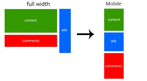
Try this example CSS.
Html
<article>
    <section class="content">1</section>
    <aside class="ads">2</aside>
    <section class="comments">3</section>
</article>
css for normal
article{width:870px; margin:0 auto;}
.content{background-color:#0C0; float:left; width:700px; min-height:300px; margin:0 0 10px;}
.ads{background-color:#06F; width:150px; float:right; min-height:450px; margin:0 0 10px;}
.comments{background-color:#F00; float:left; width:700px; min-height:150px;}
css for Responsive
article{width:100%;}
.content{float:none; width:auto; }
.ads{width:150px; float:right; min-height:450px; margin:0 0 10px;}
.comments{float:none; width:auto; }
