Question

I have a form that relies on Bootstrap 3:

Imgur

full working example: http://jsfiddle.net/x7vk7/2/

The gist is that I have 2 columns for content. The first column is col-lg-4, and the second is col-lg-8. The first column displays a form, and the 2nd column displays results.

The problem I'm having is related to the width of the inline form elements in the Cases question. I used this post to figure out how to properly nest inline form elements in a horizontal form. Here's the relevant code I have for the Cases question:

<div class="form-group">
    <label class="col-lg-2 control-label" for="id_current_case_count" data-placement="top" data-toggle="tooltip" title="How many cases have you seen?">Cases</label>
    <div class="col-lg-10">
        <div class="form-inline">
            <div class="form-group">
                <input class="form-control" id="id_current_case_count" min="0" name="current_case_count" type="number" />
            </div>
            ±
            <div class="form-group">
                <input class="form-control" id="id_case_count_uncertainty" min="0" name="case_count_uncertainty" type="number" />
            </div>
            <div class="form-group">
                <select class="form-control" id="id_case_count_interval" name="case_count_interval">
                    <option value="weekly">per week</option>
                    <option value="total">total</option>
                </select>
            </div>
        </div>
    </div>
</div>

The problem is that I want all 3 form elements for the Cases question to be on the same line. The first 2 elements are just integer fields, so it's not necessary for them to be very wide. What's the proper way to adjust the width of those first two integer fields so that all 3 fields fit on the same line?

Was it helpful?

Solution

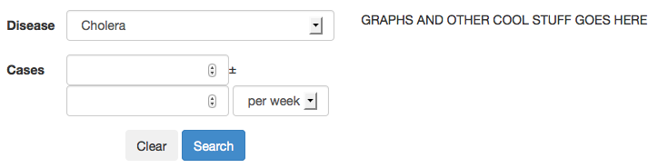
If you want to achieve this all you have to do is to use this code insted of yours:

<div class="content row">
    <div class="col-xs-3" style="padding-right: 5px;">
        <input class="form-control" id="id_current_case_count" min="0" name="current_case_count" type="number" />
    </div>                            
    <div class="col-xs-3"  style="padding-right: 5px;">
        <input class="form-control" id="id_case_count_uncertainty" min="0" name="case_count_uncertainty" type="number" />
    </div>
    <div class="col-xs-6">
        <select class="form-control" id="id_case_count_interval" name="case_count_interval">
            <option value="weekly">per week</option>
            <option value="total">total</option>
        </select>
    </div>
</div>

All the code in jsfiddle here.

OTHER TIPS

The recommended way stated in the documentation is to wrap the input in a parent element, and set the column width there.

<div class="col-xs-2">
    <input type="text" class="form-control" placeholder=".col-xs-2">
</div>

http://getbootstrap.com/css/#forms-control-sizes

In your example you already have them wrapped in a div so just add the col-class to your form-group.

You can use Bootstrap's column classes within any element group. In this case, your problem can be solved by giving each of your .form-group divs in the section in question an additional class of .col-xs-4. This will size each of them to be 1/3 of the available space, and all on the same line.

JSFiddle

You can simply set the .col-lg-4 to width="40%" or whatever else you want it set to. I use this myself so i don't see why it shouldn't work.

Example,

.col-lg-4 {
width: 50%;
}

Make sure this is in a separate CSS file that is is added in the HTML AFTER the bootstrap is.

Example,

<link href="css/bootstrap.min.css" rel="stylesheet">
<link href="css/local.css" rel="stylesheet">

Add style="width:33%;display:inline-block;" to your input tags or a class containing the same.

Licensed under: CC-BY-SA with attribution
Not affiliated with StackOverflow
scroll top