Controlling Tab colour-state / size in a TabActivity?
 https://stackoverflow.com/questions/5407300
-
29-10-2019 - |
 italiano
 english
 français
 española
 中国
中国 日本の
日本の العربية
 Deutsch
 한국어
한국어 Português
 Russian
Question
Ok, this is driving me nuts - I've searched all of the references and examples I can find and I still seem to be missing something really obvious. These are the tabs for a 7-day TV Guide (not normally with the red arrow, obviously :) )...
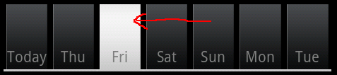
What I need to know is what is the object (View or Drawable I assume) that makes up the main body/background of a Tab itself? (as indicated by the red arrow) and how do I access it or have it automatically change its state colour to a list of my choice? Also, how can I get the state colour of the indicator TextView to follow suit?
Example: In the capture above, it's readable because I've set the textColor to a static grey (instead of the bright white which disappeared on a selected tab). But I want it to automatically become black text on white tab (selected) and bright white text on black (for unselected).
All help gratefully received.
Solution
The view which represents each tab can be changed using
setIndicator(View)
I've been using this code to build each tab :
View view = buildTabView(this, "Friday");
TabHost.TabSpec spec = tabHost.newTabSpec("cat1").setIndicator(view).setContent(intent);
tabHost.addTab(spec);

public static LinearLayout buildTabView(Context context, String label){
    LayoutInflater li = (LayoutInflater)context.getSystemService(Context.LAYOUT_INFLATER_SERVICE);
    final LinearLayout ll = (LinearLayout)li.inflate(R.layout.tab, null);

    // the following lines will change the tabs size depending on the label (text) length.
    // the longer tab text - the wider tabs
    LinearLayout.LayoutParams layoutParams = new LayoutParams(LayoutParams.WRAP_CONTENT, LayoutParams.WRAP_CONTENT, label.length() + 1);
    ll.setLayoutParams(layoutParams);

    final TextView tv = (TextView)ll.findViewById(R.id.tab_tv);
    tv.setOnTouchListener(new OnTouchListener() {
        public boolean onTouch(View v, MotionEvent event) {
            ll.onTouchEvent(event);
            return false;
        }
    });

    tv.setText(label);
    return ll;
}
And here comes layout/tab.xml
<?xml version="1.0" encoding="utf-8"?>
<LinearLayout
  xmlns:android="http://schemas.android.com/apk/res/android"
  android:layout_width="wrap_content"
  android:layout_height="wrap_content"
  android:background="@drawable/tab_bg_selector"
  android:clickable="true"
  >

  <TextView
  android:id="@+id/tab_tv"
  android:layout_width="wrap_content"
  android:layout_height="33dip"
  android:text="Text 1"
  android:textStyle="bold"
  android:textSize="16dip"
  android:gravity="center"
  android:textColor="@drawable/tab_color_selector"
  android:layout_weight="1.0"
  android:clickable="true"
  />

</LinearLayout>
Note that LinearLayout has a selector on it's background (to change backround, obviously :) ), and the TextView has a selector on the textColor (to change the text color when selected / pressed etc.). It this way you can make the text look black when tab is pressed, and white when it is not :)
OTHER TIPS
Kindly update your question with the code you use.. Do you use xml inside your drawable for animating the tabs? here is a sample tabs action handling using xml.
<?xml version="1.0" encoding="utf-8"?>
<selector xmlns:android="http://schemas.android.com/apk/res/android">
    <!-- When selected, use grey -->
    <item android:drawable="@drawable/ic_tab_about_grey"
          android:state_selected="false" />
    <!-- When not selected, use white-->
    <item android:drawable="@drawable/ic_tab_about_color" android:state_selected="true"/>
</selector>
Customize tab behavior and icons using this xml file.
Here is the code to set this animation/customizing options in tabs:
intent = new Intent().setClass(this, sms.class);
spec = tabHost.newTabSpec("sms").setIndicator("SMS",
       res.getDrawable(R.drawable.ic_tab_sms))
       .setContent(intent);
tabHost.addTab(spec);
Now the XML in layout to define tab-host and tab-widgets.
<TabHost xmlns:android="http://schemas.android.com/apk/res/android"
    android:id="@android:id/tabhost"
    android:layout_width="fill_parent"
    android:layout_height="fill_parent">
        <TabWidget
            android:id="@android:id/tabs"
            android:layout_width="fill_parent"
            android:layout_height="wrap_content"
            />
</TabHost>
Customise this xml layout with your own colors, fonts and structure.
