Multi-column Tree-View in WPF [closed]
 https://stackoverflow.com/questions/463915
-
19-08-2019 - |
 italiano
 english
 français
 española
 中国
中国 日本の
日本の العربية
 Deutsch
 한국어
한국어 Português
 Russian
Question
Anyone know where I can get a control like the Multi-column Tree-View in WPF?
Solution
I've implemented this based on the old blog post here. But if I remember right I had to do some manual work to get things to work right. Specifically with the scroll bars.
But that should give you a good start.
OTHER TIPS
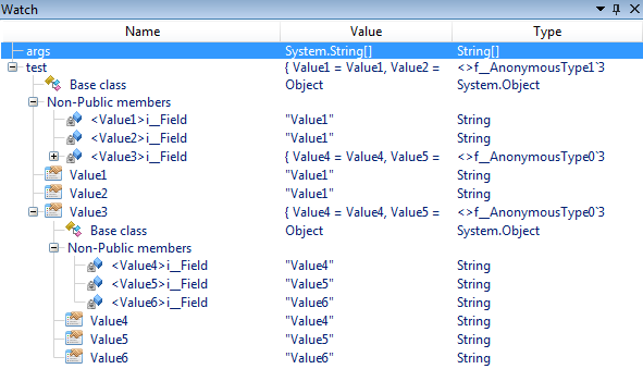
SharpDevelop has ListView subclass called SharpTreeView which does what you are looking for.
You can see a live example of this control in SharpDevelop's "Watch" window:
XAML used in the Watch window (as in 5.1.0 beta):
<tv:SharpGridView x:Key="variableGridView" AllowsColumnReorder="False">
    <GridView.Columns>
        <GridViewColumn Header="{core:Localize MainWindow.Windows.Debug.LocalVariables.NameColumn}" Width="200">
            <GridViewColumn.CellTemplate>
                <DataTemplate>
                    <StackPanel Orientation="Horizontal">
                        <tv:SharpTreeNodeView />
                        <local:AutoCompleteTextBox x:Name="name" Margin="-6 0 0 0"  MinWidth="100" Text="{Binding Node.Name}" IsEditable="{Binding Node.CanSetName}">
                            <local:AutoCompleteTextBox.ContextMenu>
                                <MultiBinding Converter="{StaticResource menuBuilder}">
                                    <Binding Path="Node.ContextMenuAddInTreeEntry" />
                                    <Binding Path="Node" />
                                </MultiBinding>
                            </local:AutoCompleteTextBox.ContextMenu>
                        </local:AutoCompleteTextBox>
                    </StackPanel>
                </DataTemplate>
            </GridViewColumn.CellTemplate>
        </GridViewColumn>
        <GridViewColumn Header="{core:Localize MainWindow.Windows.Debug.LocalVariables.ValueColumn}" Width="200">
            <GridViewColumn.CellTemplate>
                <DataTemplate>
                    <local:AutoCompleteTextBox
                        MinWidth="100"
                        Text="{Binding Node.Value}"
                        IsEditable="{Binding Node.CanSetValue}">
                        <local:AutoCompleteTextBox.ContextMenu>
                            <MultiBinding Converter="{StaticResource menuBuilder}">
                                <Binding Path="Node.ContextMenuAddInTreeEntry" />
                                <Binding Path="Node" />
                            </MultiBinding>
                        </local:AutoCompleteTextBox.ContextMenu>
                    </local:AutoCompleteTextBox>
                </DataTemplate>
            </GridViewColumn.CellTemplate>
        </GridViewColumn>
        <GridViewColumn Header="{core:Localize MainWindow.Windows.Debug.LocalVariables.TypeColumn}" Width="200">
            <GridViewColumn.CellTemplate>
                <DataTemplate>
                    <local:AutoCompleteTextBox MinWidth="100" Text="{Binding Node.Type}" IsEditable="False">
                        <local:AutoCompleteTextBox.ContextMenu>
                            <MultiBinding Converter="{StaticResource menuBuilder}">
                                <Binding Path="Node.ContextMenuAddInTreeEntry" />
                                <Binding Path="Node" />
                            </MultiBinding>
                        </local:AutoCompleteTextBox.ContextMenu>
                    </local:AutoCompleteTextBox>
                </DataTemplate>
            </GridViewColumn.CellTemplate>
        </GridViewColumn>
    </GridView.Columns>
</tv:SharpGridView>
The resource is set to the View property of a SharpTreeView control.
There is an article on codeproject that might help:
http://www.codeproject.com/KB/WPF/TreeListView.aspx
There are quite a few other useful articles there about the Wpf TreeView.
If you don't need column headers, this is fairly easy. You can just provide an item container template, add fixed width grid columns to the right, and bind it to your item's relevant data.
The default item container for a TreeView has a grid defined as (with some added comments):
    <Grid>
        <Grid.ColumnDefinitions>
            <!--Expander--><ColumnDefinition MinWidth="19" Width="Auto"/>
            <!--Item--><ColumnDefinition Width="Auto"/>
            <!--Overflow--><ColumnDefinition Width="*"/>
        </Grid.ColumnDefinitions>
        <Grid.RowDefinitions>
            <!--Current Item--><RowDefinition Height="Auto"/>
            <!--Sub-items--><RowDefinition/>
        </Grid.RowDefinitions>
        <ToggleButton x:Name="Expander" ClickMode="Press" IsChecked="{Binding IsExpanded, RelativeSource={RelativeSource TemplatedParent}}" Style="{StaticResource ExpandCollapseToggleStyle}"/>
        <Border x:Name="Bd" BorderBrush="{TemplateBinding BorderBrush}" BorderThickness="{TemplateBinding BorderThickness}" Background="{TemplateBinding Background}" Grid.Column="1" Padding="{TemplateBinding Padding}" SnapsToDevicePixels="true">
            <ContentPresenter x:Name="PART_Header" ContentSource="Header" HorizontalAlignment="{TemplateBinding HorizontalContentAlignment}" SnapsToDevicePixels="{TemplateBinding SnapsToDevicePixels}"/>
        </Border>
        <ItemsPresenter x:Name="ItemsHost" Grid.ColumnSpan="2" Grid.Column="1" Grid.Row="1"/>
    </Grid>
So just extend this grid to contain predictable-width columns to the right and you will have columns.
- Add column definition for new column, make it auto-sized
- Update the column span of "ItemsHost" to span the added column
- Add a predictable-width control to that column:
Portions affected:
<Grid>
...
   <ColumnDefinition Width="Auto"/>
...
   <ItemsPresenter ... Grid.ColumnSpan="3" ... />
...
   <Border Grid.Column="3"><!--Add column data here--></Border>
...
</Grid>
If the added border is the same width for all rows, you will have a view that feels like a treeview with columns. This obviously will not scale well, but if just need a quick and dirty solution, you should be able to do this in blend in a few minutes without adding dependencies for external controls / libraries.
Our needs quickly grew and we added a grid with column labels outside the tree and databound the width of columns there to the widths of these "columns" [actually the widths of a spanning control in the columns in question using auto-sized columns]. It works, which is all I will say in its defense.
This approach could also be done in the generated item template instead of the item container if you don't mind (or want) the selection box (the "Bd" border) extending across all of the columns.
