Responsive background image of a div together with inner image
 https://stackoverflow.com//questions/22001687
-
20-12-2019 - |
 italiano
 english
 français
 española
 中国
中国 日本の
日本の العربية
 Deutsch
 한국어
한국어 Português
 Russian
Question
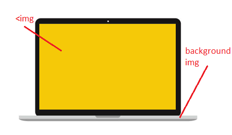
I want to make a responsive background image of a div which has an img wrapped inside: Something like this:
I am using bootstrap. Here is the HTML:
<div class="col-lg-5 col-md-5 col-sm-10 col-xs-10">
  <div class="device-laptop">
     <img src="img/test.jpg"/>
  </div>
</div>
and here is the css:
device-laptop{
  background: url('../img/macpro.jpg') no-repeat;
  width: 363px;
  height: 208px;
  padding: 12px 45px 23px 43px;
  background-size:100%;
}

.device-laptop img{
  width: 274px;
  height: 172px;
}
This is the normal form. Now i want to make this responsive so when the background image is changed, the image inside to change also. Is there anyway to achieve this?
I tried:
.device-laptop{
  background: url('../img/macpro.jpg') no-repeat;
  /*width: 363px;*/
  background-size:100%;
  height: 208px;
}
this makes the background image be responsive but how can i make also the image go parallel with the background one? Thnx
Solution
Edit: Odd, From the provided css, it appears that .device-laptop is having a fixed width and height. Not sure how it will be fluid then?
Anyway, Utilizing background-size:contain option mentioned by @papa
.. If you're ok with altering your markup. Below will do the job.
Fiddle: http://jsfiddle.net/Varinder/wf3U8/1/
HTML
<div class="some-awesome-laptop">
    <div class="some-awesome-wallpaper-wrapper">
        <img src="http://placehold.it/250x150&text=text" class="some-awesome-wallpaper" />
    </div>
</div>
CSS
.some-awesome-laptop {
    background-image:url("http://placehold.it/270x180/aaa&text=a");
    background-repeat:no-repeat;
    width:270px;
    max-width:100%;
    margin:0 auto;
    height:0;
    overflow:hidden;
    padding-bottom:66%; /* aspect ratio of the image: (180/270)*100 */
    position:relative;

    -webkit-background-size:contain;
    -moz-background-size:contain;
    background-size:contain;

}

.some-awesome-wallpaper-wrapper {
    padding:10px;
}

.some-awesome-wallpaper {
    max-width:100%;
    display:block;
}
OTHER TIPS
Use background-size:cover or background-size:contain to suite your needs. Cover might be the better option.
