How do I space out the child elements of a StackPanel?
 https://stackoverflow.com/questions/932510
-
06-09-2019 - |
 italiano
 english
 français
 española
 中国
中国 日本の
日本の العربية
 Deutsch
 한국어
한국어 Português
 Russian
Question
Given a StackPanel:
<StackPanel>
  <TextBox Height="30">Apple</TextBox>
  <TextBox Height="80">Banana</TextBox>
  <TextBox Height="120">Cherry</TextBox>
</StackPanel>
What's the best way to space out the child elements so that there are equally-sized gaps between them, even though the child elements themselves are of different sizes? Can it be done without setting properties on each of the individual children?
Solution
Use Margin or Padding, applied to the scope within the container:
<StackPanel>
    <StackPanel.Resources>
        <Style TargetType="{x:Type TextBox}">
            <Setter Property="Margin" Value="0,10,0,0"/>
        </Style>
    </StackPanel.Resources>
    <TextBox Text="Apple"/>
    <TextBox Text="Banana"/>
    <TextBox Text="Cherry"/>
</StackPanel>
EDIT: In case you would want to re-use the margin between two containers, you can convert the margin value to a resource in an outer scope, f.e.
<Window.Resources>
    <Thickness x:Key="tbMargin">0,10,0,0</Thickness>
</Window.Resources>
and then refer to this value in the inner scope
<StackPanel.Resources>
    <Style TargetType="{x:Type TextBox}">
        <Setter Property="Margin" Value="{StaticResource tbMargin}"/>
    </Style>
</StackPanel.Resources>
OTHER TIPS
Another nice approach can be seen here: http://blogs.microsoft.co.il/blogs/eladkatz/archive/2011/05/29/what-is-the-easiest-way-to-set-spacing-between-items-in-stackpanel.aspx
It shows how to create an attached behavior, so that syntax like this would work:
<StackPanel local:MarginSetter.Margin="5">
   <TextBox Text="hello" />
   <Button Content="hello" />
   <Button Content="hello" />
</StackPanel>
This is the easiest & fastest way to set Margin to several children of a panel, even if they are not of the same type. (I.e. Buttons, TextBoxes, ComboBoxes, etc.)
I improved on Elad Katz' answer.
- Add LastItemMargin property to MarginSetter to specially handle the last item
- Add Spacing attached property with Vertical and Horizontal properties that adds spacing between items in vertical and horizontal lists and eliminates any trailing margin at the end of the list
Example:
<StackPanel Orientation="Horizontal" foo:Spacing.Horizontal="5">
  <Button>Button 1</Button>
  <Button>Button 2</Button>
</StackPanel>

<StackPanel Orientation="Vertical" foo:Spacing.Vertical="5">
  <Button>Button 1</Button>
  <Button>Button 2</Button>
</StackPanel>

<!-- Same as vertical example above -->
<StackPanel Orientation="Vertical" foo:MarginSetter.Margin="0 0 0 5" foo:MarginSetter.LastItemMargin="0">
  <Button>Button 1</Button>
  <Button>Button 2</Button>
</StackPanel>
The thing you really want to do is wrap all child elements. In this case you should use an items control and not resort to horrible attached properties which you will end up having a million of for every property you wish to style.
<ItemsControl>
<!-- target the wrapper parent of the child with a style -->
<ItemsControl.ItemContainerStyle>
<Style TargetType="Control">
<Setter Property="Margin" Value="0 0 5 0"></Setter>
</Style>
</ItemsControl.ItemContainerStyle>
<!-- use a stack panel as the main container -->
<ItemsControl.ItemsPanel>
<ItemsPanelTemplate>
<StackPanel Orientation="Horizontal"/>
</ItemsPanelTemplate>
</ItemsControl.ItemsPanel>
<!-- put in your children -->
<ItemsControl.Items>
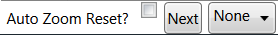
<Label>Auto Zoom Reset?</Label>
<CheckBox x:Name="AutoResetZoom"/>
<Button x:Name="ProceedButton" Click="ProceedButton_OnClick">Next</Button>
<ComboBox SelectedItem="{Binding LogLevel }" ItemsSource="{Binding LogLevels}" />
</ItemsControl.Items>
</ItemsControl>
+1 for Sergey's answer. And if you want to apply that to all your StackPanels you can do this:
<Style TargetType="{x:Type StackPanel}">
    <Style.Resources>
        <Style TargetType="{x:Type TextBox}">
            <Setter Property="Margin" Value="{StaticResource tbMargin}"/>
        </Style>
    </Style.Resources>
</Style>
But beware: if you define a style like this in your App.xaml (or another dictionary that is merged into the Application.Resources) it can override the default style of the control. For mostly lookless controls like the stackpanel it isn't a problem, but for textboxes etc you may stumble upon this problem, which luckily has some workarounds.
Following up on Sergey's suggestion, you can define and reuse a whole Style (with various property setters, including Margin) instead of just a Thickness object:
<Style x:Key="MyStyle" TargetType="SomeItemType">
  <Setter Property="Margin" Value="0,5,0,5" />
  ...
</Style>
...
  <StackPanel>
    <StackPanel.Resources>
      <Style TargetType="SomeItemType" BasedOn="{StaticResource MyStyle}" />
    </StackPanel.Resources>
  ...
  </StackPanel>
Note that the trick here is the use of Style Inheritance for the implicit style, inheriting from the style in some outer (probably merged from external XAML file) resource dictionary.
Sidenote:
At first, I naively tried to use the implicit style to set the Style property of the control to that outer Style resource (say defined with the key "MyStyle"):
<StackPanel>
  <StackPanel.Resources>
    <Style TargetType="SomeItemType">
      <Setter Property="Style" Value={StaticResource MyStyle}" />
    </Style>
  </StackPanel.Resources>
</StackPanel>
which caused Visual Studio 2010 to shut down immediately with CATASTROPHIC FAILURE error (HRESULT: 0x8000FFFF (E_UNEXPECTED)), as described at https://connect.microsoft.com/VisualStudio/feedback/details/753211/xaml-editor-window-fails-with-catastrophic-failure-when-a-style-tries-to-set-style-property#
Grid.ColumnSpacing, Grid.RowSpacing, StackPanel.Spacing are now on UWP preview, all will allow to better acomplish what is requested here.
These properties are currently only available with the Windows 10 Fall Creators Update Insider SDK, but should make it to the final bits!
The UniformGrid might not be available in Silverlight, but someone has ported it from WPF. http://www.jeff.wilcox.name/2009/01/uniform-grid/
My approach inherits StackPanel.
Usage:
<Controls:ItemSpacer Grid.Row="2" Orientation="Horizontal" Height="30" CellPadding="15,0">
    <Label>Test 1</Label>
    <Label>Test 2</Label>
    <Label>Test 3</Label>
</Controls:ItemSpacer>
All that's needed is the following short class:
using System.Windows;
using System.Windows.Controls;
using System;

namespace Controls
{
    public class ItemSpacer : StackPanel
    {
        public static DependencyProperty CellPaddingProperty = DependencyProperty.Register("CellPadding", typeof(Thickness), typeof(ItemSpacer), new FrameworkPropertyMetadata(default(Thickness), FrameworkPropertyMetadataOptions.BindsTwoWayByDefault, OnCellPaddingChanged));
        public Thickness CellPadding
        {
            get
            {
                return (Thickness)GetValue(CellPaddingProperty);
            }
            set
            {
                SetValue(CellPaddingProperty, value);
            }
        }
        private static void OnCellPaddingChanged(DependencyObject Object, DependencyPropertyChangedEventArgs e)
        {
            ((ItemSpacer)Object).SetPadding();
        }

        private void SetPadding()
        {
            foreach (UIElement Element in Children)
            {
                (Element as FrameworkElement).Margin = this.CellPadding;
            }
        }

        public ItemSpacer()
        {
            this.LayoutUpdated += PART_Host_LayoutUpdated;
        }

        private void PART_Host_LayoutUpdated(object sender, System.EventArgs e)
        {
            this.SetPadding();
        }
    }
}
sometimes you need to set Padding, not Margin to make space between items smaller than default
