How can I create a postage stamp border?
 https://stackoverflow.com//questions/21044525
-
21-12-2019 - |
 italiano
 english
 français
 española
 中国
中国 日本の
日本の العربية
 Deutsch
 한국어
한국어 Português
 Russian
Question
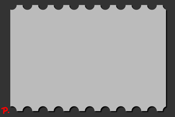
I would like a div to look like this:

but would only like to use CSS, how would I go about creating a shape like this?
Do I create custom border for the top and bottom?
Solution
You can look at the code here, it does exactly what you want: http://codepen.io/orhanveli/pen/tbGJL
The code from the website:
HTML
<!-- Lets create a CSS3 stamp -->
<div class="stamp">
    <!-- the image -->
    <img src="http://thecodeplayer.com/uploads/media/css3logo.png" />
</div>
CSS
*{margin: 0; padding: 0;}

body {
    background: #B1d202;
    padding: 100px;
    text-align: center;
}

.stamp {
    width: 280px;
    height: 180px;
    display: inline-block;
    padding: 10px;
    background: white;
    position: relative;
    -webkit-filter: drop-shadow(0px 0px 10px rgba(0,0,0,0.5));
    /*The stamp cutout will be created using crisp radial gradients*/
    background: radial-gradient(
        transparent 0px,
        transparent 4px,
        white 4px,
        white
    );

    /*reducing the gradient size*/
    background-size: 20px 20px;
    /*Offset to move the holes to the edge*/
    background-position: -10px -10px;
}
.stamp:after {
    content: '';
    position: absolute;
    /*We can shrink the pseudo element here to hide the shadow edges*/
    left: 5px; top: 5px; right: 5px; bottom: 5px;
    /*Shadow - doesn't look good because of the stamp cutout. We can still move this into another pseudo element behind the .stamp main element*/

  /*box-shadow: 0 0 20px 1px rgba(0, 0, 0, 0.5);*/
    /*pushing it back*/
    z-index: -1;
}
/*Some text*/
.stamp:before {
    content: 'CSS3';
    position: absolute;
    bottom: 0; left: 0;
    font: bold 24px arial;
    color: white;
    opacity: 0.75;
    line-height: 100%;
    padding: 20px;
}
.stamp img {

}
OTHER TIPS
You could use the mask-box-image property to do this.
See this html5 Rocks article on masking
<img src="http://www.html5rocks.com/en/tutorials/masking/adobe/humayun-thom-arno.jpg" />
CSS
img {
    -webkit-mask-box-image: url(http://www.html5rocks.com/en/tutorials/masking/adobe/stampTiles.svg) 35 repeat;
    mask-box-image: url(http://www.html5rocks.com/en/tutorials/masking/adobe/stampTiles.svg) 35 repeat;
}

If you want to only have the borders on the top and on the bottom of your image you can create this by using pseudo elements.
.stamp {
  margin-top: 50px;
  margin-left: 50px;
  position: relative;
  width: 500px;
  height: 300px;
  background: #bbb;
  -webkit-filter: drop-shadow(3px 3px 1px black);
  filter: drop-shadow(0px 0px 5px white);
}
.stamp:before {
  position: absolute;
  top: -20px;
  display: block;
  content: "";
  background: radial-gradient(circle, transparent 15px, #bbb 16px);
  background-size: 50px 40px;
  background-position: -20px -20px;
  width: 100%;
  height: 40px;
  z-index: -1;
}
.stamp:after {
  position: absolute;
  bottom: -20px;
  content: "";
  display: block;
  background: radial-gradient(circle, transparent 15px, #bbb 16px);
  background-size: 50px 40px;
  background-position: -20px -20px;
  width: 100%;
  height: 40px;
  z-index: -1;
}
body {
  margin: 0;
  background-color: #333;
}
<div class="stamp">
</div>Licensed under: CC-BY-SA with attribution
Not affiliated with StackOverflow
