How to change the gridlines of Y-axis on a chart created by using ggplot2 in R?
-
10-09-2020 - |
 italiano
 english
 français
 española
 中国
中国 日本の
日本の العربية
 Deutsch
 한국어
한국어 Português
 Russian
Question
How to change the gridlines of Y-axis on a chart created by using ggplot2 in R?
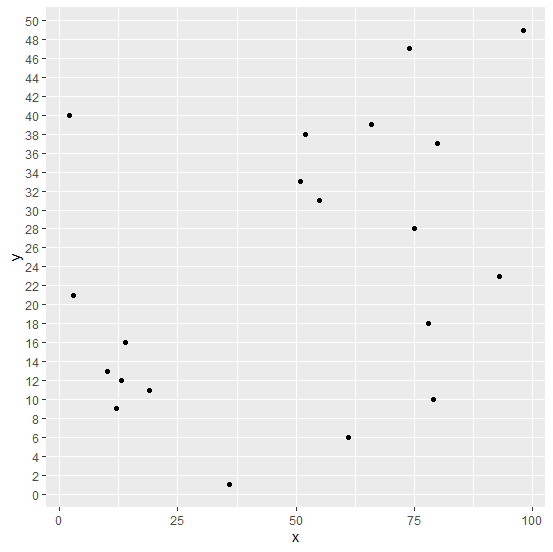
Normally, the gridlines on a plot created by using ggplot2 package are a little far from each other but sometimes the plot looks better if the gridlines are close to each other, therefore, we might want to do so. This can be done by setting the minor_breaks and breaks using scale_y_continuous if the Y-axis plots a continuous variable.
Example
Consider the below data frame −
> x<-sample(1:100,20)
> y<-sample(1:50,20)
> df<-data.frame(x,y)
> df
Output
   x  y
1 14 16
2 36 1
3 78 18
4 61 6
5 19 11
6 2 40
7 93 23
8 10 13
9 3 21
10 55 31
11 75 28
12 51 33
13 13 12
14 80 37
15 98 49
16 66 39
17 79 10
18 52 38
19 74 47
20 12 9
Loading ggplot2 package and creating a scatterplot between x and y −
> library(ggplot2)
> ggplot(df,aes(x,y))+geom_point()
Output
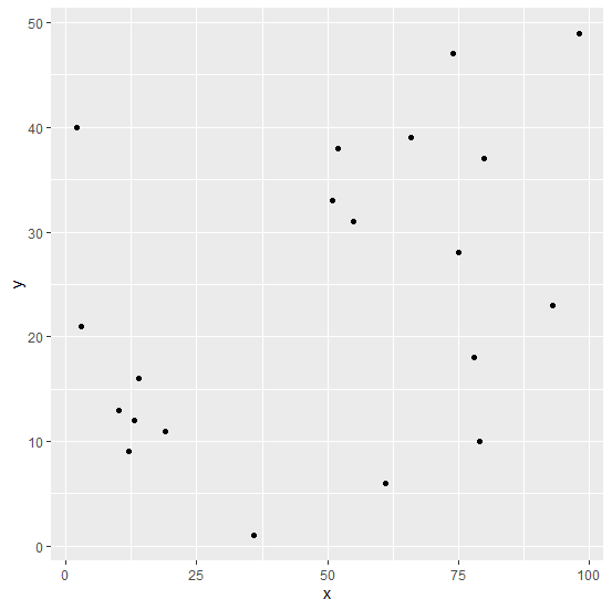
Changing the gridlines in the plot −
> ggplot(df,aes(x,y))+geom_point()+scale_y_continuous(minor_breaks=seq(0,50,2),breaks
=seq(0,50,2))
Output

Published on 04-Sep-2020 14:26:11
Advertisements
Not affiliated with Tutorialspoint
