How to change the color of lines for a line chart using ggplot2 in R?
https://www.tutorialspoint.com/how-to-change-the-color-of-lines-for-a-line-chart-using-ggplot2-in-r
-
12-09-2020 - |
 italiano
 english
 français
 española
 中国
中国 日本の
日本の العربية
 Deutsch
 한국어
한국어 Português
 Russian
Question
How to change the color of lines for a line chart using ggplot2 in R?
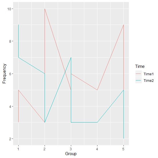
When we create line chart with each of the lines having different color, we might want to change the color of lines if the colors we used at the first time are not making the chart attractive. This can be done by manually setting the color of the lines in the chart with the help of scale_color_manual function.
Example
Consider the below data frame −
> set.seed(2)
> Group<-rep(c(1:5),times=4)
> Time<-rep(c("Time1","Time2"),each=)
> Frequency<-rpois(20,5)
> df<-data.frame(Group,Time,Frequency)
> df
   Group Time Frequency
 1 1 Time1  3
 2 2 Time2  6
 3 3 Time1  5
 4 4 Time2  3
 5 5 Time1  9
 6 1 Time2  9
 7 2 Time1  3
 8 3 Time2  7
 9 4 Time1  5
10 5 Time2  5
11 1 Time1  5
12 2 Time2  3
13 3 Time1  6
14 4 Time2  3
15 5 Time1  4
16 1 Time2  7
17 2 Time1 10
18 3 Time2  3
19 4 Time1  5
20 5 Time2  2
> library(ggplot2)
> ggplot(df,aes(x=Group,y=Frequency,colour=Time))+
+ geom_line()
Output
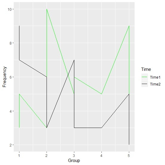
Changing the color of the lines to Green and Black −
> ggplot(df,aes(x=Group,y=Frequency,colour=Time))+
+ geom_line()+
+ scale_color_manual(values=c("Green","Black"))
Output

Published on 12-Aug-2020 15:23:21
Advertisements
Not affiliated with Tutorialspoint
