How can I apply a background image to a text input without losing the default border in Firefox and WebKit browsers?
 https://stackoverflow.com/questions/1100409
-
11-09-2019 - |
 italiano
 english
 français
 española
 中国
中国 日本の
日本の العربية
 Deutsch
 한국어
한국어 Português
 Russian
Question
For some reason most modern browsers will stop applying their default input border style to text boxes if you give them a background image. Instead you get that ugly inset style. From what I can tell there's no CSS way to apply the default browser style either.
IE 8 doesn't have this problem. Chrome 2 and Firefox 3.5 do and I assume other browsers as well. From what I've read online IE 7 has the same problem, but that post didn't have a solution.
Here's an example:
<html>
<head>
  <style>
    .pictureInput {
      background-image: url(http://storage.conduit.com/images/searchengines/search_icon.gif);
      background-position: 0 1px;
      background-repeat: no-repeat;
    }
  </style>
<body>
  <input type="text" class="pictureInput" />
  <br />
  <br />
  <input type="text">
</body>
</html>
In Chrome 2 it looks like this: http://www.screencast.com/users/jadeonly/folders/Snagit/media/d4ee9819-c92a-4bc2-b84e-e3a4ed6843b6
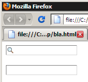
And in Firefox 3.5: http://www.screencast.com/users/jadeonly/folders/Snagit/media/d70dd690-9273-45fb-9893-14b38202ddcc
Update: JS Solution: I'm still hoping to find a pure CSS-on-the-input solution, but here's the workaround I'll use for now. Please note this is pasted right out of my app so isn't a nice, stand alone example like above. I've just included the relevant parts out of my large web app. You should be able to get the idea. The HTML is the input with the "link" class. The large vertical background position is because it's a sprite. Tested in IE6, IE7, IE8, FF2, FF3.5, Opera 9.6, Opera 10, Chrome 2, Safari 4. I need to tweak the background position a couple pixels in some browsers still:
JS:
 $$('input.link').each(function(el) {
   new Element('span',{'class':'linkIcon'}).setText(' ').injectBefore(el);
   if (window.gecko) el.setStyle('padding', '2px 2px 2px 19px');
 });
CSS:
input.link { padding-left: 19px; }
span.linkIcon { z-index: 2; width: 19px; height: 19px; position: absolute; background-image: url(img/fields.gif); background-position: 1px -179px; background-repeat: no-repeat; }
Update: CSS Close Enough Solution: Based on the suggestion from kRON here's the CSS to make the inputs match FF and IE in Vista which makes a good choice if you decide to give up on pure defaults and enforce one style. I have modified his slightly and added the "blueish" effects:
CSS:
input[type=text], select, textarea {
    border-top: 1px #acaeb4 solid;
    border-left: 1px #dde1e7 solid;
    border-right: 1px #dde1e7 solid;
    border-bottom: 1px #e3e9ef solid;
    -moz-border-radius: 2px;
    -webkit-border-radius: 2px;
    padding: 2px;
}
input[type=text]:hover, select:hover, textarea:hover, input[type=text]:focus, select:focus, textarea:focus {
    border-top: 1px #5794bf solid;
    border-left: 1px #c5daed solid;
    border-right: 1px #b7d5ea solid;
    border-bottom: 1px #c7e2f1 solid;
}
select { border: 1px; }
Solution
When you change border or background style on text inputs They revert back to the very basic rendering mode. Text inputs that are os-style are usually overlays (like flash is) which are rendered on top of the document.
I do not believe there is a pure CSS fix to your problem. Best thing to do - in my opinion - is to pick a style that you like and emulate it with CSS. So that no matter what browser you're in, the inputs will look the same. You can still have hover effects and the like. OS X style glow effects might be tricky, but I'm sure it is doable.
@Alex Morales: Your solution is redundant. border: 0; is ignored in favor of border: 1px solid #abadb3; and results in unnecessary bytes transferred across the wire.
OTHER TIPS
This is the CSS that I use that can provide the default look back:
input, select, textarea {
    border-top: 1px #acaeb4 solid;
    border-left: 1px #dde1e7 solid;
    border-right: 1px #dde1e7 solid;
    border-bottom: 2px #f1f4f7 solid;
    -moz-border-radius: 2px;
    -webkit-border-radius: 2px;
}
You could also apply :active and give the controls that blueish hue once they're selected.
Update!
Ok, here is a workaround that I think is cross-browser compatible. The only issue would be that the default style differs by a few pixels so this might need some tweaking.
<html>
    <head>
        <style>
            .pictureInput {
                text-indent: 20px;
            }
            .input-wrapper {
                position:relative;
            }
            .img-wrapper {
                position:absolute;
                top:2px;
                left:2px;
            }
        </style>
    </head>
    <body>
        <div class="input-wrapper">
            <div class="img-wrapper"><img src="http://storage.conduit.com/images/searchengines/search_icon.gif" alt="asddasd" /></div>
            <input type="text" class="pictureInput" />
        </div>
        <br />
        <br />
        <input type="text">
    </body>
</html>
By using absolute-relative positioning you can make the absolute div (containing the image) act absolute in relation to its parent which all browsers I know about (not counting sub-IE6 versions, IE6+ are fine) can handle. User scaling might be an issue, but this is how it is with workarounds.
On the upside, you don't have to change the styles on your inputs at all (except for text-indent, but you'd do that anyway I hope).
On the downside, it's not the prettiest workaround.
Old!
I know this is not what you want, but you could do something like this to at least make all the input borders consistent.
input {
    border-color:#aaa;
    border-width:1px;
}
I haven't tried it in all browsers, but since you aren't setting the border-style it might use the native style but with another size (though you can skip that too). I think the key is to just set the border-color to something so that all input fields will use the same border-color and leave the rest up to the browser.
I had a text background image, and this was also annoying me. So I put a relative <div> round the <input> and then added the image absolutely positioned over the <input>.
Then of course I needed a little more Javascript to hide the image if it was clicked, or if the input got the focus by tabbing, or by being clicked around the edges of the image.
With a bit of fiddling this looked pretty good with IE8, Firefox, Chrome, and Opera, but it's a horrible kludge and it would be nice if the browsers fixed it.
