SPFx List extension (Command set) - open custom side panel
 https://sharepoint.stackexchange.com/questions/238465
-
12-01-2021 - |
 italiano
 english
 français
 española
 中国
中国 日本の
日本の العربية
 Deutsch
 한국어
한국어 Português
 Russian
Question
I'm developing a SharePoint Framework (SPFx) list Extension (Command Set). After clicking on my custom action/Command I would very much like to open a side panel like in this nice demo. I haven't found any "official side panel" component, is there any?
To use the demo code linked above, I need to access some DOM element or a page placeholder. In the demo, which is a web part, they can access the DOM element.
export default class SidePanelWebPart extends
BaseClientSideWebPart<ISidePanelWebPartProps> {

public render(): void {
  const element: React.ReactElement<ISidePanelProps > = React.createElement(
    SidePanel,
    {
      panelPosition: this.properties.panelPosition
    }
  );

  ReactDom.render(element, this.domElement);
}
However my Command Set list extension is a BaseListViewCommandSet, and I cannot find any domElement or any other element reference in this, this.context or this.context.pageContext.
Following this Microsoft guide it should be possible to get a reference to a page holder via the context.placeholderProvider property.
this.context.placeholderProvider.tryCreateContent( PlaceholderName.Bottom)
Again my Command Set list extension is a BaseListViewCommandSet, and this.context does not contain a property placeholderProvider, neither does this.context.pageContext.
So I've just reverted to getting any element via plain javascript, e.g. via document.body:
ReactDom.render(element, document.body);
And it seems to work. But it feels hackish to open the side panel in this manner. But this is the best I've found so far. Any suggestions of improvements?
Edit 2018-03-27
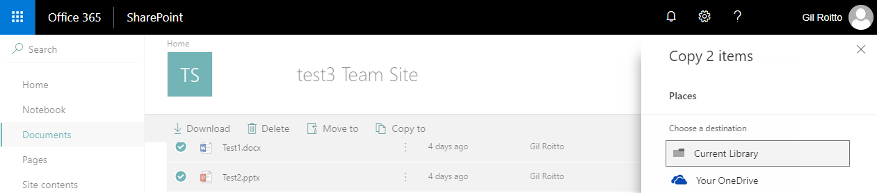
To further explain. The "side panel" experience should be the same as when you use the "Copy to" and "Move to" custom actions:
Solution
The trick I found out was to open it inside a modal.
Inside your webpart typescript file, add the below import statement:
import MyCustomPanel from './MyCustomPanel';
Now, in your onExecuteMethod, use the code mentioned below:
@override
  public onExecute(event: IListViewCommandSetExecuteEventParameters): void {
    switch (event.itemId) {
      case 'COMMAND_2':
      const dialog: MyCustomPanel = new MyCustomPanel();
      dialog.show();
      break;
    }
}
Now, create a component file name MyCustomPanel.tsx and add the below code:
import * as React from 'react';
import * as ReactDOM from 'react-dom';
import { BaseDialog, IDialogConfiguration } from '@microsoft/sp-dialog';
import {
  Panel,
  PanelType
} from 'office-ui-fabric-react';

export default class MyCustomPanel extends BaseDialog {

  public render(): void {
    ReactDOM.render(<Panel
      isLightDismiss={ false }
      isOpen={ true }
      type={PanelType.large}
      onDismissed={ () => this.close()}
    >Hello there from my custom Panel</Panel>, this.domElement);
  }
}
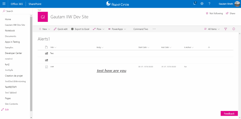
End result - i have a custom button named Command Two. See what happens when I click on it: