How make accordion detail list with UI fabric react
 https://sharepoint.stackexchange.com/questions/268362
 italiano
 english
 français
 española
 中国
中国 日本の
日本の العربية
 Deutsch
 한국어
한국어 Português
 Russian
Question
I start with UI Fabric react; I am developing a FAQ; I use for that a list; but the result is not good; I want to do something looks like an accordion, where we can see the question as a header and when we click on it or a checker the cheveron; answer is displayed, but don't know how to do that with UI fabric, here is my code
public render(): JSX.Element {


const { faqList: originalItems } = this.props;
const { items = [] } = this.state;
const resultCountText = items.length === originalItems.length ? '' : ` (${items.length} of ${originalItems.length} shown)`;
const { selectedItem } = this.state;

return (
<div >


<Label>FAQ </Label>
<FocusZone direction={FocusZoneDirection.vertical}>
<Dropdown
label="Categories"
selectedKey={selectedItem ? selectedItem.key : undefined}
onChange={this._onChange}
placeholder="Selectionnez une catégorie"
options={this.state.categorieOption}
styles={{ dropdown: { width: 300 } }}
/>
<TextField label={'Filtre par question' + resultCountText} onChange={this._onFilterChanged} />
<List items={items} onRenderCell={this._onRenderCell}  />
</FocusZone>
</div>
);
}

private _onRenderCell(item: IExampleItem, index: number | undefined): JSX.Element {
return (

<div className={classNames.itemCell} data-is-focusable={true}>

<div className={classNames.itemContent}>
<div className={classNames.itemQuestion}>{item.Question}</div>
<div className={classNames.itemReponse}>{item.Reponse}</div>
<div className={classNames.itemIndex}>{`Langue :  ${item.Langue.Nom}`}</div>

</div>

</div>
);
}
this code give me this result

i wish to do something like this
Solution
Khadi,
I've been meaning to create an accordion control for SPFx web parts, so I took this opportunity to build one in response to your question -- I hope you won't mind.
Take a look at the sample at https://github.com/hugoabernier/AccordionWebPart
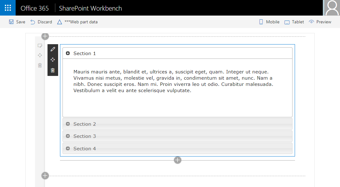
It creates an accordion which is designed to look like the accordion used in Microsoft sites:

From the code sample above, it looks like you already know how to load and filter the questions from your source, so I didn't bother with loading the questions. Feel free to use your existing code for that part.
To use the control, just clone the repo and copy the src\controls folder onto your own solution, then, in your _onRenderCell method, call the control as follows:
private _onRenderCell(item: IFAQItem, index: number | undefined): JSX.Element {
    const { collapsed } = this.state;
    return (
      <Accordion title={item.Question}
        defaultCollapsed={ collapsed} className={styles.itemCell} key={index}>
        <div className={styles.itemContent}>
          <div className={styles.itemReponse}>{item.Reponse}</div>
          <div className={styles.itemIndex}>{`Langue :  ${item.Langue.Nom}`}</div>
        </div>
      </Accordion>
    );
  }
Make sure to include a reference to the control too in your imports:
import { Accordion } from '../../../controls/accordion';
You won't need the list component to render the accordion, so in your render method replace this:
<List items={items} onRenderCell={this._onRenderCell} />
For this:
{items.map((item: IFAQItem, index: number) => {
    return this._onRenderCell(item, index);
})}
I hope this helps?
OTHER TIPS
Hugo, thank you for Accordion version for Office UI fabric react. Although there is one problem with this code:
this.state = {
    expanded: props.defaultCollapsed ? !props.defaultCollapsed : false
};
With this condition button won't be expanded by default when defaultCollapsed is explicitly set to false (expanded will be also false in this case). I changed it like this:
this.state = {
    expanded: props.defaultCollapsed == null ? false : !props.defaultCollapsed
};
Condition "props.defaultCollapsed == null" will be true when defaultCollapsed = null or undefined. If defaultCollapsed is true or false - condition "props.defaultCollapsed == null" will be false and code will use "!props.defaultCollapsed" option. Will create PR.
