Regarding Microsoft spfx documentation
 https://sharepoint.stackexchange.com/questions/282148
-
09-02-2021 - |
 italiano
 english
 français
 española
 中国
中国 日本の
日本の العربية
 Deutsch
 한국어
한국어 Português
 Russian
Question
I try to create a spfx webpart by following Microsoft document:
Original Post: https://techcommunity.microsoft.com/t5/sharepoint-developer/regarding-microsoft-spfx-documentation/m-p/1495338
and a error message comes up. Is there anything missed? or how should I check this error:
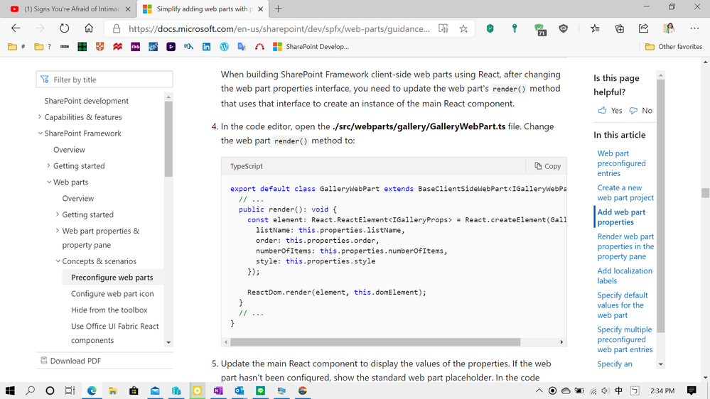
export default class GalleryWebPart extends BaseClientSideWebPart<IGalleryWebPartProps> {
  // ...
  public render(): void {
    const element: React.ReactElement<IGalleryProps> = React.createElement(Gallery, {
      listName: this.properties.listName,
      order: this.properties.order,
      numberOfItems: this.properties.numberOfItems,
      style: this.properties.style
    });
    ReactDom.render(element, this.domElement);
  }
  // ...
}
My error:
No overload matches this call.
  The last overload gave the following error.
    Argument of type 'typeof Gallery' is not assignable to parameter of type 'string | ComponentClass<IGalleryProps, any> | FunctionComponent<IGalleryProps>'.
      Type 'typeof Gallery' is not assignable to type 'ComponentClass<IGalleryProps, any>'.
        Construct signature return types 'Gallery' and 'Component<IGalleryProps, any, any>' are incompatible.
          The types of 'state' are incompatible between these types.
            Type 'void' is not assignable to type 'Readonly<any>'.ts(2769)
index.d.ts(238, 14): The last overload is declared here.

*********************************************************************************

Type 'DetailedReactHTMLElement<InputHTMLAttributes<HTMLInputElement>, HTMLInputElement>' is not assignable to type 'ReactElement<IGalleryProps, string | ((props: any) => ReactElement<any, string | ... | (new (props: any) => Component<any, any, any>)>) | (new (props: any) => Component<...>)>'.
  Types of property 'props' are incompatible.
    Type 'InputHTMLAttributes<HTMLInputElement>' is missing the following properties from type 'IGalleryProps': listName, order, numberOfItemsts(2322)
Solution
I do a test follow the document.It works well.
Test code:
GalleryWebPart.manifest.json
 {
  "$schema": "https://developer.microsoft.com/json-schemas/spfx/client-side-web-part-manifest.schema.json",
  "id": "1739c75d-fa9f-41d9-8aff-cec9ccbf76af",
  "alias": "GalleryWebPart",
  "componentType": "WebPart",

  // The "*" signifies that the version should be taken from the package.json
  "version": "*",
  "manifestVersion": 2,

  // If true, the component can only be installed on sites where Custom Script is allowed.
  // Components that allow authors to embed arbitrary script code should set this to true.
  // https://support.office.com/en-us/article/Turn-scripting-capabilities-on-or-off-1f2c515f-5d7e-448a-9fd7-835da935584f
  "requiresCustomScript": false,
  "supportedHosts": ["SharePointWebPart"],

  "preconfiguredEntries": [{
    "groupId": "5c03119e-3074-46fd-976b-c60198311f70", // Other
    "group": { "default": "Other" },
    "title": { "default": "Gallery" },
    "description": { "default": "Gallery description" },
    "officeFabricIconFontName": "Page",
    "properties": {
      "description": "Gallery",
      "listName": "",
      "order": "",
      "numberOfItems": 10,
      "style": ""
    }
  }]
}
GalleryWebPart.ts
import * as React from 'react';
import * as ReactDom from 'react-dom';
import { Version } from '@microsoft/sp-core-library';
import {
  IPropertyPaneConfiguration,
  PropertyPaneTextField
} from '@microsoft/sp-property-pane';
import { BaseClientSideWebPart } from '@microsoft/sp-webpart-base';

import * as strings from 'GalleryWebPartStrings';
import Gallery from './components/Gallery';
import { IGalleryProps } from './components/IGalleryProps';

export interface IGalleryWebPartProps {
  description: string;
  listName: string;
  order: string;
  numberOfItems: number;
  style: string;
}

export default class GalleryWebPart extends BaseClientSideWebPart <IGalleryWebPartProps> {

  public render(): void {
    const element: React.ReactElement<IGalleryProps> = React.createElement(Gallery,
      {
        description: this.properties.description,
        listName: this.properties.listName,
        order: this.properties.order,
        numberOfItems: this.properties.numberOfItems,
        style: this.properties.style
      }
    );

    ReactDom.render(element, this.domElement);
  }

  protected onDispose(): void {
    ReactDom.unmountComponentAtNode(this.domElement);
  }

  protected get dataVersion(): Version {
    return Version.parse('1.0');
  }

  protected getPropertyPaneConfiguration(): IPropertyPaneConfiguration {
    return {
      pages: [
        {
          header: {
            description: strings.PropertyPaneDescription
          },
          groups: [
            {
              groupName: strings.BasicGroupName,
              groupFields: [
                PropertyPaneTextField('description', {
                  label: strings.DescriptionFieldLabel
                })
              ]
            }
          ]
        }
      ]
    };
  }
}
IGalleryProps.ts
export interface IGalleryProps {
  description: string;
  listName: string;
  order: string;
  numberOfItems: number;
  style: string;
}
Gallery.tsx
import * as React from 'react';
import styles from './Gallery.module.scss';
import { IGalleryProps } from './IGalleryProps';
import { escape } from '@microsoft/sp-lodash-subset';

export default class Gallery extends React.Component<IGalleryProps, {}> {
  public render(): JSX.Element {
    if (this.needsConfiguration()) {
      return <div className="ms-Grid" style={{ color: "#666", backgroundColor: "#f4f4f4", padding: "80px 0", alignItems: "center", boxAlign: "center" }}>
        <div className="ms-Grid-row" style={{ color: "#333" }}>
          <div className="ms-Grid-col ms-u-hiddenSm ms-u-md3"></div>
          <div className="ms-Grid-col ms-u-sm12 ms-u-md6" style={{ height: "100%", whiteSpace: "nowrap", textAlign: "center" }}>
            <i className="ms-fontSize-su ms-Icon ms-Icon--ThumbnailView" style={{ display: "inline-block", verticalAlign: "middle", whiteSpace: "normal" }}></i><span className="ms-fontWeight-light ms-fontSize-xxl" style={{ paddingLeft: "20px", display: "inline-block", verticalAlign: "middle", whiteSpace: "normal" }}>Gallery</span>
          </div>
          <div className="ms-Grid-col ms-u-hiddenSm ms-u-md3"></div>
        </div>
        <div className="ms-Grid-row" style={{ width: "65%", verticalAlign: "middle", margin: "0 auto", textAlign: "center" }}>
          <span style={{ color: "#666", fontSize: "17px", display: "inline-block", margin: "24px 0", fontWeight: 100 }}>Show items from the selected list</span>
        </div>
        <div className="ms-Grid-row"></div>
      </div>;
    }
    else {
      return (
        <div className={styles.gallery}>
          <div className={styles.container}>
            <div className={`ms-Grid-row ms-bgColor-themeDark ms-fontColor-white ${styles.row}`}>
              <div className='ms-Grid-col ms-u-lg10 ms-u-xl8 ms-u-xlPush2 ms-u-lgPush1'>
                <span className="ms-font-xl ms-fontColor-white">
                  Welcome to SharePoint!
                </span>
                <p className='ms-font-l ms-fontColor-white'>
                  Customize SharePoint experiences using web parts.
                </p>
                <p className='ms-font-l ms-fontColor-white'>
                  List: {this.props.listName}<br />
                  Order: {this.props.order}<br />
                  Number of items: {this.props.numberOfItems}<br />
                  Style: {this.props.style}
                </p>
                <a href="https://aka.ms/spfx" className={styles.button}>
                  <span className={styles.label}>Learn more</span>
                </a>
              </div>
            </div>
          </div>
        </div>
      );
    }
  }

  private needsConfiguration(): boolean {
    return Gallery.isEmpty(this.props.listName) ||
      Gallery.isEmpty(this.props.order) ||
      Gallery.isEmpty(this.props.style);
  }

  private static isEmpty(value: string): boolean {
    return value === undefined ||
      value === null ||
      value.length === 0;
  }
}
Licensed under: CC-BY-SA with attribution
Not affiliated with sharepoint.stackexchange
