Barplot in R, aggregation of sampled data
 https://stackoverflow.com/questions/2402885
 italiano
 english
 français
 española
 中国
中国 日本の
日本の العربية
 Deutsch
 한국어
한국어 Português
 Russian
Question
I want an stacked barplot, or at least two barplots (histogramms) of the data below. But I cant't figure out how. plot(online) is not the solution, I´m looking for. Please see below.
          online              offline
1         sehrwichtig             wichtig
2             wichtig           unwichtig
3         sehrwichtig           unwichtig
4         sehrwichtig         sehrwichtig
5         sehrwichtig         sehrwichtig
6         sehrwichtig           unwichtig
7         sehrwichtig           unwichtig
8             wichtig             wichtig
9             wichtig           unwichtig
10        sehrwichtig         sehrwichtig
11        sehrwichtig             wichtig
12        sehrwichtig           unwichtig
13            wichtig         sehrwichtig
14        sehrwichtig             wichtig
I know I need a step, where the data is aggregated to:
                   online        offline
   sehrwichtig           6         7
   unwichtig             0         1
   wichtig               3         5
But how?
Solution
That aggregation is just a simple call to table inside of apply:
R> foo <- data.frame(online=sample(c("S","W","U"),10,TRUE),
                     offline=sample(c("S","W","U"),10,TRUE))
R> apply(foo,2,table)
  online offline
S      3       1
U      4       5
W      3       4
which you can feed into barplot.
OTHER TIPS
With ggplot2, you don't need to pre-aggregate the data:
library(ggplot2)
qplot(online, data = df, fill = offline)
qplot(offline, data = df, fill = online)
#generate data
df<- read.table(textConnection('
online offline
sehrwichtig wichtig
wichtig unwichtig
sehrwichtig unwichtig
sehrwichtig sehrwichtig
sehrwichtig sehrwichtig
sehrwichtig unwichtig
sehrwichtig unwichtig
wichtig wichtig
wichtig unwichtig
sehrwichtig sehrwichtig
sehrwichtig wichtig
sehrwichtig unwichtig
wichtig sehrwichtig
sehrwichtig wichtig'
),header=T)
#factor levels should be the same
levels(df$online) <- levels(df$offline)
my_table <- t(aaply(df,2,table))
library(graphics)
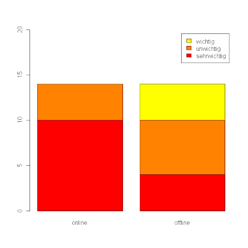
barplot2(my_table,legend = rownames(my_table), ylim = c(0, 20))
Dirk's answer is the way to go, but on the OP's data a simple apply(foo,2,table) won't work -- you need to deal with the 0 entry, perhaps like so:
my.data <- "online              offline
1         sehrwichtig             wichtig
2             wichtig           unwichtig
3         sehrwichtig           unwichtig
4         sehrwichtig         sehrwichtig
5         sehrwichtig         sehrwichtig
6         sehrwichtig           unwichtig
7         sehrwichtig           unwichtig
8             wichtig             wichtig
9             wichtig           unwichtig
10        sehrwichtig         sehrwichtig
11        sehrwichtig             wichtig
12        sehrwichtig           unwichtig
13            wichtig         sehrwichtig
14        sehrwichtig             wichtig"

df <- read.table(textConnection(my.data))

df.labels <- unique(as.character(apply(df,2,as.character)))
tallies <- apply(df,2,function(x)table(x)[df.labels])
tallies[is.na(tallies)] <- 0
rownames(tallies) <- df.labels
For brevity's sake, you could combine the last 3 lines:
tallies <- apply(df,2,function(x){y <- table(x)[df.labels];
                                   names(y) <- df.labels; y[is.na(y)] <- 0; y})
The output is:
> tallies
            online offline
sehrwichtig     10       4
wichtig          4       4
unwichtig        0       6
I haven't done this myself, but I do know of the R package that a lot of people use for the step of putting it in the second array there. It's called reshape:
http://www.statmethods.net/management/reshape.html
http://had.co.nz/reshape/introduction.pdf
As for the plotting part, I think that lattice or ggplot probably both have functions for doing exactly what you want, but again I am an R newbie so I can't say much more...
