CSS3 envelope shape
 https://stackoverflow.com/questions/8082982
-
26-02-2021 - |
 italiano
 english
 français
 española
 中国
中国 日本の
日本の العربية
 Deutsch
 한국어
한국어 Português
 Russian
Question
As you might have guessed this image is part of a mail envelope shape which I would like to create with CSS3 if possible. I've made the other parts but this one's tricky. The shape needs both a triangular cut on both sides and rounded corners (presumably border-radius-bottom-left/border-radius-bottom-right). It also has to have the ability to cast a small shadow.
This is what I've done so far -
#envelope {
background: #fff;
}

.closed {
width: 860px;
height: 0;
border-top: 80px solid fff;
border-left: 50px solid transparent;
border-right: 50px solid transparent;
-moz-box-shadow: 0 1px 5px #ccc;
-webkit-box-shadow: 0 1px 5px #ccc;
box-shadow: 0 1px 5px #ccc;
}
jsFiddle - http://jsfiddle.net/hsYUy/
Solution
My attempt, I only used the shadow and rotate properties for chrome, but you can add it for other browsers,
body {
  background: #f2f2f2;
}
#content {
  width: 460px;
  margin: 0 auto;
  background: #fff;
  height: 400px;
  /* for demo */
  -moz-box-shadow: 0 1px 5px #ccc;
  -webkit-box-shadow: 0 1px 5px #ccc;
  box-shadow: 0 1px 5px #ccc;
  border-bottom-left-radius: 15px;
  -moz-border-radius-bottomleft: 15px;
  -webkit-border-bottom-left-radius: 15px;
  border-bottom-right-radius: 15px;
  -moz-border-radius-bottomright: 15px;
  -webkit-border-bottom-right-radius: 15px;
  z-index: 0;
}
.closed {
  z-index: 1;
  width: 460px;
  overflow: hidden;
  margin: 0 auto;
  height: 80px;
  margin-bottom: -5px;
}
.closed .mid {
  /*background: #fff;*/
  width: 360px;
  margin: 0 auto;
  margin-top: -70px;
  height: 80px;
  background-color: #fff;
  -moz-box-shadow: 0 1px 5px #ccc;
  -webkit-box-shadow: 0 1px 5px #ccc;
  box-shadow: 0 1px 5px #ccc;
  -webkit-border-radius: 12px;
}
.left,
.right {
  display: none;
}
.closed .right {
  display: block;
  width: 0;
  height: 100px;
  border-left: 60px solid #fff;
  border-right: 1px solid #ccc;
  margin-left: 384px;
  -webkit-transform: rotate(39deg);
  margin-top: -34px;
  box-shadow: 1px -1px 1px #ccc;
}
.closed .left {
  display: block;
  width: 0;
  height: 100px;
  border-right: 60px solid #fff;
  border-left: 1px solid #ccc;
  margin-left: 16px;
  -webkit-transform: rotate(-39deg);
  margin-top: -100px;
  box-shadow: -1px -1px 1px #ccc;
}
<div id="content">
<div class="closed">
<div class="right"></div>
<div class="left"></div>
<div class="mid"></div>
</div>
</div>OTHER TIPS
Here's my try, with just one div
div {
    margin:20px;
    width:500px;
    height:60px;
    border-bottom-left-radius: 90px 200px;
    border-bottom-right-radius: 90px 200px;
    box-shadow: 0 5px 3px -5px #888,
    5px 0 3px -5px #888,
    -5px 0 3px -5px #888;
}<div></div>A 1 element solution using 2D skew transforms on pseudo-elements.
DEMO
Result:
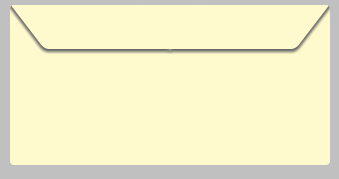
HTML:
.envelope {
  overflow: hidden;
  position: relative;
  margin: 0 auto;
  width: 20em;
  height: 10em;
  border-radius: .25em;
  background: lemonchiffon;
}
.envelope:before,
.envelope:after {
  position: absolute;
  top: -.25em;
  width: 40%;
  height: 30%;
  content: '';
}
.envelope:before {
  left: 1em;
  border-radius: 0 0 0 .25em;
  box-shadow: -.2em .2em .2em dimgrey;
  transform: skewX(37.5deg);
}
.envelope:after {
  right: 1em;
  border-radius: 0 0 .25em 0;
  transform: skewX(-37.5deg);
  box-shadow: .2em .2em .2em dimgrey;
}
<div class='envelope'></div>Here's 3 approximations http://jsfiddle.net/JKirchartz/RNChA/ using only border-radius, should work in all browsers with the proper prefixes.
HTML:
.env {
  width: 100%;
  height: 300px;
  border: 3px solid #bbb;
  margin: 1em
}
.env_top {
  border: 0.2em solid #bbb;
  border-top: 0;
  height: 60px;
  max-width: 100%;
}
.one {
  -webkit-border-radius: 0px 0px 24px 24px / 0px 0px 200px 200px;
  -moz-border-radius: 0px 0px 24px 24px / 0px 0px 200px 200px;
  border-radius: 0px 0px 24px 24px / 0px 0px 200px 200px;
}
.two {
  -webkit-border-radius: 0px 0px 24px 24px / 0px 0px 300px 300px;
  -moz-border-radius: 0px 0px 24px 24px / 0px 0px 300px 300px;
  border-radius: 0px 0px 24px 24px / 0px 0px 300px 300px;
}
.thr {
  -webkit-border-radius: 0px 0px 100px 100px / 0px 0px 300px 300px;
  -moz-border-radius: 0px 0px 100px 100px / 0px 0px 300px 300px;
  border-radius: 0px 0px 100px 100px / 0px 0px 300px 300px;
}
<div class="env">
<div class="env_top one"></div>
</div>
<div class="env">
<div class="env_top two"></div>
</div>
<div class="env">
<div class="env_top thr"></div>
</div>