Add space between HTML elements only using CSS
 https://stackoverflow.com/questions/8184958
 italiano
 english
 français
 española
 中国
中国 日本の
日本の العربية
 Deutsch
 한국어
한국어 Português
 Russian
Question
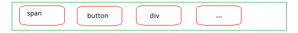
I have several same HTML elements going one after another:
<span>1</span>
<span>2</span>
<span>3</span>
I'm looking for the best way of adding space BETWEEN the elements using CSS only
[no space] [1] [space 10px] [2] [space 10px] [3] [no space]
Additionally:
- Please write down browser compatibility of your receipts
UPDATE
It looks like I was unclear. I don't want to use ANY ADDITIONAL HTML MARKUP like
<span></span> <span></span> <span class="last_span"></span>
I don't want to use tables
I want the first and last span to be targeted automatically by CSS
I don't want to use javascript
Optional requirement: last span can be NOT LAST CHILD of the parent tag, but it will be the LAST SPAN of the parent tag. Spans do not have any other tags between them.
Solution
A good way to do it is this:
span + span {
    margin-left: 10px;
}
Every span preceded by a span (so, every span except the first) will have margin-left: 10px.
Here's a more detailed answer to a similar question: Separators between elements without hacks
OTHER TIPS
Just use margin or padding.
In your specific case, you could use margin:0 10px only on the 2nd <span>.
UPDATE
Here's a nice CSS3 solution (jsFiddle):
span {
    margin: 0 10px;
}

span:first-of-type {
    margin-left: 0;
}

span:last-of-type {
    margin-right: 0;
}
Advanced element selection using selectors like :nth-child(), :last-child, :first-of-type, etc. is supported since Internet Explorer 9.
add these rules to the parent container:
display: grid
grid-auto-flow: column
grid-column-gap: 10px
Good reference: https://cssreference.io/
Browser compatibility: https://gridbyexample.com/browsers/
You can style elements with excluding first one, just in one line of code:
span ~ span {
    padding-left: 10px;
}
No need to change any classes.
You can take advantage of the fact that span is an inline element
span{
     word-spacing:10px;
}
However, this solution will break if you have more than one word of text in your span
span:not(:last-child) {
    margin-right: 10px;
}
You can write like this:
span{
 margin-left:10px;
}
span:first-child{
 margin-left:0;
}
<span> is an inline element so you cant make spacing on them without making it block level.
Try this
Horizontal
span{
    margin-right: 10px;
    float: left;
}
Vertical
span{
    margin-bottom: 10px;
}
Compatible with all browsers.
You should wrap your elements inside a container, then use new CSS3 features like css grid, free course, and then use grid-gap:value that was created for your specific problem
span{
  border:1px solid red;
}
.inRow{
  display:grid;
  grid-template-columns:repeat(auto-fill,auto);
  grid-gap:10px /*This add space between elements, only works on grid items*/
}
.inColumn{
  display:grid;
  grid-template-rows:repeat(auto-fill,auto);
  grid-gap:15px;
}
<div class="inrow">
<span>1</span>
<span>2</span>
<span>3</span>
</div>
<div class="inColumn">
<span>4</span>
<span>5</span>
<span>6</span>
</div>Or, instead of setting margin and than overriding it, you can just set it properly right away with the following combo:
span:not(:first-of-type) {
    margin-left:  5px;
}

span:not(:last-of-type) {
    margin-right: 5px;
}
If you want to align various items and you like to have same margin around all sides, you can use the following. Each element withing container, regardless of type, will receive the same surrounding margin.
.container {
  display: flex;
}
.container > * {
  margin: 5px;
}
If you wish to align items in a row, but have the first element touch the leftmost edge of container, and have all other elements be equally spaced, you can use this:
.container {
  display: flex;
}
.container > :first-child {
  margin-right: 5px;
}
.container > *:not(:first-child) {
  margin: 5px;
}
span.middle {
    margin: 0 10px 0 10px; /*top right bottom left */
}

<span>text</span> <span class="middle">text</span> <span>text</span>
