how to handle 'double opacity' of two overlapping divs
 https://stackoverflow.com/questions/8749950
-
14-04-2021 - |
 italiano
 english
 français
 española
 中国
中国 日本の
日本の العربية
 Deutsch
 한국어
한국어 Português
 Russian
Question
I have two divs, both with 0.6 opacity. I need them to overlap but retain their opacity and not create a new combined opacity level. I can't use an image.
EDIT -- The little circle is supposed to have a canvas element in it. Not sure if pseudo-elements would be the best solution.
Is there anyway to do this with CSS, or should I just use canvas?
example -
http://dabblet.com/gist/1566209
HTML:
<div id="foo">
    <div id="bar">
    </div>
</div>
CSS:
/**
 * Double Opacity
 */
body{background:green;}

#foo{
height:150px;
width:250px;
background:rgba(0, 0, 0, 0.6);
position:absolute;
left:40%;
top:20%;
}

#bar{
height:40px;
width:40px;
background:rgba(0, 0, 0, 0.6);
border-radius:40px;
position:absolute;
top:-15px;
left:-15px;
}
Solution
SUMMARY:
Depending on what is needed it can be tricky but the basic approach is pretty straight forward.
This approach is a little different from my first thought... but this has the same result.
- I made a black/transparent pattern for the circle and set it to
:before. - The circle is then transformed
rotate(180deg)and moved to fit on the corner of the<div>. - Then I set the
opacityof that circle to0.6. - The
<div>itself is not affected by theopacity. - Next I added the
:afterelement and put an image asbackground(you can control this via js if needed) - I added some effects to the image (
border-radius,box-shadow,border) to show how easily and independent this element can be controlled. - I used a lighter background and set the
opacityto0.3to show the result
HERE'S THE FIDDLE: http://jsfiddle.net/pixelass/nPjQh/4/
Look at this version for some crazy results: http://jsfiddle.net/pixelass/nPjQh/5/
each of these examples only use a single div element
Basic rules. (these rules "could" be used to create a dynamic behavior with js)
position = absolute;
top = circleHeight / -2;
left = circleHeight / -2; //(left = top)
rotation = 180deg;
opacity = valueAofBackground;
bgColor = valueRGBofBackground;
#inner {
    width: 100%;
    height: 100%;
    position: absolute;
    left: 0;
    top: 0;
    z-index: -1;
    background-color: rgba(0, 0, 0, 0.3);
    padding:20px;
    border-radius: 20px;
    border-top-left-radius: 0;
}
#inner:before {
    content: "";
    background-image: -webkit-linear-gradient(transparent 50%, rgb(0, 0, 0) 50%, rgb(0, 0, 0)),
        -webkit-linear-gradient(0deg, transparent 50%, rgb(0, 0, 0) 50%, rgb(0, 0, 0));
    height: 40px;
    width: 40px;
    border-radius: 40px;
    position: absolute;
    top: -20px;
    left: -20px;
    -webkit-transform: rotateZ(180deg);
    opacity:0.3;
}
#inner:after {
    content: "";
    background: url('http://lorempixel.com/10/10/sports/1/') no-repeat;
    background-position:0;
    height: 10px;
    width: 10px;
    border-radius: 10px;
    position: absolute;
    top: -6px;
    left: -6px;
    -webkit-box-shadow: 0 0 10px rgb(255,255,255);
    border: 1px rgb(255,255,255) solid;

}
Better explanaition
Original commented version http://jsfiddle.net/pixelass/nPjQh/10/
see the comments in the code below
#inner {
background: rgba(0,0,0,0.5) /*this is the full color-code of the div (with alpha)*/
}
#inner:before {
    /*the solid color of the circle = rgbValue of the div*/
    background-image: -webkit-linear-gradient(transparent 50%, rgb(0, 0, 0) 50%, rgb(0, 0, 0)),
        -webkit-linear-gradient(0deg, transparent 50%, rgb(0, 0, 0) 50%, rgb(0, 0, 0));
    /*opacity of the circle = alpha of the div*/
    opacity: 0.5;
}
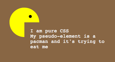
This example has a full transparent div ...the circle is a "pacman"- shape: http://jsfiddle.net/pixelass/nPjQh/14/
Managing the offset of the circle
Look at these examples that handle the offset of the circle (NOT USING PSEUDEO-ELEMENTS)
1:1 copy of the OP's code (15px offset): http://jsfiddle.net/pixelass/nPjQh/12/
With a lot smaller offset (5px): http://jsfiddle.net/pixelass/nPjQh/13/
(the content has the same opacity as the circle)
How does the offset work?
Control the background-size vs. the top and left
Rules:
top = left;
background-size = elementHeight * 2 + top * 2;
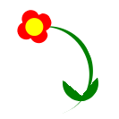
Look at the flower (it is also only one <div> with pseudo-elements)
the background-size is bigger than the circle. which creates the green leaves on the bottom
http://jsfiddle.net/pixelass/nPjQh/15/
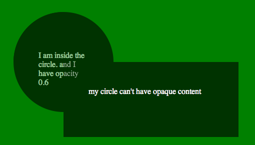
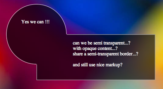
CURRENT PROBLEM
See this fiddle: http://jsfiddle.net/pixelass/nPjQh/16/
If not using another layer as seen in the examples at the top of the post the content will be transparent. So if you only need an image inside the circle the above examples will work fine.
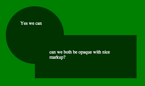
HOW TO SOLVE THIS ISSUE
If you need a canvas or another div inside the circle you would have to put the circle on the div and layer the needed div over the circle
See this fiddle: http://jsfiddle.net/pixelass/nPjQh/17/
change around a little and it will work fine. GET THE CODE FROM THE FIDDLE
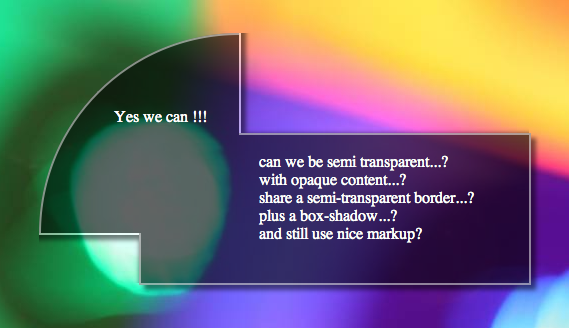
Different shape /advanced Styling
If you use a different shape with flat sides, you could even put a border around the sum of the two divs.. or even add a box shadow
still using the simple markup of....
<div id="foo">
    <div id="bar">
    </div>
</div>
See the fiddle for the box-shadow: http://jsfiddle.net/pixelass/nPjQh/21/
Apply a border to the circle
Using -webkit-mask-image we could add a border to the circle.
http://jsfiddle.net/pixelass/nPjQh/24/
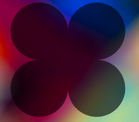
More examples:
Four circles around the div
http://jsfiddle.net/pixelass/nPjQh/25/
Markup:
<div id="foo">
    <div id="bar1"></div>
    <div id="bar2"></div>
    <div id="bar3"></div>
    <div id="bar4"></div>
</div>
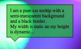
Using this technique to make a tooltip
http://jsfiddle.net/pixelass/nPjQh/31/
Markup:
<div id="foo">
    <div id="bar"></div>
    I am a pure css tooltip with a semi-transparent background and a black border. <br/>
    My width is static an my height is dynamic...
</div>
OTHER TIPS
I think the only way would be to do the opacity separately,
How about this: http://jsfiddle.net/rudiedirkx/TqRCw/
(Dabble's editor sucks!!)
It can't be done with only pseudo elements sadly =(
It can be done with only pseudo elements! See pixelass' answer. CSS3 is a requirement though.
Revised Answer
This fiddle is compatible with IE9 and resolves the duplication of background needed in my original answer. It does use pseudoelements to generate the circle. This solution spins off pixelass's "pacman" idea, only instead of using the newer background gradient css to generate, it uses the older (and little used or understood) clip property to make the circle in two parts. This solved the issue of your circle not being "centered" at the corner.
#foo {
    height:150px;
    width:250px;
    background: rgba(0, 0, 0, 0.6);
    position:absolute;
    left:40%;
    top:20%;
}

#bar {
    height:40px;
    width:40px;
    position:absolute;
    top:-15px;
    left:-15px;
    line-height: 40px;
}

#bar:before,
#bar:after {
    content: '';
    display: block;
    background: rgba(0, 0, 0, 0.6);
    border-radius: 40px;
    width: 100%;
    height: 100%;
    position: absolute;
    z-index: -1;
    top: 0;
    left: 0;
}

#bar:before {
    clip: rect(0 40px 15px 0);
}

#bar:after {
    clip: rect(15px 15px 40px 0);
}
Original Answer
You can do this (see fiddle). It pushes the circle below and "overlays" the portion that overlaps with a pseudoelement to reestablish the background color of the body:
body{background:green;}

#foo{
height:150px;
width:250px;
background:rgba(0, 0, 0, 0.6);
position:absolute;
left:40%;
top:20%;
}

#bar{
height:40px;
width:40px;
background:rgba(0, 0, 0, 0.6);
border-radius:40px;
position:absolute;
top:-15px;
left:-15px;
z-index: -1;
}

#bar:after {
    content: '';
    display: block;
    background: green;
    position: absolute;
    right: 0;
    bottom: 0;
    width: 25px;
    height: 25px;
}
I have created a Q/A to handle this scenario along with the 'hover' of such overlapped elements.
Overlapped elements with opacity and handling the 'hover' on those.
The solution is basically to set the opacity in the parent level instead directly on the children elements and to toggle those while hover, with JS.
HTML
<div class="wrapper">
  <div class="first"></div>
  <div class="second"></div>
</div>
JS
$(".first, .second").hover(function() {
  $(".wrapper, .first, .second").not(this).toggleClass("add-opacity");
});
Hope this helps.
