Mobile issue – website isn't properly detecting screen size [closed]
 https://wordpress.stackexchange.com/questions/345507
-
16-04-2021 - |
 italiano
 english
 français
 española
 中国
中国 日本の
日本の العربية
 Deutsch
 한국어
한국어 Português
 Russian
Question
my question concerns this website (currently on my staging server): https://sunstonebookkeeping.markhannondesign.com
The theme is a child theme of a parent theme I created with Underscores and Bootstrap. I am getting some odd behavior when I view the website on my phone. See the screenshot below.
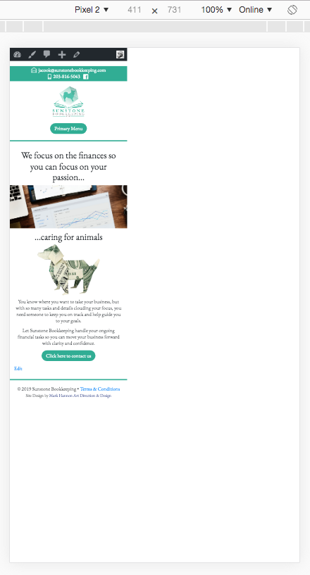
If I click another page in the menu, the website corrects itself and fits properly on the screen. However when I turn my phone to landscape, the full-size desktop version loads. Again, when I click another page in the menu, the website resizes itself to properly fit the screen.
Any idea what is causing this?
Solution
Your primary menu container is set to left: 5000px; witch stretches the width of the page. You can find this style directive in ...themes/sunstone-bookkeeping/css/mobile.css on line 66.
@media screen and (max-width: 600px)
.nav-menu {
    position: absolute;
    left: 5000px;
}
One way to fix this is to add the following styles to the parent element:
.menu-menu-1-container {
    position: relative;
    overflow-x: hidden;
}
This solution shouldn't mess with other styles.
The proper way of applying this kind of changes is described here: child themes. In the style.css file of your child theme you can safely add the solution that I proposed. Cheers!
