Text Wrapping around an absolute positioned div
 https://stackoverflow.com/questions/1915831
 italiano
 english
 français
 española
 中国
中国 日本の
日本の العربية
 Deutsch
 한국어
한국어 Português
 Russian
Question
I know there are a few questions about similar topics but they mostly amount to floating the div/image. I need to have the image (and div) positioned absolutely (off to the right) but I simply want the text flow around it. It works if I float the div but then I can't position it where I want. As it is the text just flows behind the picture.
<div class="post">
<div class="picture">
<a href="/user/1" title="View user profile."><img src="http://www.neatktp.com/sites/default/files/photos/BlankPortrait.jpg" alt="neatktp's picture" title="neatktp's picture" /></a></div>
<span class='print-link'></span><p>BlahBlahBlahBlahBlahBlahBlahBlahBlahBlahBlahBlahBlahBlahBlah.</p>
<p>BlahBlahBlahBlahBlahBlahBlahBlahBlahBlahBlahBlahBlahBlahBlah.</p>
</div>
Is an example of the HTML
With the CSS being:
    .picture img {
        background: #fff;
        border: 1px #ddd solid;
        padding: 2px;
        float: right;
}

.post .picture {
    display: block;
    height: auto;
    position: absolute;
    right: -10px;
    top: -10px;
    width: auto;
}

.post {
    border: 1px solid #FFF;
    border-bottom: 1px solid #e8ebec;
    padding: 37px 22px 11px;
    position: relative;
    z-index: 4;
}
It's a Drupal theme so none of this code is mine, it's just that it's not fully working when it comes to putting a picture there.
Solution
Absolute positioning takes the element out of the normal document flow, and therefore it does not interact with the other elements. Perhaps you should revist how to position it using float instead, and ask about it here on Stack Overflow if you get stuck :)
OTHER TIPS
I know this is an older question but I came across it looking to do what I believe you were trying to. I've made a solution using the :before CSS selector, so it's not great with ie6-7 but everywhere else you should be good.
Basically, putting my image in a div I can then add a long thing float block before hand to bump it down and the text wraps merrily around it!
img {
  float:right;
  clear:both;
  width: 50% ;
  margin: 30px -50px 10px 10px ;
}
.rightimage:before {
  content: '' ;
  display:block;
  float: right;
  height: 200px;

}
You can check it out here:
When you position a div absolutely, you're effectively taking it out of the document flow, so the other elements will act as if it's not there.
To get around this, you can instead use margins:
.myDivparent
{
   float: left;
   background: #f00;
}

.myDivhascontent
{
   margin-left: 10px; /*right, bottom, top, whichever you need*/
}
Hopefully that will do the trick :)
As mentioned by @Kyle Sevenoaks, you are taking absolute positioned content out of the document flow.
As far as I can see, the only way to have the parent div wrap the absolute positioned contents, is to use javascript to set the width and height on each change.
In my opinon, the "Absolute" trait is poorly named, because its position is actually relative to the first parent whos position is not static
<div class="floated">
 <div style="position: relative;">
  <div class="AbsoluteContent">
    stuff
  </div>
 </div>
</div>
I think the best option is to add an additional div after the float content, but still inside the parent to clear previous styles.
<div class="clear"></div>
And CSS:
.clear
{clear:both;}
I needed a similar solution to float a pullout quote (not an image) which would have variable length text inside. The pullout quote needed to be inserted into the HTML at the top (outside the flow of the text) and float down into the content with text that wraps around it. Modifying Leonard's answer above, there is a really simple way to do this!
See Codepen for Working Example: https://codepen.io/chadwickmeyer/pen/gqqqNE
CSS
/* This creates a space to insert the pullout content into the flow of the text that follows */
.pulloutContainer:before {
  content: '' ;
  display:block;
  float: right;
  /* The height is essentially a "margin-top" to push the pullout Container down page */
  height: 200px;
}

.pulloutContainer q {
  float:left;
  clear:both;
  /* This can be a set width or percent, if you want a pullout that floats left or right or full full width */
  width: 30%;
  /* Add padding as you see fit */
  padding: 50px 20px;
}
HTML
<div id="container">

  <div class="pulloutContainer">
      <!-- Pullout Container Automatically Adjusts Size -->
      <q>Lorem ipsum dolor sit amet, consectetur adipiscing elit Lorem ipsum dolor sit amet Lorem ipsum dolor sit amet, consectetur adipiscing elit Lorem ipsum dolor sit amet.</q>
    </div>

    <div class="content">
       <h1>Sed Aucteor Neque</h1>
       <p>Lorem ipsum dolor sit amet, consectetur adipiscing elit. Nullam in dui mauris. Vivamus hendrerit arcu sed erat molestie vehicula. Sed auctor neque eu tellus rhoncus ut eleifend nibh porttitor. Ut in nulla enim. Phasellus molestie magna non est.</

      ...INSERT MORE TEXT HERE...

  </div>
</div>
Absolute positioning does not let you wrap text. You have to use float and position using margin or padding.
Here's a trick that might work for some:
if you have a container packed with a lot of objects, and you want that positioned object to appear up high in certain cases, and down lower in other cases (various screen sizes for example), then just intersperse copies of the object multiple times in your html, either inline(-block), or with float, and then display:none the items you dont want to see according to the conditions you need.
Here is a JSFiddle to show exactly what I mean: JSFiddle of right positioning high and low
Note: I added color only for effect. Except for the class names, the subject-1 and subject-2 divs are otherwise exact copies of each other.
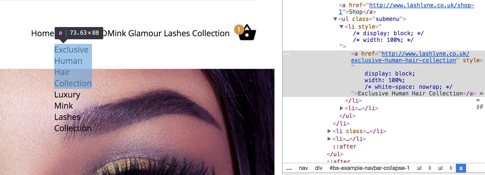
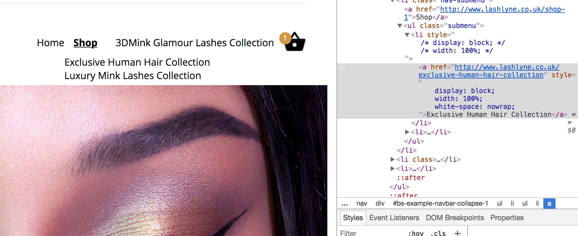
There is an easy fix to this problem. It's using white-space: nowrap;
<div class="position:relative">
 <div style="position: absolute;top: 100%; left:0;">
  <div style="white-space:nowrap; width: 100%;">
    stuff
  </div>
 </div>
</div>
For example I was making a dropdown menu for a navigation so the setup I was using is
<ul class="submenu" style="position:absolute; z-index:99;">
   <li style="width:100%; display:block;">
      <a href="#" style="display: block;width: 100%;white-space: nowrap;">Dropdown link here</a>
   </li>
<ul>
Image Examples
Also if you still can't figure it out check out the dropdowns on bootstrap templates which you can google. Then find out how they work because they are using position absolute and getting the text to take up 100% width without wrapping the text.
