High Resolution Image IE Browser Rendering
 https://stackoverflow.com/questions/10108615
-
30-05-2021 - |
 italiano
 english
 français
 española
 中国
中国 日本の
日本の العربية
 Deutsch
 한국어
한국어 Português
 Russian
Question
I am optimizing my site for these higher resolution monitors (especially the new iPad). I have the site formatted the way I want, and I was just increasing the resolution of each image but still constraining it to the DIVs that I currently have. For example, I have an image with a resolution of 483x246 and I have it fitting a DIV with a set size of 188x96.
The images look great on Chrome, Firefox, and most importantly on the new iPad. Even zoomed in it's nice and crisp (as opposed to my old 188x96 image that looked blurry and pixelated when zoomed in)
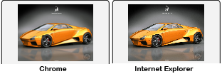
The problem comes in when I open the page in IE. It displays the image at the correct size but it's jagged. See link to comparison below. I know it's an issue with the way IE resizes and renders pictures on the fly.
My question would be, is there a way to make IE display the picture nicely? If not, is there a way I can put in the code so that if it detects IE, it displays my old low res image? I've looked everywhere but haven't found anything that relates to my specific problem. I know this is a small example but my bigger images do the same thing and are more noticeable. I hope you all can help. Thanks. :)
Comparison:
Solution
Have you tried putting this in your CSS?
img { -ms-interpolation-mode: bicubic; }
There's also this https://github.com/adamdbradley/foresight.js which looks very interesting
Make sure IE9 isn't in compatibility mode or IE7/8 mode... 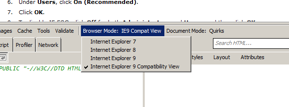
OTHER TIPS
The reason this happends if because the bitmapdata is actually rendered completely different in the IE browser, the thing IE does is it "cuts" away pixels over a set ratio so like every 5 pixels it yanks a pixel and therefor makes it look like it misses certain gradient properties.
not much you can do about this except for keeping the aspect ratio set but I guess you would've known that by yourself already
