How to view a website as it appears on mobile safari from desktop safari?
 https://apple.stackexchange.com/questions/413030
-
31-05-2021 - |
 italiano
 english
 français
 española
 中国
中国 日本の
日本の العربية
 Deutsch
 한국어
한국어 Português
 Russian
Question
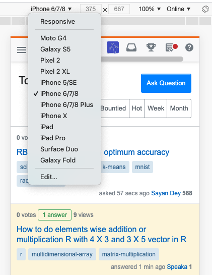
On chrome on desktop, it's easy to view a website as it appears when viewed on chrome on many other devices. That is, simply cmd + option + j to open dev tools, then clicking on the 'Toggle Device Toolbar' lets you select which device you want to view the site as. For example, this is stackoverflow.com viewed from chrome on desktop (it can be made to show what would be seen by a user accessing the site from chrome on an iPhone 8):
Question
How do I view a website as seen from other devices safari running on desktop?
I've tried changing the user agent, which simply tells the website to serve what it normally would to a mobile device, however, this doesn't affect the fact that it's still being viewed on a desktop browser, which is very different to a mobile one.
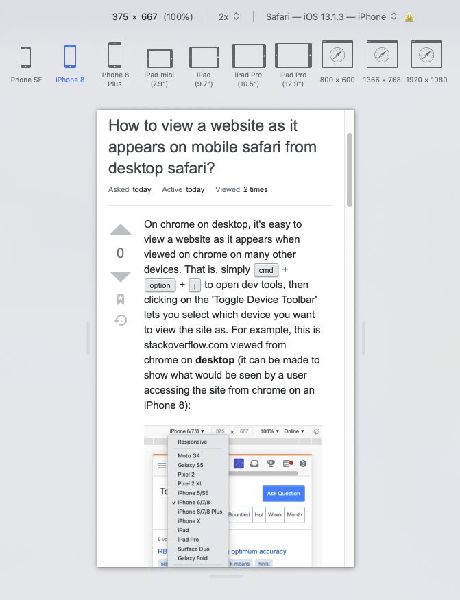
Solution
From the Develop menu > Enter Responsive Design Mode Cmd ⌘ Ctrl ⌃ R
You can then choose between a selection of devices…
Click for larger image
If you don't have that menu open already, it's in Safari Prefs > Advanced
